datedreamer v0.3.6
DateDreamer
An easy to use lightweight javascript calendar library.
Install & Usage
Install
Install DateDreamer with either yarn or npm.
npm install datedreameryarn install datedreamerUse
<script src="node_modules/datedreamer/datedreamer.js">

<div id="calendar"></div>

<script>
   window.onload = () => {
       new datedreamer.calendar({...options})
   }
</script>
OR
import * as datedreamer from "datedreamer";

new datedreamer.calendar({...options});
OR
import {calendar} from "datedreamer";

new calendar({...options});
Standalone Calendar
Use this if you want a standalone calendar that comes with an input filled and a Today button.
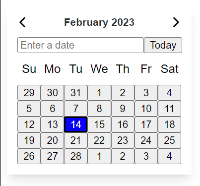
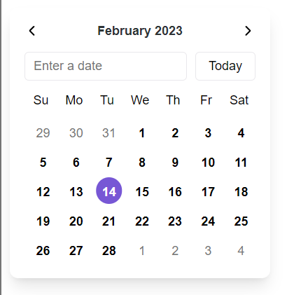
element: Sets where to insert the calendar to. Can be either a CSS selector string or an HTMLElement object.selectedDate: Sets the starting date for the calendar. Can be set to a date string, Date object, or null. If null, todays date will be selected by default. If a string is passed, theformatoption should also be passed in order for the calendar to know the format of theselectedDatethat you are passing.format: Use this to specify the input AND output format of the date. Please see the available formats from DayJS. Example:'DD/MM/YYYY'iconNext: Sets the next arrow icon. You can pass it either text or an svg.iconPrev: Sets the previous arrow icon. You can pass it either text or an svg.inputLabel: Sets the label of the date input element.inputPlaceholder: Sets the placeholder of the date input element.hideInputs: Hides the input and today button from the UI.onChange: Use this to provide a callback function that the calendar will call when the date is changed. The callback function will receive aCustomEventargument that will include the chosen date inside the detail property.new datedreamer.calendar({ ..., onChange: (e) => { // Get Date object from event console.log(e.detail); } })onRender: Use this to provide a callback function that the calendar will call when the calendar is rendered. The callback function will receive aCustomEventargument that will include acalendarproperty inside of the eventdetailproperty.new datedreamer.calendar({ ..., onRender: (e) => { // Calendar has rendered console.log(e.detail.calendar); } })theme: Sets the style template to use. Options areunstyledandlite-purple.unstyled:
lite-purple:
styles: Use this property to pass css styles that will be passed into the components style tag.new datedreamer.calendar({ ..., styles: ` button { color: blue } ` })
Toggle Calendar
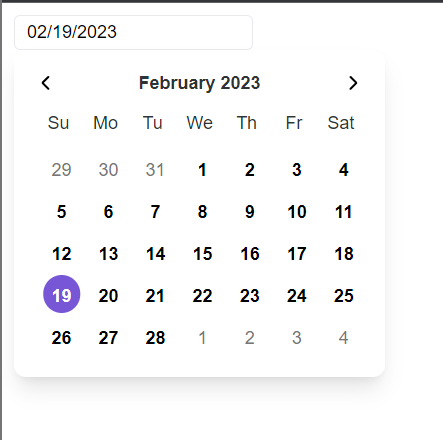
The toggle calendar has the same options as the Standalone Calendar, however the input is a standalone input element which when clicked, triggers the calendar to show.


new datedreamer.calendarToggle({
    ...options
});
Development
Install dependencies using yarn
yarn install
Run development server
yarn start
2 years ago
2 years ago
3 years ago
3 years ago
3 years ago
3 years ago
2 years ago
2 years ago
3 years ago
3 years ago
3 years ago
3 years ago
3 years ago
3 years ago
3 years ago
3 years ago
3 years ago
3 years ago
3 years ago
3 years ago
3 years ago
3 years ago
3 years ago
3 years ago
3 years ago
3 years ago
3 years ago