datetime-picker-vue v0.0.5
fork from vue-ctk-date-time-picker, Due to the fact that
vue-ctk-date-time-pickerhas not been updated for many years, in order to prevent such a good project from being deprecated, we have decided to continue maintaining the project. welcome issue.
DatetimePickerVue
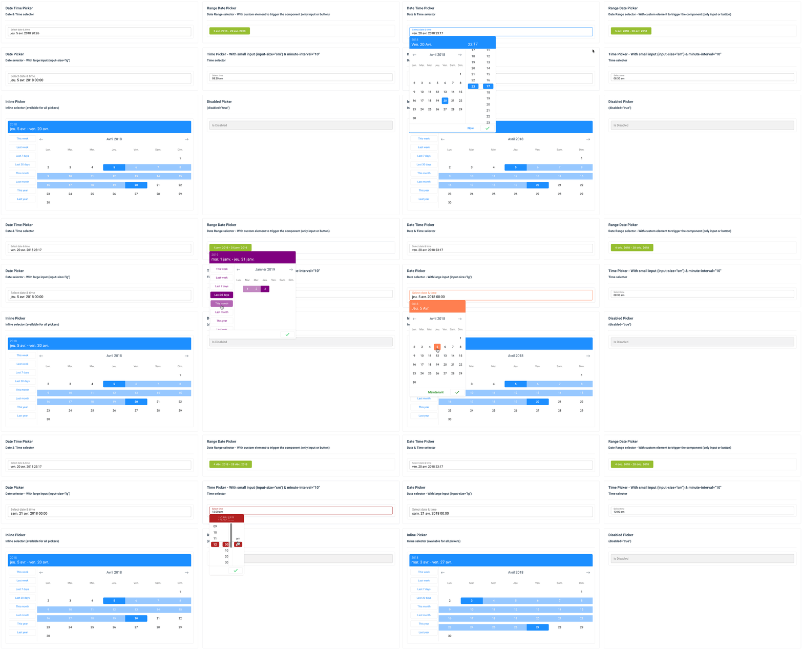
A vue component for select dates (range mode available) & time

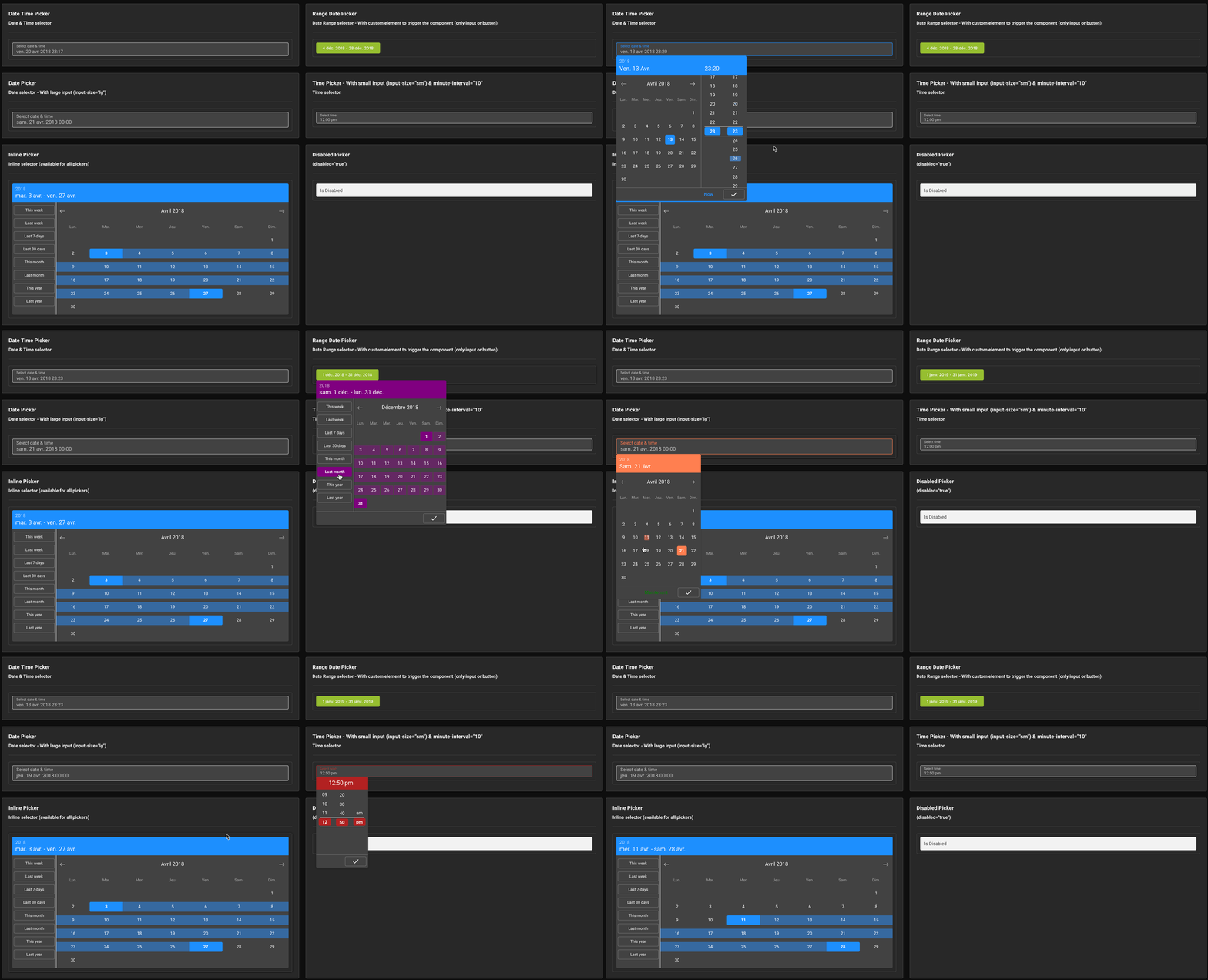
Dark mode

Demo
Installation
Yarn
yarn add datetime-picker-vueNPM
npm i --save datetime-picker-vueUsage
ES6 Modules / CommonJS
import DatetimePickerVue from 'datetime-picker-vue';
import 'datetime-picker-vue/dist/datetime-picker-vue.css';

Vue.component('DatetimePickerVue', DatetimePickerVue);
<DatetimePickerVue v-model="yourValue" />UMD
<link
  rel="stylesheet"
  type="text/css"
  href="${YOUR_PATH}/datetime-picker-vue.css"
/>

<div id="app">
  <DatetimePickerVue v-model="yourValue"></DatetimePickerVue>
</div>

<script src="https://unpkg.com/vue" charset="utf-8"></script>
<script
  src="${YOUR_PATH}/datetime-picker-vue.umd.min.js"
  charset="utf-8"
></script>

<script type="text/javascript">
  Vue.component('datetime-picker-vue', window['datetime-picker-vue']);
  new Vue({
    el: '#app',
    data() {
      return {
        yourValue: null
      };
    }
  });
</script>
Use custom element to trigger the component
<DatetimePickerVue :no-value-to-custom-elem="(true|false)" >
  ...
  <input type="text" />
  ... or
  <button type="button">Label</button>
  ...
</DatetimePickerVue>
Props API
| Props | Type | Required | Default |
|---|---|---|---|
| v-model | String | yes | - |
| format | String | no | 'YYYY-MM-DD hh:mm a' |
| label | String | no | Select date & time |
| hint (1) | String | no | - |
| error (2) | Boolean | no | false |
| color (3) | String (hex) | no | dodgerblue |
| button-color (4) | String (hex) | no | #00C853 |
| position | String | no | null |
| locale (5) | String | no | Browser Locale |
| persistent | Boolean | no | false |
| minute-interval | Integer | no | 1 |
| second-interval | Integer | no | 1 |
| output-format | String | no | null |
| only-time | Boolean | no | false |
| only-date | Boolean | no | false |
| no-label | Boolean | no | false |
| no-header | Boolean | no | false |
| no-value-to-custom-elem (6) | Boolean | no | false |
| min-date (7) | String | no | - |
| max-date (7) | String | no | - |
| no-weekends-days | Boolean | no | false |
| auto-close | Boolean | no | false |
| inline | Boolean | no | false |
| overlay | Boolean | no | false |
| range | Boolean | no | false |
| dark | Boolean | no | false |
| no-shortcuts | Boolean | no | false |
| no-button | Boolean | no | false |
| input-size | String (sm or lg) | no | null |
| button-now-translation | String | no | 'Now' |
| button-confirm-translation | String | no | '✓' |
| no-button-now | Boolean | no | false |
| first-day-of-week | Int (0 to 7) | no | - |
| disabled-dates (8) | Array<string> | no | [] |
| disabled-hours (9) | Array<string> | no | - |
| shortcut | String | no | - |
| custom-shortcuts (10) | Array<object> | no | - |
| disabled-weekly (11) | Array<integer> | no | [] |
| no-keyboard (12) | Boolean | no | false |
| right (13) | Boolean | no | false |
| noClearButton | Boolean | no | false |
| behaviour | Object | no | See behaviour |
| id (14) | String | no | undefined |
(1) hint : Is a text that replaces the label/placeholder (Ex : Error designation)
(2) error : When is true --> Input border & label are red
(3) color: Replace color for the hint, the borders & picker color
(4) button-color: Replace color for the buttons on bottom (validation & 'now')
(5) locale : Default value is the locale of the browser - Ex : Set locale="zh_cn" to force to Chinese language
(6) no-value-to-custom-elem : No value will set to your elem
(7) min-date && max-date should be in the same format as property format specified. If format not set - it is set to 'YYYY-MM-DD hh:mm a' by default
(8) Disabled-Dates is an Array of dates in 'YYYY-MM-DD' format (ex: ['2018-04-03', '2018-04-07', '2018-04-09'])
(9) disabled-hours : Must be an Array of hours in 24h format ('00' to '23') : ['00','01','02','03','04','05','06','07','19','20','21','22','23']
(10) custom-shortcuts - It's an array of objects. Each object represents a single shortcut.
[
  { key: 'thisWeek', label: 'This week', value: 'isoWeek' },
  { key: 'lastWeek', label: 'Last week', value: '-isoWeek' },
  { key: 'last7Days', label: 'Last 7 days', value: 7 },
  { key: 'last30Days', label: 'Last 30 days', value: 30 },
  { key: 'thisMonth', label: 'This month', value: 'month' },
  { key: 'lastMonth', label: 'Last month', value: '-month' },
  { key: 'thisYear', label: 'This year', value: 'year' },
  { key: 'lastYear', label: 'Last year', value: '-year' }
];
Shortcut types allowed are : ['day', '-day', 'isoWeek', '-isoWeek', 'quarter', 'month', '-month', 'year', '-year', 'week', '-week']
For each shortcut, a key, label and value must be specified. The key is a unique key for that specific shortcut.
Additional values can be passed as a callback function that will be called whenever the user clicks on the shortcut. The callback receives an object as first argument with the start and end values, with the shortcut object itself.
You can use this feature for translate existing shortcuts.
If the value of shortcut is a number (Integer), this number correspond to number of day (for 5 --> Last 5 days).
If the value of shortcut is a function, we'll use it to generate the start and end values. This function should return an object with the start & end values. Both values must be a moment object. The function is called when the user clicks on the shortcut button.
[
  {
    key: 'customValue',
    label: 'My custom thing',
    value: () => {
      return {
        start: moment(),
        end: moment().add(2, 'days')
      }
    },
    callback: ({ start, end }) => {
      console.log('My shortcut was clicked with values: ', start, end)
    }
  },
];
With the shortcut property, you can specify a shortcut that's selected by default by passing it's key value.
:shortcut="'thisMonth'"(11) disabled-weekly : Days of the week which are disabled every week, in Array format with day index, Sunday as 0 and Saturday as 6: [0,4,6]
(12) no-keyboard : Disable keyboard accessibility & navigation
(13) right : add this attribute to align the picker on right
(14) id : it assigns id such as 'passedstring-input' to input help differentiate between two date-time-picker on same component.
Any additional attribute passed to the component will be automatically be bound to the input component. (eg. if you pass a
typeattribute, the<input>will receive it).
Behaviour
In order to avoid having too many properties in the component, We're adding a behaviour property that is an object including some annex behaviour values.
The default value for this object is:
{
  time: {
    nearestIfDisabled: true;
  }
}
To override those values, pass a new object with the values you want to override:
<datetime-picker-vue
  :behaviour="{
    time: {
      nearestIfDisabled: false
    }
  }"
/>| Behaviour | Description | Type | Default |
|---|---|---|---|
| time.nearestIfDisabled | If true, it will select the nearest available hour in the timepicker, if the current selected hour is disabled. Per example, if the hour is 12 but all the hours have been disabled until 14, then the 14 will be selected by default. Set false to disable this behaviour; the current hour will remain selected even if it has been disabled. The user cannot re-select it. | Boolean | true |
Events API
| Event | Return |
|---|---|
| input | value (formatted with 'format' props) |
| is-shown | Component is shown |
| is-hidden | Component is hidden |
| ok | Click on ok button (so component is closed) |
| destroy | Component is destroy |
Keyboard Accessible
| Key | Action |
|---|---|
| Arrow Right | Next Day |
| Arrow Left | Previous Day |
| Arrow Down | Same day on next week |
| Arrow Up | Same day on previous week |
| Page Down | Same day on previous month |
| Page Up | Same day on next month |
| Enter or Space | Select day |
| Escape | Close component |
Upcoming features (Todo)
- Double Calendar on RangeDatePicker (issue : #33)
- Inputs Text to choose values (issue #30)
- TimePicker seconds support (already release)
Contribute
Setting up development server
Without Docker
Ensure you have Node and npm in your machine. Minimal config is:
- node >= 6.0
- npm >= 3.0
This project is built with
node@12.x.
Install the development dependencies by running:
npm installOnce your dependencies are installed, start the development server with:
npm run serveThis will start the development server available at http://localhost:8080.
Docker
To easily set-up your development environment, you can spin up a container containing the development app. For that, you need Docker with docker-compose in your machine.
Once you've everything running, you can simply run the following command to start the dev server:
docker-compose up -dThis will start the development server inside a container and accessible through http://localhost:8080.
Compiles and hot-reloads for development
npm run serveLinter
npm run lintTests
Work in progress
License
This project is licensed under MIT License
Credit
Open source time proudly sponsored by aShu-guo