dialog4react v1.0.1
dialog4react
Dialog modal for React, that can queue messages.
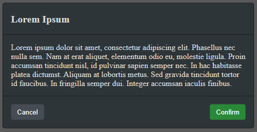
Installation
Using npm:
npm install dialog4react --saveOr using yarn:
yarn add dialog4reactQuick Example
You'll need to render DialogComponent somewhere in your project. You need only one DialogComponent in your entire project. Messages can be queued from anywhere within your project. For example:
import React, { Component } from 'react';
import { DarkDialogComponent as DialogComponent } from 'dialog4react';
import MyCoolWebsite from './MyCoolWebsite';

export default class App extends Component {
    render() {
        return (
            <React.Fragment>
                <MyCoolWebsite />
                <DialogComponent />
            </React.Fragment>
        );
    }
}
import React, { Component } from 'react';
import Dialog from 'dialog4react';
export default class MyCoolWebsite extends Component {
onClickButton = () => {
Dialog.add({
title: 'Lorem Ipsum',
body: 'Lorem ipsum dolor sit amet, consectetur adipiscing elit. Phasellus nec nulla sem.',
showCancel: true
});
};
render() {
return (
<div>
<h1>hello world</h1>
<button onClick={this.onClickButton}>test</button>
</div>
);
}
}Messages
From anywhere within your project you can enqueue as many messages as you need using Dialog.add(message) method. DialogComponent will render them one at a time, until all of them are dismissed. The structure of a message object looks like this:
export type Message = {
    title?: string, // title of the message
    body?: string, // body of the message
    showCancel?: boolean, // should cancel button be visible
    onClickCancel?: CallbackFunction, // executed when cancel button is clicked
    onClickConfirm?: CallbackFunction, // executed when confirm button is clicked
    cancelText?: string, // override text inside cancel button
    confirmText?: string, // override text inside confirm button
};
export type CallbackFunction = (message: Message) => void;
By default DialogComponent will use string Cancel for cancel button and Confirm for confirm button. You can change this per message using cancelText and confirmText fields of message object.
Dialog.add({
    title: "Hello",
    body: "Would you like some tea?",
    showCancel: true,
    cancelText: "No",
    confirmText: "Yes"
});
You can also change those default values globally with props on DialogComponent.
<DialogComponent
    buttonCancelText={"No"}
    buttonConfirmText={"Yes"}
/>
Please note that all fields of a message are optional, therefore you can show messages without title or without body. By default cancel button is not visible, so you need to pass showCancel:true in order to display it. Confirm button is always visible. In theory you could execute Dialog.add({}); to display a modal that contains only Confirm button and no information at all.. but that would be stupid.
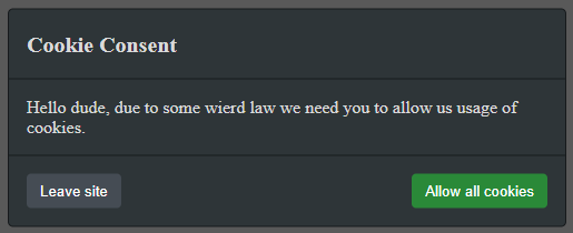
Most important are in my opinion CallbackFunctions. Those are fired based on their corresponding button clicks. Example usage:
Dialog.add({
    title: "Cookie Consent",
    body: "Hello dude, due to some wierd law we need you to allow us usage of cookies.",
    showCancel: true,
    cancelText: "Leave site",
    confirmText: "Allow all cookies",
    onClickCancel: () => {
        window.location = "https://www.google.com/";
    },
    onClickConfirm: () => {
        const setCookie = (name, value, days) => {
            // https://stackoverflow.com/questions/14573223/set-cookie-and-get-cookie-with-javascript
            let expires = "";
            if (days) {
                let date = new Date();
                date.setTime(date.getTime() + (days*24*60*60*1000));
                expires = "; expires=" + date.toUTCString();
            }
            document.cookie = name + "=" + (value || "")  + expires + "; path=/";
        }
        setCookie("cookie-consent", "isn't it ironic to store cookie consent in a cookie", 365);
    }
});
One last thing.. message object is given back to CallbackFunctions in case you need to attach your own data to it. This can be useful if you want to have one big callback function with switch or something like that:
const sharedCallback = (message) => {
    switch(message.myCustomId) {
        default:
            crashWebsite();
            break;
        case 1234:
            crashMySmartFridge();
            break;
        case 5678:
            feedMyCat();
            break;
    }
};
Dialog.add({
    title: "Message 1",
    onClickConfirm: sharedCallback,
    myCustomId: 1234,
});
Dialog.add({
    title: "Message 2",
    onClickConfirm: sharedCallback,
    myCustomId: 5678,
});
Built-in styles
You can use built-in styles by importing different version of DialogComponent.
Dark style:
import { DarkDialogComponent as DialogComponent } from 'dialog4react';
Light style:
import { LightDialogComponent as DialogComponent } from 'dialog4react';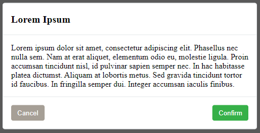
Custom styles
Regular DialogComponent comes with no built-in css. That is perfect for creating your own style.
import { DialogComponent } from 'dialog4react'; HTML structure of DialogComponent looks like this:
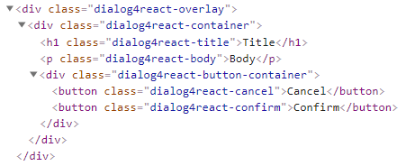
You can change classNames using the following props:
<DialogComponent
    overlayClassName={"dialog4react-overlay"}
    containerClassName={"dialog4react-container"}
    titleClassName={"dialog4react-title"}
    bodyClassName={"dialog4react-body"}
    buttonContainerClassName={"dialog4react-button-container"}
    buttonConfirmClassName={"dialog4react-confirm"}
    buttonCancelClassName={"dialog4react-cancel"}
/>
If you need something to start with, you can copy the following css. It comes from DarkDialogComponent.
.dialog4react-overlay {
    position: absolute;
    top: 0;
    left: 0;
    right: 0;
    bottom: 0;
    background-color: rgba(0,0,0,0.65);
    z-index: 2147483647;
}
.dialog4react-container {
    max-width: 500px;
    min-width: 250px;
    width: fit-content;
    margin: 0 auto;
    position: relative;
    top: 50%;
    transform: translateY(-50%);
    background-color: #2e3538;
    color: #dadada;
    border: 1px solid #171a1c;
    border-radius: 0.3rem;
}
.dialog4react-title {
    margin: 0;
    text-align: left;
    padding: 1rem;
    border-bottom: 1px solid #171a1c;
    font-size: 1.25rem;
    line-height: 1.5;
}
.dialog4react-body {
    padding: 1rem;
    margin: 0;
}
.dialog4react-button-container {
    display: flex;
    align-items: center;
    justify-content: space-between;
    padding: 0.75rem;
    border-top: 1px solid #171a1c;
}
button.dialog4react-confirm, button.dialog4react-cancel {
    border-radius: 0;
    outline: 0;
    border: none;
    cursor: pointer;
    margin: 0.25rem;
    padding: 0.375rem 0.75rem;
    border-radius: 0.25rem;
    transition: background-color 0.2s ease-in-out;
    text-align: center;
    vertical-align: middle;
    line-height: 1.5;
    color: #ffffff;
}
button.dialog4react-confirm:only-child {
    margin-left: auto;
}
button.dialog4react-confirm {
    background-color: #2a8938;
}
button.dialog4react-confirm:hover {
    background-color: #309c40;
}
button.dialog4react-cancel {
    background-color: #454c54;
}
button.dialog4react-cancel:hover {
    background-color: #505962;
}