1.0.7 • Published 11 months ago
duality-comparison-slider v1.0.7
Duality - Comparison Slider Component
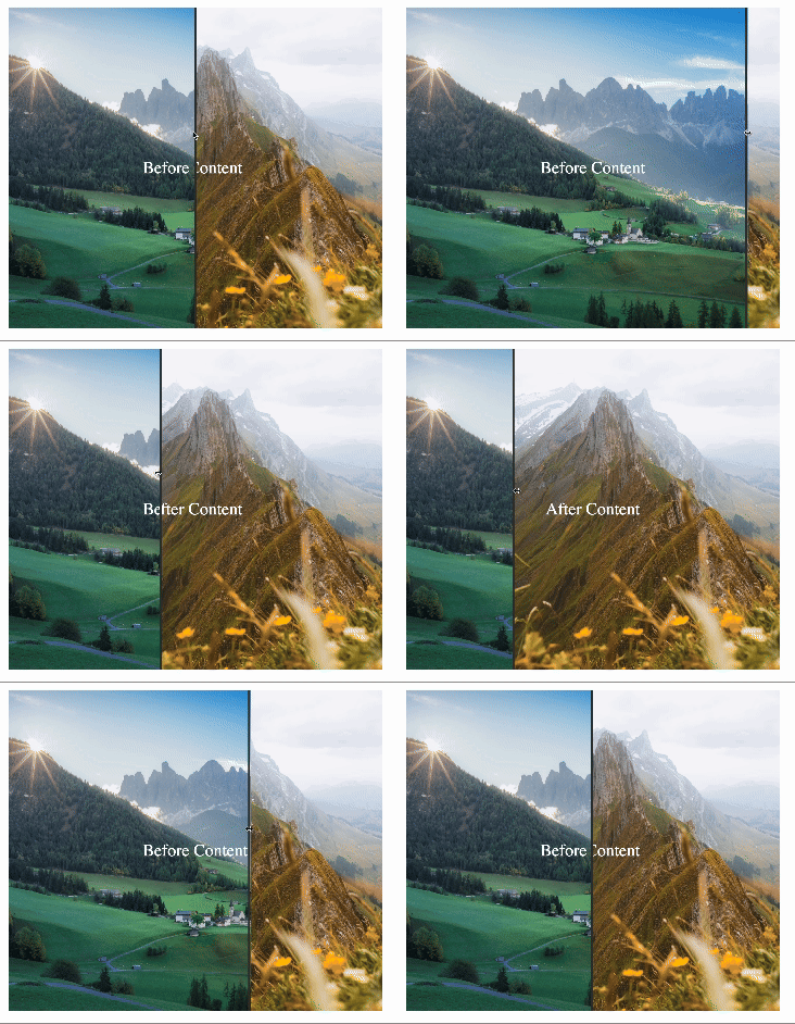
Duality React component that allows users to compare "Before" and "After" content using a smooth, adjustable slider. This component can showcase image transformations, design differences, or any content that benefits from direct comparison.

Installation
npm install duality-comparison-sliderUsage
Import ComparisonSlider and use it to compare two pieces of content with custom dimensions:
import ComparisonSlider from 'duality-comparison-slider'

function App() {
  return (
    <ComparisonSlider
      height={300}
      width={350}
    >
      <ComparisonSlider.Before>
        <div
          style={{
            backgroundImage:
              'url("https://images.unsplash.com/photo-1729366790976-81844c8dd310?q=80&w=3270&auto=format&fit=crop&ixlib=rb-4.0.3&ixid=M3wxMjA3fDB8MHxwaG90by1wYWdlfHx8fGVufDB8fHx8fA%3D%3D")',
            backgroundRepeat: 'no-repeat',
            backgroundSize: 'cover',
            display: 'flex',
            justifyContent: 'center',
            alignItems: 'center',
            color: 'white',
          }}
        >
          Before Content
        </div>
      </ComparisonSlider.Before>
      <ComparisonSlider.After>
        <div
          style={{
            backgroundImage:
              'url("https://images.unsplash.com/photo-1723675747885-84f60ccc4db8?q=80&w=3270&auto=format&fit=crop&ixlib=rb-4.0.3&ixid=M3wxMjA3fDB8MHxwaG90by1wYWdlfHx8fGVufDB8fHx8fA%3D%3D")',
            backgroundRepeat: 'no-repeat',
            backgroundSize: 'cover',
            display: 'flex',
            justifyContent: 'center',
            alignItems: 'center',
            color: 'white',
          }}
        >
          After Content
        </div>
      </ComparisonSlider.After>
    </ComparisonSlider>
  )
}

export default App
Props
| Prop | Type | Default | Description |
|---|---|---|---|
width | number | 500 | Width of the slider container in pixels. |
height | number | 500 | Height of the slider container in pixels. |
Development
To build the component from the source, use:
npm run rollupContributing
Feel free to contribute to Duality by reporting issues, suggesting new features, or submitting pull requests. Contributions are welcome!
License
Licensed under the ISC License.