dynamic-antd-theme v0.8.7

A simple plugin to dynamic change ant-design theme whether less or css.
English | 简体中文
After gzip: 42.7kB
This project was initially targeted at 'ant-design', that means it's used in the React project. However, the core style was also applicable to 'ant-design-vue' || 'ant-design-angular'. In addition, for the convenience of one-key and auto use, the color-picker was also packaged into the project, resulting in too large a volume of the project. Aiming at this problem, I develope a new minor version —— mini-dynamic-antd-theme.
🏠 HomePage
🌍 Browser Support
 |  |  |  |  |
|---|---|---|---|---|
| Chrome 39.0+ ✔ | Edge 12.0+ ✔ | Firefox 30.0+ ✔ | IE 11+ ✔ | Safari 9.1+ ✔ |
📦 Install
npm install dynamic-antd-theme or yarn add dynamic-antd-theme
🔨 Usage
The best usage of the dynamic-antd-theme is in the common compnent (Layout/Header etc...) of your application.
// Layout.js
...
import DynamicAntdTheme from 'dynamic-antd-theme';
...

<div className='theme-container'>
  <span>Change antd theme: </span>
  <DynamicAntdTheme />
</div>
✨ Props
| Props | Type | Default | Description |
|---|---|---|---|
| primaryColor | String | #1890d5 | your antd initial @primary-color |
| storageName | String | custom-antd-primary-color | the name that is saved in the localStorage |
| style | Object | null | you can custom the component style simply |
| placement | String | bottomRight | change the color-picker position, bottom, bottomRight, right, topRight, top, topLeft, left, bottomLeft |
| themeChangeCallback | Func | null | you can do something use themeColor when themeColor changed. |
| customCss | String | '' | you can define custom css effect any element. |
How to use the primaryColors in customCss?
You can do this using the following four variables(just like scss):
- $primary-color
- $primary-hover-color
- $primary-active-color
- $primary-shadow-color
const customCss = `
  .ant-btn {
    font-family: fantasy;
  }
  .custom-title {
    color: $primary-color;
  }
  .custom-title:hover {
    color: $primary-hover-color;
    cursor: pointer;
  }
  #custom-id {
    color: $primary-shadow-color;
  }
`;
🌞 Export
| export | Description |
|---|---|
| default | The component |
| changeAntdTheme | param: (color, options), change the antd theme. The options specific attributes are as follows: - storageName: This can be configured to set storageName when not using picker . - customCss: custom Css |
🌰 More Example
Basic Use
<DynamicAntdTheme primaryColor='#77dd66' />

<DynamicAntdTheme storageName='my-custom-define-color' />

<DynamicAntdTheme style={{ display: 'margin: 10px' }} />

function themeChangeCallback (color) {
  document.getElementById('my-header-bar').style.backgroundColor = color;
}

<DynamicAntdTheme themeChangeCallback={this.themeChangeCallback} />
Define Custom CSS
// define custom css
const customCss = `
  .ant-btn {
    font-family: fantasy;
  }
  .custom-title {
    color: $primary-color;
  }
  .custom-title:hover {
    color: $primary-hover-color;
    cursor: pointer;
  }
  #custom-id {
    color: $primary-shadow-color;
  }
`;

<DynamicAntdTheme
  customCss={customCss}
/>
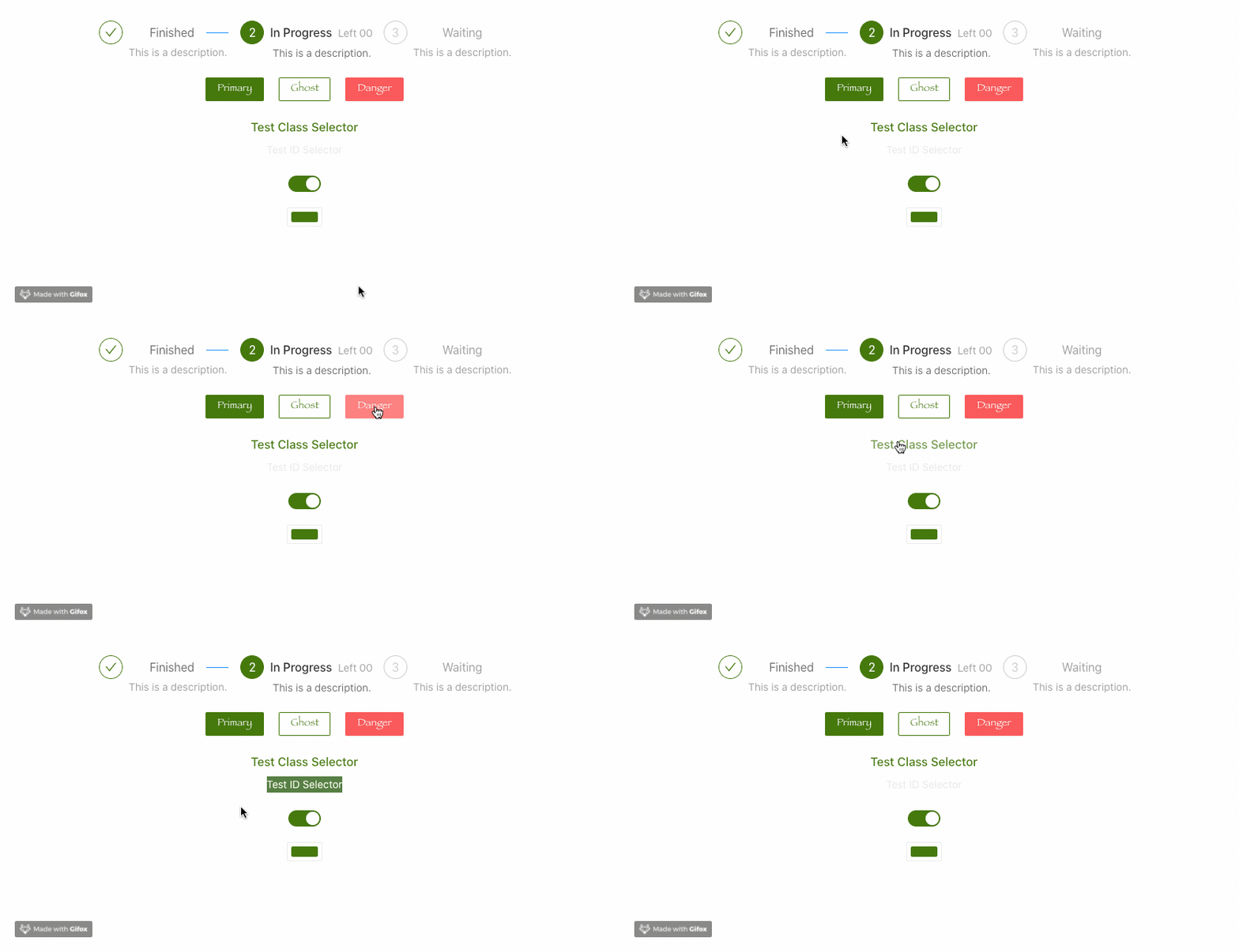
The effects as flow:

No Color-Picker
If u don't need the
color-picker,mini-dynamic-antd-theme is more suitable for you.
import { generateThemeColor, changeAntdTheme } from 'dynamic-antd-theme';
...

<Button
  onClick={
    () => {
      const color = 'blue';
      changeAntdTheme(color);
    }
  }
>Change Theme</Button>
⚠️ Attention
This solution is easy to use, so it is prone to problems. We hope you can give us timely feedback. For example, if there is a problem with any component, we will fix the updated version as soon as possible.
The current version requires your antd version to be lower than v3.19.0
The antd version is higher than v3.19.0 you can also use it, if have some problems remember give me an issue.
- ...Plugin versions are updated from time to time based on antd (new antd components are updated)
🔗 Changelogs
🍎 Follow-Up Plan
- More custom type:
border-color,border-radius, etc.
If you're interested in this repository, Fork/PR/Issue all are welcome.
4 years ago
4 years ago
5 years ago
5 years ago
5 years ago
5 years ago
5 years ago
5 years ago
5 years ago
5 years ago
5 years ago
5 years ago
5 years ago
5 years ago
5 years ago
5 years ago
6 years ago
6 years ago
6 years ago
6 years ago
6 years ago
6 years ago
6 years ago
6 years ago
6 years ago
6 years ago
6 years ago
7 years ago
7 years ago
7 years ago
7 years ago
7 years ago
7 years ago
7 years ago
7 years ago
7 years ago
7 years ago
7 years ago
7 years ago
7 years ago
7 years ago
7 years ago
7 years ago
7 years ago
7 years ago
7 years ago
7 years ago
7 years ago
7 years ago
