Editor-Creator


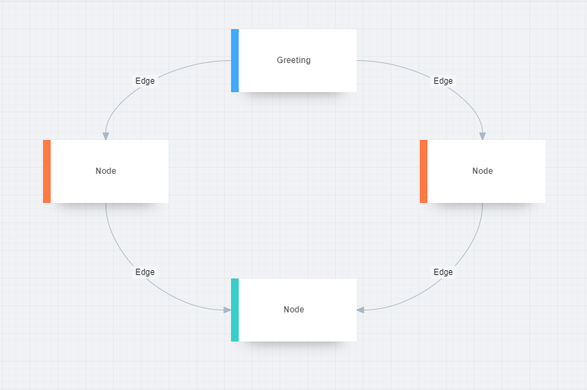
Editor-Creator is a visual graph editor based on G6 and React. It's a tool that provides a visual interface for creating and editing graphs. It can be used for various applications where graph visualization and manipulation is required.

Installation
$ npm install editor-creator --save
Usage
import React from 'react';
import Editor, { Flow } from 'editor-creator';

const data = {
  nodes: [
    {
      id: '0',
      label: 'Node 1',
      x: 10,
      y: 10,
    },
    {
      id: '1',
      label: 'Node 2',
      x: 20,
      y: 250,
    },
  ],
  edges: [
    {
      label: 'Label',
      source: '0',
      target: '1',
    },
  ],
};

const FlowEditor = () => {
  return (
    <Editor className="editor">
      <Flow
        data={data}
        graphConfig={{
          renderer: 'canvas',
          defaultNode: {
            shape: 'node',
          },
          defaultEdge: {
            shape: 'flowEdge',
          },
          minZoom: 0.1,
          maxZoom: 2,
        }}
        className="editor-flow"
      />
    </Editor>
  );
};

export default FlowEditor;
API
Editor
| Prop | Type | Description |
|---|
style | React.CSSProperties | This prop is used to apply CSS styles to the component. |
children | ReactElement[] | React elements that are going to be rendered inside the component. |
className | string | CSS class name for the component. |
onBeforeExecuteCommand (EditorEvent) | (e: CommandEvent) => void | Event handler for before a command is executed. |
onAfterExecuteCommand (EditorEvent) | (e: CommandEvent) => void | Event handler for after a command has been executed. |
Flow
| Prop | Type | Description |
|---|
style | React.CSSProperties | This prop is used to apply CSS styles to the component. |
className | string | CSS class name for the component. |
data | FlowData | Data required for the flow. |
graphConfig | Partial<GraphOptions> | Configuration options for the graph. |
customBehaviors | object | Custom behaviors to be registered on the graph. |
customModes | (mode: string, behaviors) => object | Function to customize the modes of the graph. |
GraphReactEventProps | Partial<GraphReactEventProps> | Props related to the GraphReact events. |
EditorContext
For EditorContextProps:
| Property | Type | Description |
|---|
graph | Graph | null | The graph object, which is either an instance of Graph or null. |
executeCommand | (name: string, params?: object) => void | A function that executes a command with a given name and optional parameters. |
commandManager | CommandManager | An instance of CommandManager which manages the execution of commands. |
For EditorPrivateContextProps:
| Property | Type | Description |
|---|
setGraph | (graph: Graph) => void | A function that sets the graph. |
commandManager | CommandManager | An instance of CommandManager which manages the execution of commands. |
Graph
| Prop | Description |
|---|
style | Optional. CSS properties to apply to the container div of the GraphComponent. |
className | Optional. Class name(s) to apply to the container div of the GraphComponent. |
containerId | Required. ID to apply to the container div of the GraphComponent. This is also used to get the dimensions for the graph. |
data | Required. Data that represents the nodes and edges of the graph. |
parseData | Required. Function that preprocesses the data before it's passed to the graph. |
initGraph | Required. Function that initializes and returns the graph. |
setRef | Required. Function that receives a ref to the container div. This ref can be used to manipulate the DOM node directly. |
GraphReactEventProps | Optional. Props corresponding to graph events. If a function is passed for any of these props, it will be called when the corresponding event is fired on the graph. |
Command
| Prop | Description |
|---|
name | Required. The name of the command that this component will execute when clicked. |
className | Optional. Class name(s) to apply to the Command component. Default is "command". |
disabledClassName | Optional. Class name(s) to apply to the Command component when it is disabled. Default is "command-disabled". |
ItemPanel
| Prop | Description |
|---|
style | Optional. This prop is used to apply CSS styles to the component. |
className | Optional. CSS class name for the component. |
Item
| Prop | Description |
|---|
style | Optional. CSS Properties to apply to the Item component. |
className | Optional. Class name(s) to apply to the Item component. |
type | Optional. The type of the item, either a node or edge. Default is ItemType.Node. |
model | Required. The data model for the node. |
children | Optional. ReactNode(s) to render as children of this component. This can be used to customize the content of the item component. |
Plugins
Minimap
| Field | Description |
|---|
viewportClassName | Optional. The class name of the viewport. |
type | Optional. The type of the minimap, can be 'default', 'keyShape', or 'delegate'. |
size | Optional. An array of two numbers to represent the width and height of the minimap respectively. |
delegateStyle | Optional. The style of the delegate shape. |
drawEdges | Optional. A boolean value to determine if the edges should be drawn. |
refresh | Optional. A boolean value to determine if the minimap should refresh. |
padding | Optional. The padding around the viewport. |
PluginBaseConfig | Base configuration for all G6 plugins. |
Usage
import React from 'react';
import Editor, { Flow, Minimap } from 'editor-creator';

const FlowEditor = () => {
  return (
    <Editor className="editor">
      <Flow
        data={data}
        ref={component => {
          if (component) {
            const { graph } = component;
            if (graph && graph.cfg.plugins.length === 0) {
              const minimap = new Minimap({
                size: [230, 120],
                delegateStyle: {
                  fill: '#1890ff40',
                  stroke: '#1890ff40',
                },
                drawEdges: false,
              });

              graph.addPlugin(minimap);

              minimap.updateCanvas();
            }
          }
        }}
        className="editor-flow"
      />
    </Editor>
  );
};

export default FlowEditor;
Grid
Usage
import React from 'react';
import Editor, { Flow, Grid } from 'editor-creator';

const FlowEditor = () => {
  return (
    <Editor className="editor">
      <Flow
        data={data}
        ref={component => {
          if (component) {
            const { graph } = component;
            if (graph && graph.cfg.plugins.length === 0) {
              const grid = new Grid(graph);
              graph.addPlugin(grid);
            }
          }
        }}
        className="editor-flow"
      />
    </Editor>
  );
};

export default FlowEditor;
EditableLabel
Usage
import React from 'react';
import Editor, { Flow, EditableLabel } from 'editor-creator';

const FlowEditor = () => {
  return (
    <Editor className="editor">
      <EditableLabel />
      <Flow data={data} className="editor-flow" />
    </Editor>
  );
};

export default FlowEditor;
Examples
Feel free to experiment with editor-creator directly in your browser to assess its suitability for your project requirements:
Basic Example
The following example shows how to use simple Flow component from the library in your React application.

Advanced Example
The following example shows you a React component that serves as a graphical user interface for managing flows of nodes and edges. This component provides utilities for managing nodes and edges, such as undoing and redoing actions, copying, pasting, removing, and zooming in and out. It also features an interactive minimap and a grid layout for ease of navigation and a context menu for quick access to commands.


