edtimepicker v1.0.9
EDTimePicker
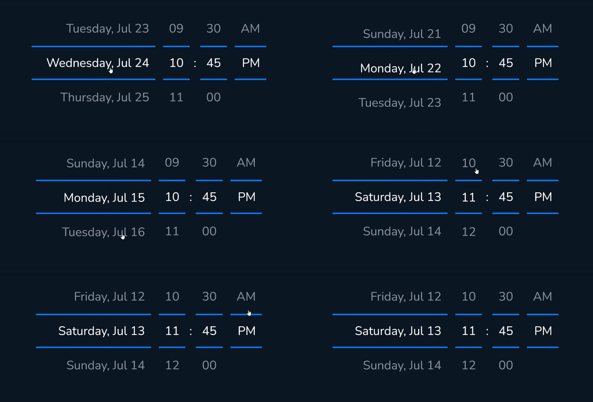
EDTimePicker is a responsive, mobile-friendly date and time picker component for React applications.
Features
- Responsive design for mobile and desktop
- Easy integration with React projects
- Customizable options for date and time selection
Demo

Installation
You can install EDTimePicker via npm:
npm install edtimepickerUsage
Here's a basic example of how to use the EDTimePicker component in your React application:
import React from 'react';
import EDTimePicker from 'edtimepicker';


function App() {
   const [date, setDate] = useState("03-10-2019 23:00");

   function onTimeChanged(newDate){
      // ... do something
   }
   return (
      <div className="App">
         <h1>Example Usage of EDTimePicker</h1>
         <EDTimePicker
            currentDate = {date} // set Date and Time. #default: new Date();
            options = {{
               borderColor: "#ff0000",
               daysNameFormat: "DDDD, MMM DD",
               timeFormat: "hh:mm A" // or "HH:mm" for 24 hour format
               //.... and more
            }}
            onDateChange = {onTimeChanged}
         />
      </div>
   );
}

export default App;
Options and Defaults
EDTimePicker provides several customizable options, allowing you to tailor its functionality to your needs. Below are the available options and their default values:
Detailed Options
minutesStep: Defines the step interval for minutes selection.- Default:
15
- Default:
viewItems: Number of items visible in the picker wheel.- Default:
3
- Default:
itemHeight: Height of each item in the picker wheel.- Default:
40
- Default:
daysNameWheel: Whether to show days names in a wheel format.- Default:
true
- Default:
daysNameFormat: Format for displaying the day names.- Default:
"DDDD, MMM DD" DDDD- full day name. exp:SundayDDD- short day name. exp:SunDD- day of month with 0. exp:03 or 24D- day of month without 0. exp:3 or 24MMMM- full month name. exp:AugustMMM- short month name. exp:AugMM- month number with 0. exp:08M- month number without 0. exp:8YYYY- Full Year. exp:2029YY- las 2 digit of Year. exp:29HH- Hour with 0 in 24 hour format. exp:08 or 19H- Hour without 0 in 24 hour format. exp:8 or 19hh- Hour with 0 in 12 hour format. exp:08 AM or 07 PMh- Hour without 0 in 12 hour format. exp:8 AM or 7 PMmm- minutes with 0. exp:09 or 22m- minutes without 0. exp:9 or 22
- Default:
timeFormat: Format for displaying the time.- Default:
"hh:mm A"
- Default:
dateWheelsFormat: Format for displaying the date wheels.- Default:
"MMMM|DD|YYYY"
- Default:
showTime: Determines whether the time picker is visible.- Default:
true
- Default:
showDate: Determines whether the date picker is visible.- Default:
true
- Default:
borderColor: Color of the picker border.- Default:
"#2867f9"
- Default:
addClass: Additional CSS class for customization.- Default:
""
- Default:
textAlign: Alignment of the text in the picker.- Default:
"left"
- Default:
Methods
onDateChange: Callback function triggered on date change. Return new Date();
JQUERY version
To get Jquery version please Visit our website
Contributing
We welcome contributions to improve EDTimePicker! If you'd like to contribute, please fork the repository and submit a pull request.
License
EDTimePicker is licensed under the MIT License. See the LICENSE file for more details.