elise-graphics v1.0.8
Elise Graphics Library
Introduction
Elise provides a retained mode graphics API based on the HTML5 canvas element.
Elise provides a set of graphics primitives for representing 2D graphical content. Elements are grouped into model objects that serve as their container and provide a repository for additional resources required for their display. Some elements are stroked and must have a stroke color and optionally width specified to be visible when rendered. Some elements are fillable and may be filled with solid colors, color gradients, images, or other models. Models may be added as elements to other models to allow composition of highly complex models from simpler elements.
Features
- Rich set of 2D drawing primitives including line, rectangle, ellipse, polyline, polygon, path, image, text, and sprites.
- Shared resource library for indirect referenced to bitmap, model, and text resources with support for localization.
- Support for element interactivity and animation.
- Support for sprite and image transitions.
- Design surface and component library for interactive model creation and editing.
- Higher level surface library for creation of graphical applications with integration of video and other HTML content.
- Sketcher class to gradually draw and fill complex polygonal models for visual effect.
Installation
Elise is provided as a CommonJS structured JavaScript library with TypeScript type definitions and as a packed UMD module with a global name of elise.
Install using NPM
npm i elise-graphics
CommonJS Use (e.g. Browserify, Webpack, RequireJS)
If utilizing one of the popular JavaScript packaging tools available that support CommonJS, the Elise can be imported with a require statement after installation.
var elise = require('elise-graphics');Browser Use (UMD bundle)
Alternatively, one of the bundled UMB scripts can be included in an HTML script tag to import Elise into the global JavaScript namespace using the name elise. If the script is included immediately prior to the closing body tag, then the preceeding DOM elements will be available for scripting.
The packed UMD modules are located in the node_modules/elise-graphics/_bundles folder after installing using NPM.
- elise-graphics.js - Expanded with code documentation
- elise-graphics-min.js - Minimized without documentation
The appropriate script may be copied to an application folder used for third part scripts or referenced directly from its location in the node_modules folder.
If using Express, an alias to the node_modules folder can be created:
    // Allow front-end access to node_modules/elise-graphics folder
    app.use('/elise', express.static(`${__dirname}/node_modules/elise-graphics`));
The snippet below assumes the 'elise/' path is mapped to the node_modules/elise-graphics folder using this method.
    <!DOCTYPE html>
    <body>
        <!-- Elise Host Element -->
        <div id="elise-host"></div>

        <!-- JS Library Dependencies -->
        <script src="elise/_bundles/elise-graphics.js"></script>
    </body>

    </html>
Simple Example
Given a host div with an id of 'elise-host' as shown in the HTML example above, an Elise model can be created, populated with elements and bound to the designated element.
    var hostDiv = document.getElementById('elise-host');
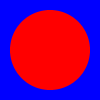
    var model = elise.Model.create(100, 100).setFill('Blue');
    var rect = elise.EllipseElement.create(50, 50, 40, 40).setFill('Red');
    model.add(rect);
    elise.view(hostDiv, model);
The example above does the following:
- Creates a model with a width and height of 100 units.
- Sets the fill (background) color of the model to blue.
- Create an ellipse element with a center point of 50,50 and with horizontal and vertical radii of 40 units.
- Sets the fill color of the ellipse element to red.
- Adds the ellipse element to the model.
- Binds the model to the host div element to be rendered in the browser.
Result

Example Projects
Core Elements and Concepts
Graphics primitives include:
- Line - Stroked line segment
- Rectangle - Stroked and filled rectangle
- Ellipse - Stroked and filled ellipse
- Polyline - Stroked, multiple segment line
- Polygon - Stroked and filled multiple line segment shape
- Path - Stroked and filled shaped defined by line and curve segments
- Image - Bitmap image
- Text - Stroked and filled text
- Sprite - Bitmap image segment
- Model - Collection of composed elements
Strokes
Stroked elements require a stroke property to define the color and width of the stroke used to render them. Strokes may be defined using either one of the named colors or a hex style color and may optionally specify a width other than the default of one drawing unit.
Fills
Fillable elements may be filled with:
- Solid Color - Solid color with optional alpha transparency
- Gradient - Gradual color swath with arbitrary number of color stops
- Linear Gradient - Linear gradient
- Radial Gradient - Radial gradient
- Image - Tiled bitmap fill with configurable fill scale and opacity.
- Model - Tiled fill of external or embedded drawing model with configurable fill scale and opacity.
Transforms
Elements may have affine transforms assigned to alter their visual representation
- Translate - Translate (reposition) element
- Scale - Scale (resize) element
- Rotate - Rotate element
- Skew - Skew element horizontally or vertically
- Matrix - Combination of transforms specified in matrix form
Colors
Colors are specified with a text string using one of the following forms:
- Named Color - One of the known named colors (e.g. Red, Blue, Yellow)
- #rrggbb - Six digit hexadecimal RGB form with # prefix
- #aarrggbb - Eight digit hexadecimal ARGB form with # prefix