ember-adminlte-components v0.2.2
ember-adminlte-components
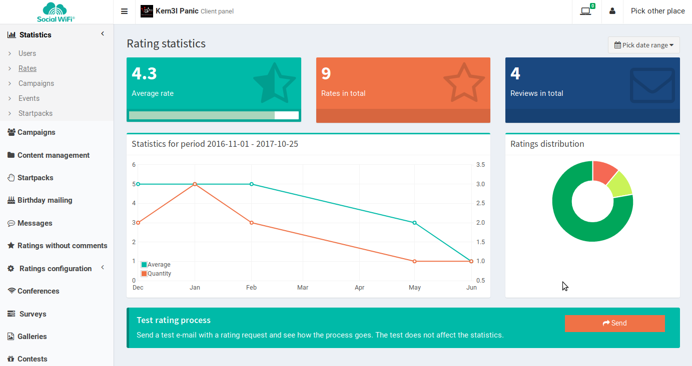
A set of components and AdminLTE dependencies for Ember projects.
This package helps using AdminLTE in Ember projects:
- Pulls AdminLTE and it dependencies from npm (bower not needed)
- Exposes a set of components with overall page design and blocks
The project is in an early stage of development after being extracted from our internal Ember applications using AdminLTE.
Usage
Add the package to your package.json and install it (you can use yarn too).
Right now due to how AdminLTE initialises it JavaScript it's assumed you use
AdminLTE starting from the main route.
The base template for application.hbs looks like so:
<div class="wrapper">
  <header class="main-header">
    <div class="logo">
      <span class="logo-mini"><b>Short</b>Title</span>
      <span class="logo-lg"><b>Longer</b>Title</span>
    </div>
    <nav class="navbar navbar-static-top" role="navigation">
      <a role="button" data-toggle="offcanvas" class="sidebar-toggle" href="#">
        <span class="sr-only">Toggle Navigation</span>
      </a>
      <div class="navbar-custom-menu">
        <ul class="nav navbar-nav">
          USER MENU can go here
        </ul>
      </div>
    </nav>
  </header>
  <aside class="main-sidebar">
    <section class="sidebar">
      MAIN MENU goes here
    </section>
  </aside>
  <div class="content-wrapper">
    {{outlet}}
  </div>
With that you should get the layout of AdminLTE. Routes will render in the main
content-wrapper section and you can link them in the left side menu.

Components
- https://github.com/socialwifi/ember-adminlte-components/tree/master/app/templates/components/lte/
- https://github.com/socialwifi/ember-adminlte-components/tree/master/app/components/lte/
- lte/add-box: html box that can be used as a form box
- lte/color-box: small single-colored box with and icon and some content
{{#lte.color-box classNames='bg-orange' value=model.somevalue label="Some Value" icon='star-o' loading=loading}}
<span class="small-box-footer">
</span>
{{/lte.color-box}}- lte/content-body, lte/content-header: simple wrappers for HTML structure of the content-wrapper section. lte/table-box - wraps a table in AdminLTE box (with some CRUD support).
{{#lte.content-header}}The Header{{/lte.content-header}}

{{#lte.content-body}}
  {{#lte.table-box icon="hand-paper-o" title="Something" loading=loading}}
    <div class="box-body table-responsive no-padding">
      <table class="table table-hover">
        <thead>
        <tr>
          <th>Foo</th>
          <th>Bar</th>
        </tr>
        </thead>
        <tbody>
        {{#each model as |something|}}
          <tr>
            <td>{{something.x}}</td>
            <td>{{something.y}}</td>
          </tr>
        {{/each}}
        </tbody>
      </table>
    </div>
  {{/lte.table-box}}
{{/lte.content-body}}- lte/help-tooltip: Displays a tooltip with some text:
{{lte.help-tooltip message="Some text"}}- lte/loading-wrapper: Display spinner during loading state, else - wrapper content. Requires *-loading route to be present and configured (see loading state support described below).
- lte/null-boolean-label: Display yes/no/maybe label based on value. Requires ember-intl.
<td>{{lte/null-boolean-label label=content.isActive}}</td>- lte/progress-bar: AdminLTE progress bar widget:
{{lte/progress-bar progress=someProgressValue active=true reversed=true}}- lte/responsive-column: Generates bootstrap grid column with different values for lg/sm/xs classes:
{{#lte/responsive-column large=3 small=6 xsmall=12}}
   some content
{{/lte/responsive-column}}- lte/status-label: AdminLTE (status) label widget.
{{#lte.status-label}}Some value{{/lte.status-label}}Notifications

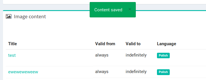
lte/notification-widget is the HTML widget of a floating notification used in AdminLTE. Works together with included notification service to show and fade-out notifications sent from various places of your AdminLTE project in ember.
Add at the start of application.hbs:
<div class="notifications">
  {{#each notifications as |notification|}}
    {{lte/notification-widget notification=notification}}
  {{/each}}
</div>
application controller:
notificationService: Ember.inject.service('notifications'),
notifications: Ember.computed.readOnly('notificationService.notifications'),
somewhere in your code (likely controllers):
this.get('notificationService').success('Some text');
this.get('notificationService').warning('Some text');
this.get('notificationService').error('Some text');
Loading state spinners

Some components as well as lte/loading-wrapper support loading state of Ember routes. Like if you fetch a list of elements that will be displayed in a table - it's good to have loading enabled for smooth transitions and nice loading spinners effect.
If you have an elements.js route then to add loading support add elements-loading.js route file:
import LoadingRoute from '../common/routes/loading-route';

export default LoadingRoute.extend({
  loadedRouteName: 'elements',
});
Wrap the part of your elements.hbs template that uses route model data in the loading-wrapper component
{{#lte/loading-wrapper loading=loading}}

{{/lte/loading-wrapper}}
In elements controller add:
loading: falseThis will use the route template while loading it allow to re-use the HTML code and adding loading spinner icon on top of it.
Depending of needs you can skip the lte/loading-wrapper and use the loading variable directly:
{{#if loading}}
    <div class="loading-wrapper">
      {{fa-icon "refresh" spin=true size="3"}}
    </div>
{{else}}
    somthing
{{/if}}
Future features
Components, controllers and shared code for CRUD operations (with ember-intl, ember-cp-validations and others).