fa-diagrams v1.0.3
fa-diagrams
SVG diagrams built from Font-Awesome icons

Web Editor
Summary
Usage
Node module
const faDiagrams = require('fa-diagrams');

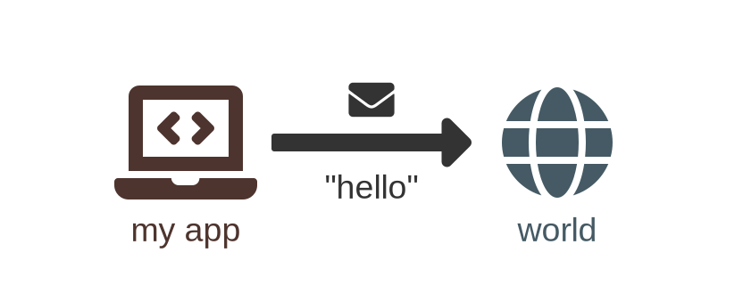
// data: example1
const data = {
  "nodes": [
    {
      "name": "node1",
      "icon": "laptop-code",
      "color": "#4E342E",
      "bottom": "my app"
    },
    {
      "name": "node2",
      "icon": "globe",
      "color": "#455A64",
      "bottom": "world"
    }
  ],
  "links": [
    {
      "from": "node1",
      "to": "node2",
      "color": "#333333",
      "top": {
        "icon": "envelope"
      },
      "bottom": "\"hello\""
    }
  ]
}

const svg = faDiagrams.compute(data); // string containing xml data

//export as SVG with fs
const fs = require('fs');
fs.writeFileSync('diagram.svg', svg, {encoding:'utf-8'});

//export as PNG with svg2img (npm i svg2img)
const svg2img = require('svg2img');
svg2img(svg, function(error, buffer) {
    fs.writeFileSync('diagram.png', buffer);
});
Will produce the diagram above
Html script
<head>
    ...
    <script src="fa-diagrams-data.min.js"></script>
    <script src="fa-diagrams.min.js"></script>
    ...
</head>
<body>
...
<script>
    ...
    const svg = faDiagrams.compute(data); // string containing xml data
    ...
</script>
...
</body>
</html>
Install
Static scripts
Get the scripts from this repository dist folder
<script src="fa-diagrams-data.min.js"></script> <!-- 1.04 MB -->
<script src="fa-diagrams.min.js"></script> <!-- 110.40 KB -->
CDN
<script src="https://cdn.jsdelivr.net/npm/fa-diagrams@latest/dist/fa-diagrams-data.min.js"></script>
<script src="https://cdn.jsdelivr.net/npm/fa-diagrams@latest/dist/fa-diagrams.min.js"></script>
or
<script src="https://unpkg.com/fa-diagrams/dist/fa-diagrams-data.min.js"></script>
<script src="https://unpkg.com/fa-diagrams/dist/fa-diagrams.min.js"></script>
NPM
npm install fa-diagramsBuild from sources
You will need subversion installed (used for precise folder fetching in GitHub)
git clone https://github.com/klemek/fa-diagrams.git
cd fa-diagrams
npm install
node build.sh
API
You must pass as argument an object containing 3 keys:
options
Key (.subkey) | Default value | Info | Redefined |
|---|---|---|---|
placing.max-link-length | 3 | maximum stretching of links between nodes | no |
placing.diagonals | true | allow diagonal links to be made | no |
rendering.beautify | false | output a readable SVG file | no |
rendering.scale | 256 | (in pixels) final icons size | no |
rendering.color | black | color of all elements | no |
rendering.h-spacing | 1.3 | how width is stretched comparing to height | no |
rendering.icons.scale | 1 | default scaling of icons | in node |
rendering.icons.color | '' | color of all icons | in node |
rendering.sub-icons.scale | 0.4 | default scaling of sub-icons | in sub-icon |
rendering.sub-icons.color | '' | color of all sub-icons | in sub-icon |
rendering.sub-icons.margin | 0.3 | margin between sub-icons and elements | in sub-icon |
rendering.links.scale | 1 | default scaling of links | in link |
rendering.links.color | '' | color of all links (might be redefined in link definition) | in link |
rendering.links.size | 0 | forced size/length of the links (0 means it will be computed from the distance between the nodes) | in link |
rendering.texts.font | 'Arial' | font family of the texts (might be redefined in sub-elements definition) | in text |
rendering.texts.font-size | 15 | font size of the texts | in sub-text |
rendering.texts.font-style | 'normal' | font style of the texts (see Font styles) | in sub-text |
rendering.texts.color | '' | color of all texts | in sub-text |
rendering.texts.margin | 0.2 | margin between texts and elements | in sub-text |
rendering.texts.line-height | 1.2 | height of each line in font size | in sub-text |
nodes
Array of object as following:
| Key | Type | Required | Info |
|---|---|---|---|
name | string | yes | used in links to reference nodes |
icon | string/object | yes | name of the Font-Awesome icon of the node (see Icon names) |
top, bottom, left, right | string or object | no | see Sub-elements |
color | string | no | redefined the color |
scale | number | no | redefine this node icon scale |
x, y | number | no | force the position of this node |
links
Array of object as following:
| Key | Type | Required | Info |
|---|---|---|---|
from | string | yes | source node name |
to | string | yes | destination node name |
type | string | no | link's appearance (see Link types) |
top, bottom or left, right | string or object | no | left and right are relative of the link's direction, top and bottom relative of the link's angle, see Sub-elements |
color | string | no | redefine the color |
scale | number | no | redefine this link scale |
size | number | no | forced size/length of the link |
Sub-elements
Elements meant to be drawn along-side a node/link.
There are two types: text and icons
Texts
You can just enter a string to be considered a text but you can define a text with more options as following:
| Key | Type | Required | Info |
|---|---|---|---|
text | string | yes | value of your text |
color | string | no | redefine the color |
font | string | no | redefine the font family |
font-size | number | no | redefine the font size |
font-style | string | no | redefine the font style (see Font styles) |
margin | number | no | redefine the margin with the parent element |
line-height | number | no | height of each line in font size |
Icons
You can define a relative icon with the following:
| Key | Type | Required | Info |
|---|---|---|---|
icon | string/object | yes | name of the Font-Awesome icon of the sub-element (see Icon names) |
color | string | no | redefine the color |
scale | number | no | redefine this sub-icon scale |
margin | number | no | redefine the margin with the parent element |
More info
Icon names
Icons are fetched from Font-Awesome free icons.
When you reference an icon, for example circle, it's searched in the solid folder then regular then brands.
If, in this case you want the hollow circle from the regular style, just enter regular circle or circle regular instead.
It's very flexible as you can copy-paste from an HTML page far fa-circle and it will also works.
You can also specify a custom icon by entering the following object instead of a string:
| Key | Type | Required | Info |
|---|---|---|---|
path | string | yes | the SVG path of your icon |
width | string | no | the custom width of the path (if blank, height is taken, then the height of all icons: 512) |
height | string | no | the custom height of the path (if blank, width is taken) |
Link types
Here are the accepted types and their preview :

You can use none to make an invisible link.
Font styles
First, you should use web-safe fonts to be sure your SVG will be rendered correctly
Here are the available styles :
normalbolditalicobliqueunderlinedoverlinedstriked
The style can also be a compound like bold italic.
Thrown errors
Errors can be thrown in these 2 cases :
- Nodes could not be placed based on the constraints:
Failed to place nodes
- A node or a link have an invalid property
Node 'name' is invalid at key ...
Change icons
If you want to change the icons you can edit/build your own resources.json as following:
{
    "name";: "squares",
    "height";: 60, //height of all icons
    "index";: [ // which categories are there and in which order it should be searched
        "solid",
        "hollow"
    ],
    "icons";: {
      "solid";: {
        "square";:{
          "path";:"M10 10v-40h40v40z",
          "width";:60
        }
      },
      "hollow";: {
        "square";:{
          "path";:"M10 10v-40h40v40h-40m10 10v-20h20v20h-20z",
          "width";:60
        }
      }
    }
}
Examples
Example 1 : Hello World

{
  "nodes": [
    {
      "name": "node1",
      "icon": "laptop-code",
      "color": "#4E342E",
      "bottom": "my app"
    },
    {
      "name": "node2",
      "icon": "globe",
      "color": "#455A64",
      "bottom": "world"
    }
  ],
  "links": [
    {
      "from": "node1",
      "to": "node2",
      "color": "#333333",
      "top": {
        "icon": "envelope"
      },
      "bottom": "\"hello\""
    }
  ]
}
nodes:
- name: node1
icon: laptop-code
color: '#4E342E'
bottom: my app
- name: node2
icon: globe
color: '#455A64'
bottom: world
links:
- from: node1
to: node2
color: '#333333'
top:
icon: envelope
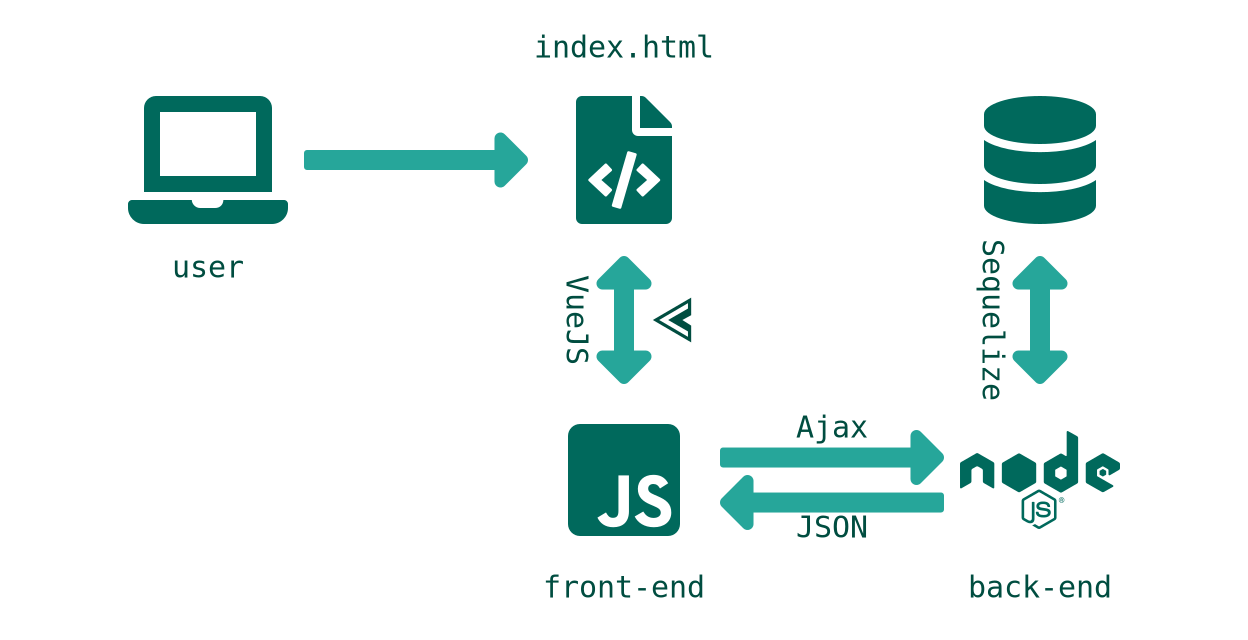
bottom: '"hello"'Example 2 : Web App

{
  "options": {
    "placing": {
      "diagonals": false
    },
    "rendering": {
      "icons": {
        "color": "#00695C"
      },
      "links": {
        "color": "#26A69A"
      },
      "texts": {
        "color": "#004D40",
        "font": "mono",
        "font-size": 12,
        "margin": 0.25
      },
      "sub-icons": {
        "color": "#004D40"
      }
    }
  },
  "nodes": [
    {
      "name": "client",
      "icon": "laptop",
      "bottom": "user"
    },
    {
      "name": "page",
      "icon": "file-code",
      "top": "index.html"
    },
    {
      "name": "js",
      "icon": "js-square",
      "bottom": "front-end"
    },
    {
      "name": "server",
      "icon": "node",
      "bottom": "back-end"
    },
    {
      "name": "db",
      "icon": "database"
    }
  ],
  "links": [
    {
      "from": "client",
      "to": "page"
    },
    {
      "from": "page",
      "to": "js",
      "type": "double",
      "top": {
        "icon": "vuejs"
      },
      "bottom": "VueJS",
      "direction": "down"
    },
    {
      "from": "js",
      "to": "server",
      "type": "split-double",
      "direction": "right",
      "top": {
        "text": "Ajax"
      },
      "bottom": {
        "text": "JSON"
      }
    },
    {
      "from": "db",
      "to": "server",
      "type": "double",
      "bottom": "Sequelize"
    }
  ]
}
options:
placing:
diagonals: false
rendering:
icons:
color: '#00695C'
links:
color: '#26A69A'
texts:
color: '#004D40'
font: mono
font-size: 12
margin: 0.25
sub-icons:
color: '#004D40'
nodes:
- name: client
icon: laptop
bottom: user
- name: page
icon: file-code
top: index.html
- name: js
icon: js-square
bottom: front-end
- name: server
icon: node
bottom: back-end
- name: db
icon: database
links:
- from: client
to: page
- from: page
to: js
type: double
top:
icon: vuejs
bottom: VueJS
direction: down
- from: js
to: server
type: split-double
direction: right
top:
text: Ajax
bottom:
text: JSON
- from: db
to: server
type: double
bottom: Sequelize

