 falconjs-component-flexgrid
12 Column Flex Grid Component for FalconJS
Getting Started
inside your FalconJS App directory
Install the package
npm install --save falconjs-component-flexgridoryard add falcon-js-component-flexgridImport inside your App
    import {Row, Col} from 'falconjs-component-flexgrid'
    import 'falconjs-component-flexgrid/dist/index.css'
Usage
Baseline
In Rows use the gutter property for spacing. In Columns use the span property to define the span of the column on the 12 grid
    <Row gutter={40} >
          <Col span={4}><div>1</div></Col>
          <Col span={4}><div>2</div></Col>
          <Col span={4}><div>3</div></Col>
    </Row>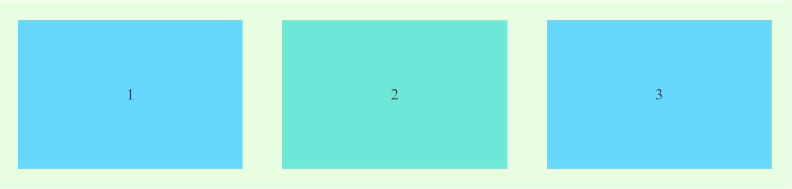
Offset
Offset the position of the column to the right.
   <Row gutter={20}>
          <Col span={4} offset={4}> <div>Span 4 | Offset 4</div></Col>
          <Col span={4}><div>Span 4</div></Col>
   </Row>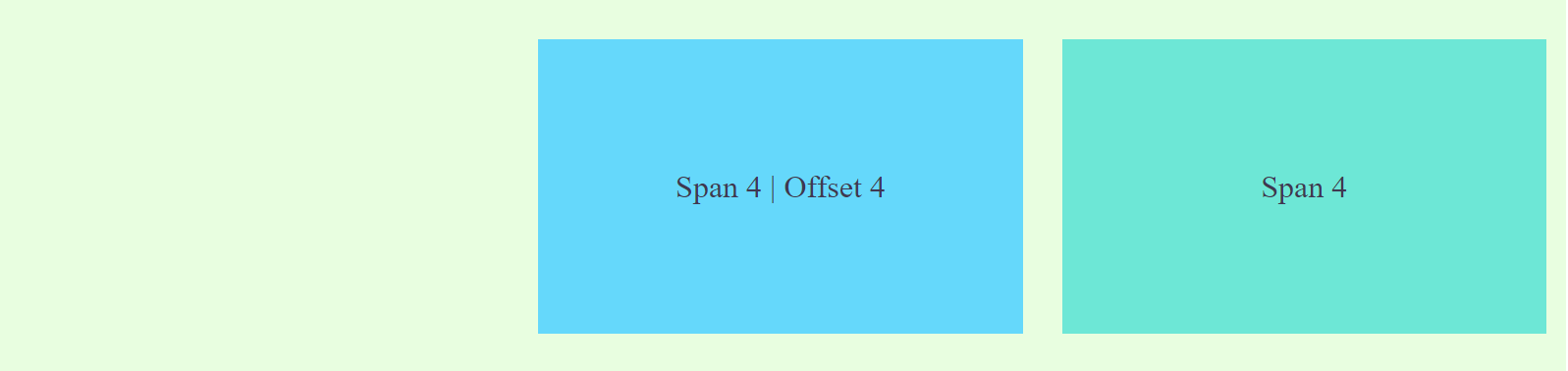
Order
Sort the columns within <Row>
    <Row gutter={20}>
        <Col span={4} order={3}><div>C</div></Col>
        <Col span={4} order={2}><div>B</div></Col>
        <Col span={4} order={1}><div>A</div></Col>
    </Row>
Align and Distribute
justify to distribute the columns inside the row
options: start, center, end, space-between, and space-around
code snippet <Row justify="center">
vertical to vertical align the columnds inside the row
options: top, middle, bottom
code snippet <Row vertical="top">
Flexbox parameters can be passed to Row to align and distribute the columns inside it.
Vertical alignment
        <Row gutter={20} justify="center" vertical="bottom">
          <Col span={4} > <div class="tall">Tall</div></Col>
          <Col span={4} > <div class="medium">Medium</div> </Col>
          <Col span={4} > <div class="short">Short</div></Col>
        </Row>
        <Row gutter={20} justify="center" vertical="middle">
          <Col span={4} > <div class="tall">Tall</div></Col>
          <Col span={4} > <div class="medium">Medium</div> </Col>
          <Col span={4} > <div class="short">Short</div></Col>
</Row> 
        <Row gutter={20} justify="center" vertical="top">
          <Col span={4} > <div class="tall">Tall</div></Col>
          <Col span={4} > <div class="medium">Medium</div> </Col>
          <Col span={4} > <div class="short">Short</div></Col>
</Row> 
Distribute (Justify)
        <Row gutter={20} justify="start">
          <Col span={3} > <div class="tall">Tall</div></Col>
          <Col span={3} > <div class="medium">Medium</div> </Col>
          <Col span={3} > <div class="short">Short</div></Col>
        </Row>
        <Row gutter={20} justify="center">
          <Col span={3} > <div class="tall">Tall</div></Col>
          <Col span={3} > <div class="medium">Medium</div> </Col>
          <Col span={3} > <div class="short">Short</div></Col>
        </Row>
        <Row gutter={20} justify="end">
          <Col span={3} > <div class="tall">Tall</div></Col>
          <Col span={3} > <div class="medium">Medium</div> </Col>
          <Col span={3} > <div class="short">Short</div></Col>
        </Row>
        <Row gutter={20} justify="space-between">
          <Col span={3} > <div class="tall">Tall</div></Col>
          <Col span={3} > <div class="medium">Medium</div> </Col>
          <Col span={3} > <div class="short">Short</div></Col>
        </Row>
        <Row gutter={20} justify="space-around">
          <Col span={3} > <div class="tall">Tall</div></Col>
          <Col span={3} > <div class="medium">Medium</div> </Col>
          <Col span={3} > <div class="short">Short</div></Col>
        </Row>
Responsive
dimension xs, sm, md, lg, xl
        <Row gutter={20} justify="center" vertical="top">
          <Col xs={12} sm={12}  md={4} lg={6} xl={6}><div> xs-12 sm-12 md-4 lg-6 xl-6</div></Col>
          <Col xs={12} sm={12} md ={8} lg={6} xl={6}><div> sm-12 sm-12 md-8 lg-6 xl-6</div></Col>
        </Row>


*note: span and offset can be defined as a property of the query like so md={{ span:4, offset: 4}}
##Component Properties
Row
<Row>
| Property | Description | Type | Default | Options |
|---|---|---|---|---|
| vertical | Vertical alignment of the Columns inside the Row | String | start |
start, middle, botoom |
| gutter | Spacing between columns | Number | 0 | 0 to ... |
| justify | Horizontal distributionon the columns | String | start |
start,end,center, space-around, space-between |
Col
<Col>
| Property | Description | Type | Default | Note |
|---|---|---|---|---|
| span | Number of Cells to be occupied by the Columns | Number | none | setting setting the value to 0 would yield display:none to the Column |
| offset | cell offset from the left of the Column | Number | 0 | |
| order | column number in row | Number | node | This will result to sorting of the Columns inside a particular row |
| xs | <768px and also default setting, could be a span value or a object contain above props | Number or Object | media query | |
| sm | ≥768px, could be a span value or a object contain above props | Number or Object | media query | |
| md | ≥992px, could be a span value or a object contain above props | Number or Object | media query | |
| lg | ≥1200px, could be a span value or a object contain above props | Number or Object | media query | |
| xl | ≥1600px, could be a span value or a object contain above props | Number or Object | media query |
Contributions and request are welcome!
Please Fork and submit PR
Testing
Prerequesite on testing install parcel to install npm i -g parcel-bundler
- Clone this repo
git clone https://github.com/jmdisuanco/falconjs-component-flexgid cd falcon-js-component-flexgridnpm start- the demo will be served on
http://localhost:8000
Base on
This is based on FalconJS flex grid component is based on Abraztsov's ReactSimpleFlexGrid