flexible-auto-complete v1.3.3
Welcome to Flexible Autocomplete!
Have you ever wanted to have a ready to use auto-complete that can easily fit in your components? Have you thought of what it takes to get there? With flexible auto-complete, you can configure an auto-complete to perform task the way you want it.
NOTE: Starting with version 1.1.0 this library is compatible with Angular 6+.
NOTE: Starting with version 1.3.1 you need to import this library through @sedeh/flexible-auto-complete.
Please send your requests or comments through the link provided below:
Live Demo | Source code | Comments/Requests
MODULE:
  FlexibleAutoCompleteModule

EXPORTS:
  FlexibleAutoCompleteComponent
Features
- Responsive
- ADA Compliant
- Configurable
Attributes
| Attribute | status | Description |
|---|---|---|
| icon | Optional | Icon to show on the auto-complete field. |
| message | Optional | Text for screen reader to make each tab ADA compliant. |
| placeholder | Optional | placeholder message on type ahead field. |
| direction | Optional | If hoeizontal, results will be laid out horizontally. Default is "vertical". |
| delayby | Optional | Time in miliseconds to delays making remote requests to capture as many characters as possible for fast type users. |
| triggeron | Optional | Trigger lookup request after specified number of charachters reached. |
| animateonresult | Optional | Expand field and the display result if type ahead result has items. |
| allowdropdown | Optional | Display result in a dropdown fashion or push down other contents. |
| viewport | Optional | View port max size of resulting display area. |
| template | Optional | If provided, will be used to display result according to template layout. |
| source | Required | URL to fetch data from. |
| flexibleId | Optional | ID for the search. Will allow using more than one search in a page. |
| data | Optional | if 'source' URL is not supplied, supplied 'data' will be used to do type ahead lookup. |
| remotepath | Optional | instructs the auto complete to access results through given value. By default, response.body will be used to get the results. If remotepath contains dot, result will be traverse down to its final destination. for example, "body.data" will fetch data from "response.body.data". Default value is "body". |
| prefetchdata | Optional | Will call the remote source URL without additional arguments and saves the result for filtering when user types in charachters. |
| keymap | Optional | List of keys to be used when trying to match up and filter/display data in the response received or in the default data supplied. |
Events
| Event | Description |
|---|---|
| onsearch | Will be fired when search request is performed on a key entered in type ahead field. |
| onselect | Will be fired when an item is selected. |
How it can be done?
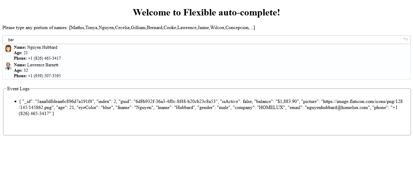
You will need to set the auto-complete in your HTML content:
In this example:
'source' URL will be concatinated with typed charachters. so, if url is http://somethig/keywords, you need to supply 'http://somethig/' or if it is 'http://somethig?param=keyword' you need to supply 'http://somethig?param='. If source URL is supplied, no need to supply data as it will be ignored.


<flexible-auto-complete
  icon="fa fa-search"
  message="find user"
  placeholder="Please enter a name"
  direction="vertical"
  delayby="300"
  triggeron="2"
  animateonresult="true"
  allowdropdown="true"
  viewport="200px"
  [template]="tab2"
  [data]="data"
  [keymap]="['fname','lname']"
  (onsearch)="onsearch($event)"
  (onselect)="onselection($event)"></flexible-auto-complete>

<flexible-auto-complete
  icon="fa fa-search"
  message="find user"
  placeholder="Please enter a name"
  prefetchdata="true"
  source="http://jsonplaceholder.typicode.com/users/"
  remotepath="_body"
  [keymap]="['name']"
  (onselect)="onselection($event)"></flexible-auto-complete>

<ng-template #tab2 let-detail="data">
  <img [src]="detail.picture" width="10px" />
  <span class="info">
      <span><span class="bold">Name:</span> {{detail.fname}} {{detail.lname}}</span>
      <span><span class="bold">Age:</span> {{detail.age}}</span>
      <span><span class="bold">Phone:</span> {{detail.phone}}</span>
    </span>
</ng-template>
You will also need to implement a few functions
  onselection(event) {
    // decide on what to do with the evet
  }
If you want to overide any parts of default look, you can use ::ng-deep and do the following:
CSS Example:

::ng-deep .viewport {
    li {
        display: flex;
        flex-direction: row;

        img {
            border-radius: 50%;
            border: 1px splid red;
            flex: 0 0 2%;
            float: left;
            width: 25px;
            height: 25px;
        }
        .info {
            font-size: 0.9rem;
            display: flex;
            flex-direction: column;
            float: left;
            margin-left: 5px;
            flex: 1;

            .bold {
                font-weight: bold;
            }
        }
    }
}
Version History
| Version | Description |
|---|---|
| 1.3.1 | Updated dependencies. |
| 1.3.0 | It was brought to my attention that some users have trouble using my components in their angular 6 environment. Since I had only updated few dependencies when moved to Angular 6, I am thinking dependencies are causing issues. So, for this release, I am updating all dependencies to what Angular 6 applications are expecting to have. Please let me know if this is fixing or not fixing any issues you are facing. |
| 1.2.0 | Added onsearch event to be triggered when a search request is sent out. Modified key event to select next/previous result on arrow up/down keys. Added allowdropdown and animateonresult attributes to create a dropdown like search result and expand search field width when there is a result. |
| 1.1.0 | Updated libraries to become compatible with Angular 6+. |
| 1.0.1 | Fixed few issues and added attributes to make the auto-fill function better. |
| 1.0.0 | Initial release. |

How to include font-awesome in your project?
In your project root folder, find and open the file 'angular-cli.json' in any editor Locate the styles[] array and add font-awesome references directory. like:
"apps":
	[
        {
            ....
            "styles": [
              "../node_modules/font-awesome/css/font-awesome.css"
              "styles.css"
            ],
            ...
        }
    ]