flexible-preview-box v1.2.1
Welcome to flexible preview box!
Have you ever wanted a preview box that can display anything in different ways on different application flows just by toggling meta-data rules for each flow? Flexible preview box is built with Angular 4+ code and can display images or videos with relative data or action links above or below its view port. links or any content display is controlled and formatted by the meta-data rules you provide. You can write your own formatters and achieve what is needed for a specific situation or use existing formatter from into-pipes library. Flexible preview box can display any data for any purpose. For example: product display, user info display, video teaser display, ..., possibilities are endless.
NOTE: If your project still is angular 2, 4, or 5; please luck-down your reference to 1.1.1 version by removing ^ from the version dependency in your package JSON. Otherwise for Angular 6+, please use 1.1.2 version or higher.
NOTE: Starting with version 1.2.1 you need to import this library through @sedeh/flexible-preview-box.
Please send your requests or comments through the link provided below:
Live Demo | Source code | Comments/Requests
DEPENDENCIES:
	"font-awesome": "^4.7.0",
	"@sedeh/into-pipes": "^2.1.1"
Formatting the preview box display content.
We are using "into-pipes" library. To see available formatting options, please follow what is supported by the library.
Sample Use
<flexible-preview-box
  *ngFor="let preview of myPreviews"
  [item]="preview"
  [viewport]="preview.images"
  [metadata]="presentationKeys"
  [effects]="config"
  (onselect)="onselect($event)"></flexible-preview-box>
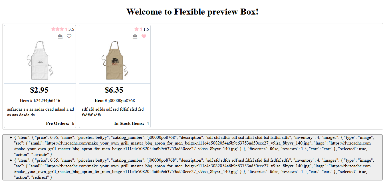
In above example the following could be a possible way of previewing the item presented to the box:
config = {
    zoomOnHover: true,
    hovereffect: true,
    width: "250",
    height: "150"
  }

  presentationKeys = [
    {
      key: 'reviews',
      value: 'Reviews',
      hidelabel: true,
      present: true,
      position: 'above',
      side: 'right',
      format: 'rating'
    },
    {
      key: 'favorites',
      value: 'Favorites',
      hidelabel: true,
      present: true,
      position: 'above',
      sidebyside: true,
      side: 'right',
      format:'favorite'
    },
    {
      key: 'cart',
      value: 'Add to cart',
      present: true,
      hidelabel: true,
      position: 'above',
      sidebyside: true,
      side: 'right',
      format:'cart'
    },
    {
      key: 'price',
      value: 'Price',
      hidelabel: true,
      emphasize: true,
      present: true,
      position: 'below',
      side: 'center',
      format: 'currency'
    },
    {
      key: 'catalog_number',
      value: 'Item #',
      present: true,
      spacing: "10",
      position: 'below',
      side: 'center'
    },
    {
      key: 'description',
      value: 'Description',
      hidelabel: true,
      present: true,
      spacing: "10",
      position: 'below',
      side: 'left'
    },
    {
      key: 'inventory',
      value: 'Remaining Items',
      present: true,
      spacing: "10",
      position: 'below',
      side: 'right',
      format: 'inventory'
    }
  ]
So we need to create three custom formatters "favourite", "cart", and "inventory". favourite custom pipe should display an icon if value is set and toggle it and its value on click and perform saving or removing favourite or fire an event. cart custom pipe should display an icon if value is set and toggle it and its value on click and insert/remove the item in/from a cart or fire an event. inventory custom pipe should display relative information if inventory item is greater or less than zero.
To see how you can create custom formatters, look at into-pipes library.
attributes
| Attribute | Details |
|---|---|
| item | JSON data to be displayed. |
| viewport | Place to display image or video. |
| metadata | Data that controls which item attribute has to be played and in what form. |
| effects | Configuration attributed that controls the box. |
viewport
the value passed to view port can be of the following:
{
  type: string, // video
  src: {
    egg: string, // URL
    mp4: string, // URL,
    webm: string, // URL,
  }
}

OR

{
  type: string, // image
  src: {
    small: string,
    large: string
  }
}
mtadata
| Attribute | Details |
|---|---|
| key | JSON path to the item to be displayed. |
| value | Textual representation of key on the box. |
| present | Display the attribute if present is set or skip. |
| position | Display the attribute above or below the box view port. |
| side | Display the attribute on right, left, or centre of box. |
| emphasize | Display in a large and bold fashion. |
| spacing | Top margin on the displayed row. |
| hidelabel | Do not show the label. |
| format | Format the value using into-pipes library. |
effects
the following are type of effects that control the box
| Attribute | Details |
|---|---|
| zoomOnHover | if view port has two small and large images, displays large image on hover if set. |
| hovereffect | will give a small zoom out effect on hover if set. |
| width | will control the view-port width. |
| height | will control the view-port height. |
Events
You can register to receive the following events:
| Event | Details |
|---|---|
| onselect | '{ "id": "<tag box ID>", "selecedIndex": "<index list of selected items>" }' |
Revision History
| Version | Description |
|---|---|
| 1.2.1 | Updated dependencies. |
| 1.2.0 | It was brought to my attention that some users have trouble using my components in their angular 6 environment. Since I had only updated few dependencies when moved to Angular 6, I am thinking dependencies are causing issues. So, for this release, I am updating all dependencies to what Angular 6 applications are expecting to have. Please let me know if this is fixing or not fixing any issues you are facing. |
| 1.1.2 | Rolling to angular 6+ after fixing the dependency issue. |
| 1.1.1 | Temporary roll-back to angular 5. I forgot to luck-down the dependencies for angular 5 before upgrading to angular 6. this will cause problem if you are still using angular 5. |
| 1.1.0 | Updated libraries to become compatible with Angular 6+. |
| 1.0.0 | Initial release. |
