grids-system-components v0.1.15
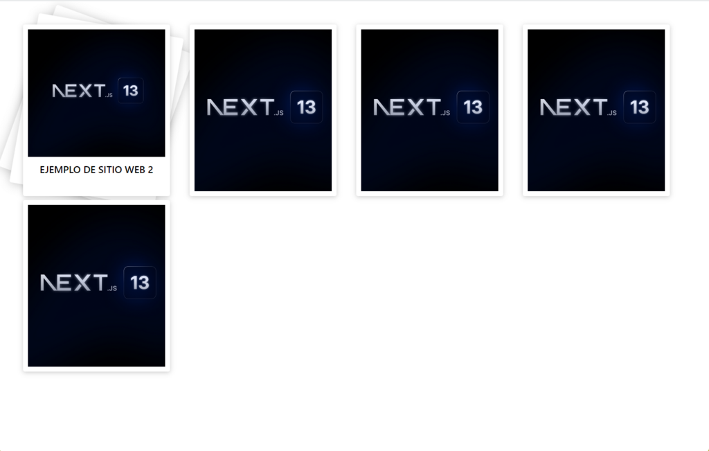
General description
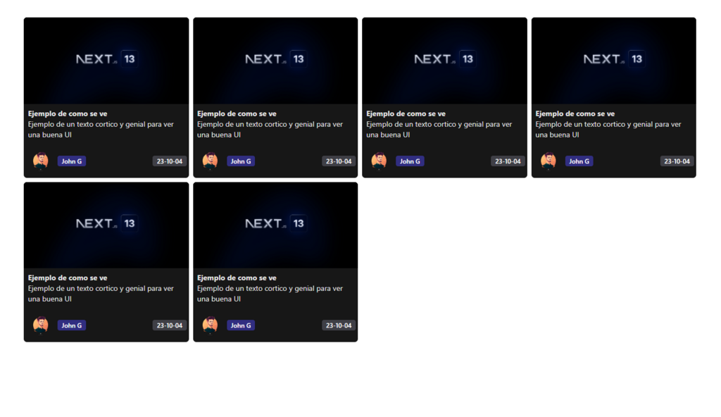
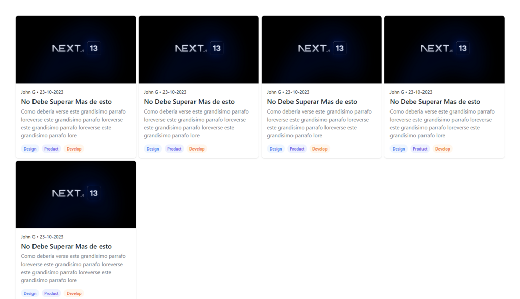
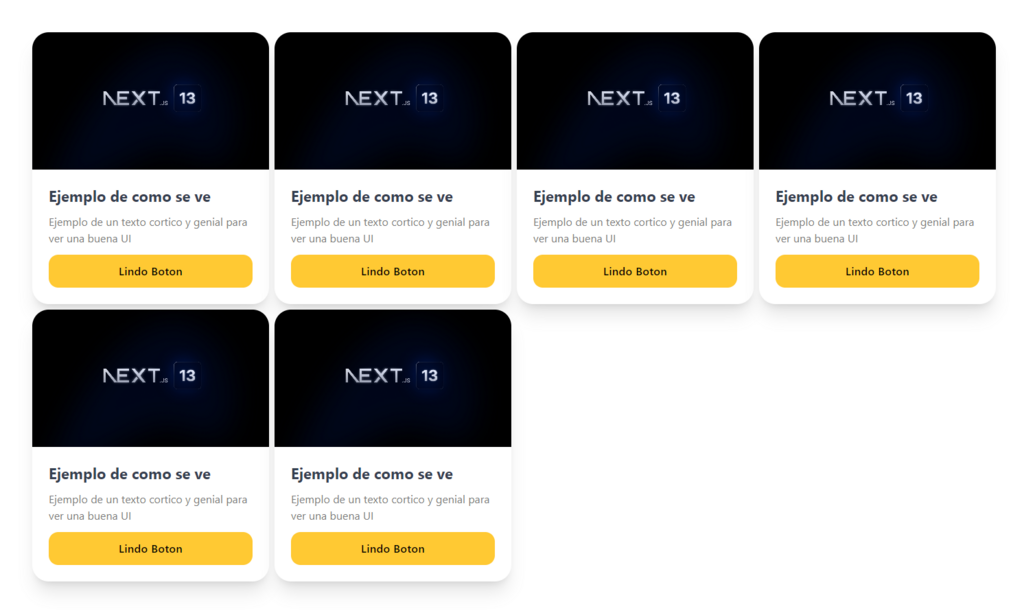
This project is a collection of reusable React components for creating content cards. It includes three different components: Card, Card2 and Card3. Each of them has a different set of variables that can be customized to create unique content cards.
Variables
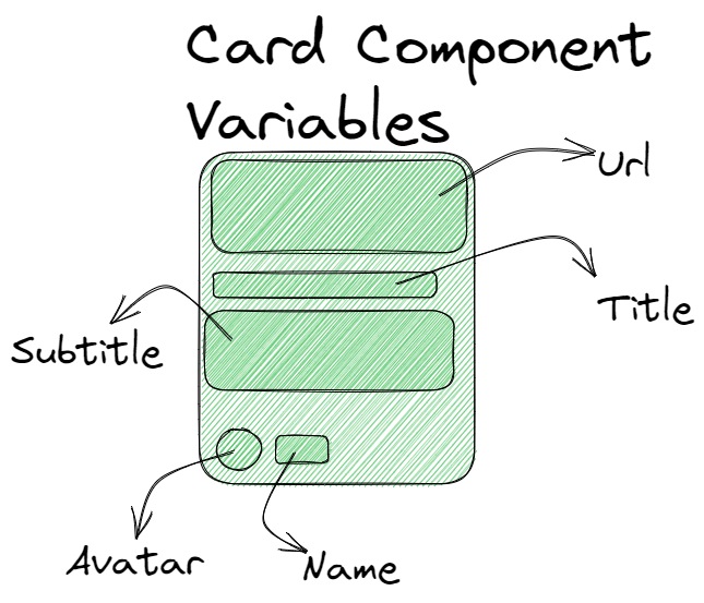
Card
The Card component receives the following variables:
- Url: A text string representing the URL of the image to be displayed on the card.
- Title: A text string that represents the title of the card.
- Subtitle: A text string that represents the subtitle of the card.
- Name: A text string that represents the name of the author of the component.
- Date: A text string representing the date the card was created.
- Avatar: A text string representing the URL of the author's avatar image.
Card2
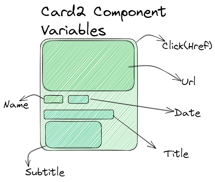
The Card2 component receives the following variables:
- Url: A text string representing the URL of the image to be displayed in the component.
- Title: A text string that represents the title of the component.
- Subtitle: A text string that represents the subtitle of the component.
- Click: A text string representing the URL the component will go to when clicked.
- Name: A text string that represents the name of the author of the component.
- Date: A text string representing the date the component was created.
Card3
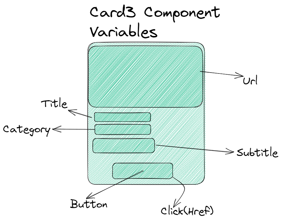
The Card3 component receives the following variables:
- Url: A text string representing the URL of the image to be displayed in the component.
- Title: A text string that represents the title of the component.
- Subtitle: A text string that represents the subtitle of the component.
- Click: A text string representing the URL the component will go to when clicked.
- Button: A text string that represents the text that will be displayed on the component's button.
- Category: A text string representing the category of the component.
Card4
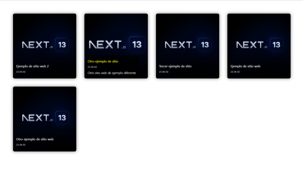
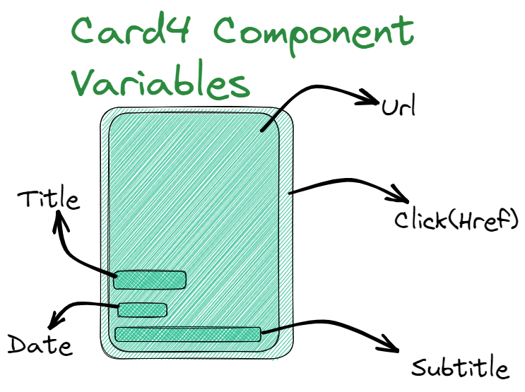
The Card4 component receives the following variables:
- Url: A text string representing the URL of the image to be displayed in the component.
- Title: A text string that represents the title of the component.
- Subtitle: A text string that represents the subtitle of the component.
- Click: A text string representing the URL the component will go to when clicked.
- Date: A text string representing the date the component was created
Card5
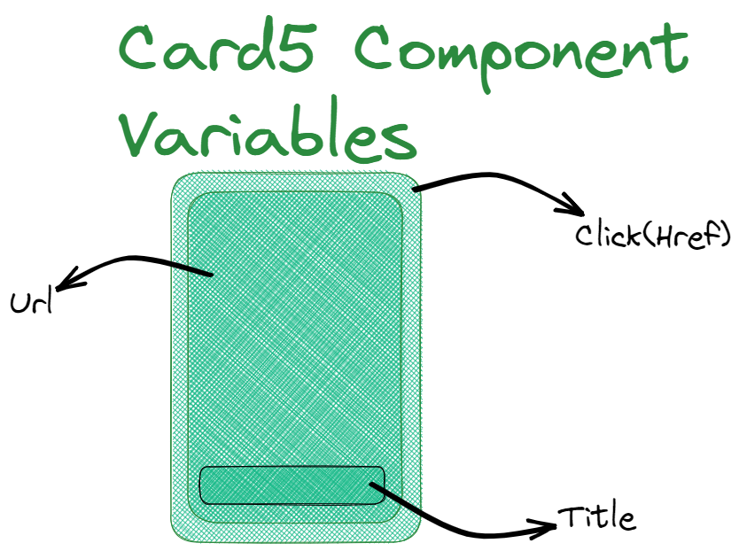
The Card5 component receives the following variables:
- Url: A text string representing the URL of the image to be displayed in the component.
- Title: A text string that represents the title of the component.
- Click: A text string representing the URL the component will go to when clicked.
Examples
NOTE: You can access 3 different card designs and different use cases. They are called Card, Card2 and Card3 and if you only want to use the grid system without cards. creating your own letter design then you just have to import Grid
Creating one by one manually and entering the data
    import { Grid, Card3 } from "grids-system-component"

    <Grid sm={1} md={2} lg={3} xl={4} Xvariants='p-12 gap-2' >
      <Card3
        Url='https://i.postimg.cc/wx5whRxc/twitter-card.png'
        Click='https://www.youtube.com/watch?v=yJnhtMvU6ao'
        Title='Ejemplo de como se ve' Button='Lindo Boton'
        Subtitle='Ejemplo de un texto cortico y genial para ver una buena UI'
      />
      </Grid>
Entering an API or Array and using a map()
    const array2 = [
        {
        url: "https://i.postimg.cc/wx5whRxc/twitter-card.png",
        click: 'https://www.google.com/',
        title: "Ejemplo de sitio web 2",
        subtitle: "Otro sitio web de ejemplo",
        button: "Más información",
        category: "noticias"
        },
        {
        url: "https://i.postimg.cc/wx5whRxc/twitter-card.png",
        click: 'https://www.google.com/',
        title: "Otro ejemplo de sitio",
        subtitle: "Otro sitio web de ejemplo diferente",
        button: "Conocer más",
        category: "noticias"
        },
    ];

    import { Grid, Card2 } from "grids-system-component"

    <Grid sm={1} md={2} lg={3} xl={4} Xvariants="p-12 gap-2">
            {array2.map((item, index) => (
            <Card2
                key={index}
                Url={item.url}
                Click={item.click}
                Title={item.title}
                Button={item.button}
                Subtitle={item.subtitle}
                Category={item.category}
            />
            ))}
    </Grid>
Breakpoints and Corresponding Devices
| Break point | Corresponding Device | Typical Resolution |
|---|---|---|
| sm | Small smartphones | 640px |
| md | Tablets in landscape mode | 768px |
| lg | Laptop and Desktop Computer Screens | 1024px |
| xl | Larger screens, such as HDTV screens | 1280px |