headless-react-datepicker v1.1.9
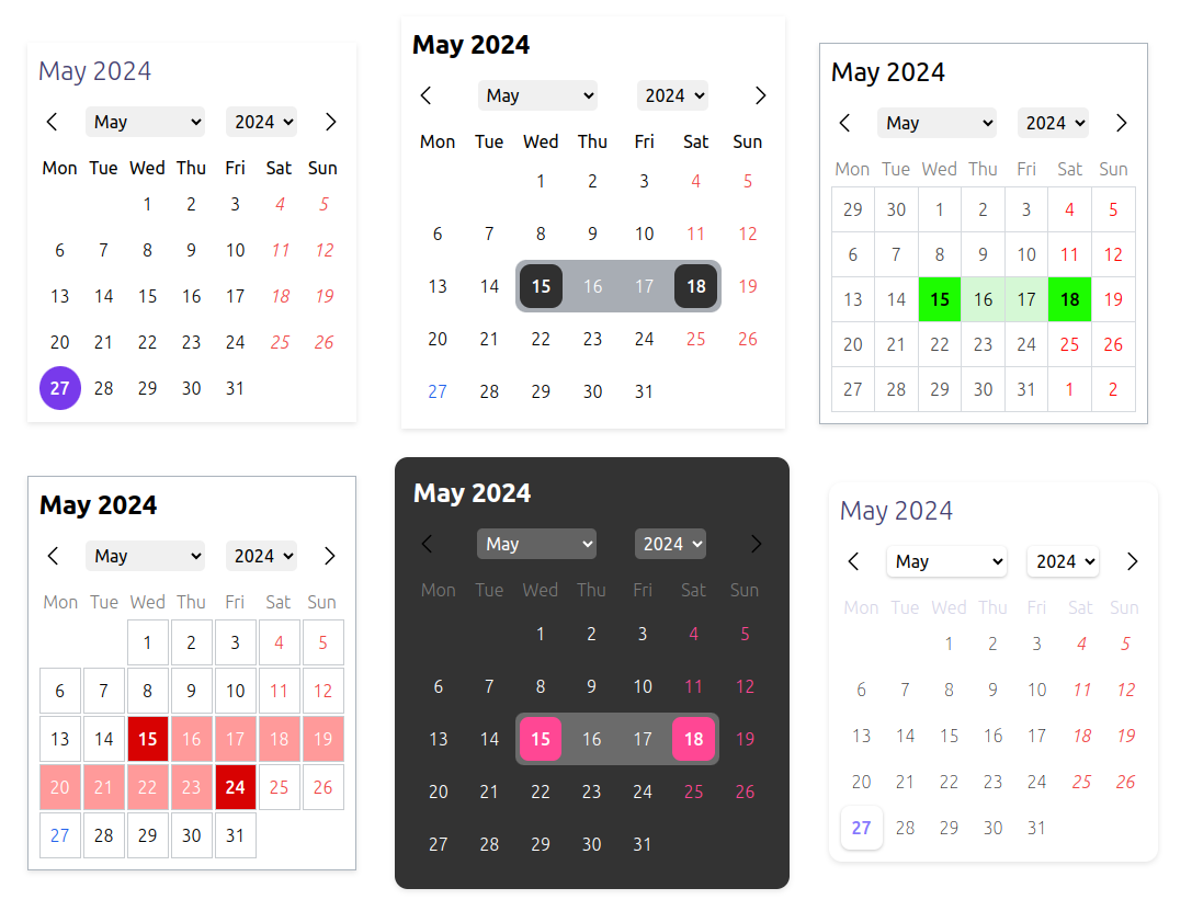
Headless React Datepicker
A headless, highly customizable, multi-calendar date picker component for React. It supports various calendars and locales.
Live demo
https://sepehr09.github.io/headless-react-datepicker/
Customization

Supported Calendars
All calendars are supported by the ECMAScript's Intl API:
- Gregory
- Persian
- Indian
- Iso8601
- Japanese
- Buddhist
- Chinese
- Coptic
- Dangi
- Ethioaa
- Ethiopic
- Hebrew
- Islamic
- Islamic-umalqura
- Islamic-tbla
- Islamic-civil
- Islamic-rgsa
- Islamicc
- Roc
Supported Locales
All locales are supported by the Intl API.
Installation
1. install the package
npm install headless-react-datepicker

# or

yarn add headless-react-datepicker

# or

pnpm add headless-react-datepicker
2. import the css file
import "headless-react-datepicker/dist/styles.css";Usage
import React from "react";
import DatePickerProvider, {
  Title,
  Header,
  WeekDays,
  DaySlots,
} from "headless-react-datepicker";

const MyAwesomeDatePicker = () => {
  return (
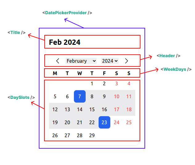
    <DatePickerProvider>
      <Title />
      <Header />
      <WeekDays />
      <DaySlots />
    </DatePickerProvider>
  );
};
Customization

Headless!

DatePickerProvider
Must be in place as the parent of the whole calendar component.
import { DatePickerProvider } from "headless-react-datepicker";props
| Name | Type | Description |
|---|---|---|
| value | Date | Date[] | The value of the date picker (Controlled component). |
| initialValue | Date | Date[] | The initial value of the date picker. |
| defaultStartDate | Date | The default start date. Useful when you want to be on a different month or year despite the initial value. |
| config | TCalendarConfig | The configuration for the date picker. |
| isRange | boolean | Indicates whether the date picker is a range picker. |
| calendar | TCalendar | The calendar to use. |
| onChange | (value: Date | Date[]) => void | on calendar selected date change |
| children | ReactNode | The other parts of the calendar or your custom components. |
TCalendarConfig
| Name | Type | Description | Default |
|---|---|---|---|
| weekStartsOn | TDay | undefined | The first day of the week. | "monday" |
| locale | string | undefined | The locale to use. | "en-US" |
| showOtherDays | boolean | undefined | Show other days from the previous and next month or not. | false |
| otherDaysSelectable | boolean | undefined | Allow selecting other days from the previous and next month or not. | false |
| weekdayFormat | "long" | "short" | "narrow" | undefined | "narrow" | |
| dayFormat | "numeric" | "2-digit" | undefined | "numeric" | |
| yearRangeFrom | number | undefined | last 10 years if not provided | |
| yearRangeTo | number | undefined | current year if not provided | |
| maxDate | Date | undefined | Prevent selecting dates before this date. | |
| minDate | Date | undefined | Prevent selecting dates after this date. | |
| weekends | TDay[] | undefined | Specify which days of the week are holidays. | undefined |
| weekendSelectable | boolean | undefined | Allow selecting weekends or not. | true |
| allowBackwardRange | boolean | undefined | If user select a date before the previous selected date, it will be considered as a range or start from beginning. | false |
TCalendar
"gregory" | "persian" | "islamic" | "islamic-umalqura" | "islamic-tbla" | "islamic-civil" | "islamic-rgsa" | "iso8601" | "japanese" | "islamicc" | "roc" | "chinese" | "indian" | "buddhist" | "coptic" | "dangi" | "ethioaa" | "ethiopic" | "hebrew"
Components
Title component
The Title component is used to display the month and year based on the selected locale and calendar.
import { Title } from "headless-react-datepicker";props
| Name | Type | Options | Default |
|---|---|---|---|
| monthFormat | string | undefined | "numeric", "2-digit" , "long" , "short" , "narrow" | "short" |
| yearFormat | string | undefined | "numeric" , "2-digit" | "numeric" |
| className | string | ClassName of the title component | |
| style | CSSProperties | css styles of the title component |
Header component
The Header component is used to navigate to the next and previous month and select month and year from the drop-down list.
You can customize arrow icons with React Node and the dropdowns with className and CSS stylesheets.
import { Header } from "headless-react-datepicker";props
| Name | Type | Description |
|---|---|---|
| leftIcon | ReactNode | |
| rightIcon | ReactNode | |
| rootClassName | string | the root className of the header |
| rootStyles | CSSProperties | the root css styles of the header |
| monthSelectClassName | string | Class name of the month select dropdown |
| monthSelectStyles | CSSProperties | css styles of the month select dropdown |
| monthOptionClassName | string | className of the month Options in the dropdown |
| monthOptionStyles | CSSProperties | css styles of the month Options in the dropdown |
| monthSelectedOptionClassName | string | className the selected option in the month dropdown |
| monthSelectedOptionStyles | CSSProperties | css styles the selected option in the month dropdown |
| yearSelectClassName | string | className of the year select dropdown |
| yearSelectStyles | CSSProperties | css styles of the year select dropdown |
| yearOptionClassName | string | className of the year Options in the dropdown |
| yearOptionStyles | CSSProperties | css styles of the year Options in the dropdown |
| yearSelectedOptionClassName | string | className the selected option in the year dropdown |
| yearSelectedOptionStyles | CSSProperties | css styles the selected option in the year dropdown |
| prevButtonClassName | string | className of the previous button (left button) |
| prevButtonStyles | CSSProperties | css styles of the previous button (left button) |
| nextButtonClassName | string | className of the next button (right button) |
| nextButtonStyles | CSSProperties | css style of the next button (right button) |
WeekDays component
The WeekDays component is used to display the weekday header.
import { WeekDays } from "headless-react-datepicker";props
| Name | Type | Description |
|---|---|---|
| renderer | (args: TWeekDaysRendererArgs) => ReactNode | Custom renderer. If provided, the whole component will be ignored |
| className | string | Custom class name for the element |
| style | CSSProperties | css styles for the element |
| rootClassName | string | Custom class name for the parent root element |
| rootStyle | CSSProperties | css styles for the parent root element |
TWeekDaysRendererArgs
| Name | Type | Options | Description |
|---|---|---|---|
| formattedTitle | string | Title based on calendar config.weekdayFormat which follows locale and calendar. | |
| weekIndex | number | ||
| weekDay | TDay | "monday" | "tuesday" | "wednesday" | "thursday" | "friday" | "saturday" | "sunday" |
DaySlots component
The DaySlots component is used to display the month and year based on the selected locale and calendar.
import { DaySlots } from "headless-react-datepicker";props
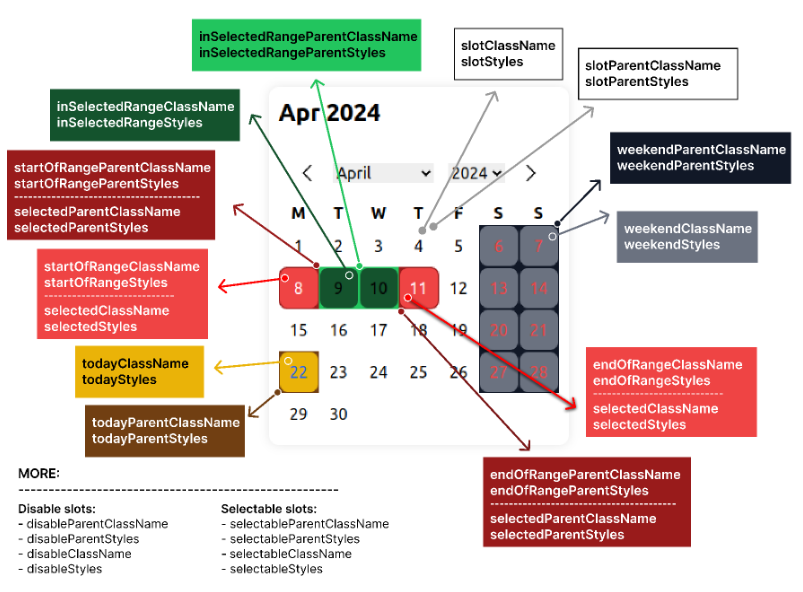
| Name | Type | Description | Default |
|---|---|---|---|
| dayRenderer | (args: TDaySlotsDayRendererArgs) => ReactNode | Custom renderer | |
| onClickSlot | (date: Date) => void | when click on slot | |
| parentClassName | string | parent box | |
| parentStyles | CSSProperties | parent box | |
| slotParentClassName | string | ||
| slotParentStyles | CSSProperties | ||
| slotClassName | string | ||
| slotStyles | CSSProperties | ||
| todayStyles | CSSProperties | ||
| todayClassName | string | ||
| todayParentStyles | CSSProperties | ||
| todayParentClassName | string | ||
| disableStyles | CSSProperties | ||
| disableClassName | string | ||
| disableParentStyles | CSSProperties | ||
| disableParentClassName | string | ||
| weekendStyles | CSSProperties | ||
| weekendClassName | string | ||
| weekendParentStyles | CSSProperties | ||
| weekendParentClassName | string | ||
| selectedStyles | CSSProperties | ||
| selectedClassName | string | ||
| selectedParentStyles | CSSProperties | ||
| selectedParentClassName | string | ||
| selectableStyles | CSSProperties | ||
| selectableClassName | string | ||
| selectableParentStyles | CSSProperties | ||
| selectableParentClassName | string | ||
| inSelectedRangeStyles | CSSProperties | ||
| inSelectedRangeClassName | string | ||
| inSelectedRangeParentStyles | CSSProperties | ||
| inSelectedRangeParentClassName | string | ||
| inHoveredRangeStyles | CSSProperties | ||
| inHoveredRangeClassName | string | ||
| inHoveredRangeParentStyles | CSSProperties | ||
| inHoveredRangeParentClassName | string | ||
| startOfRangeStyles | CSSProperties | ||
| startOfRangeClassName | string | ||
| startOfRangeParentStyles | CSSProperties | ||
| startOfRangeParentClassName | string | ||
| endOfRangeStyles | CSSProperties | ||
| endOfRangeClassName | string | ||
| endOfRangeParentStyles | CSSProperties | ||
| endOfRangeParentClassName | string |
TDaySlotsDayRendererArgs props
| Name | Type | Options | Default |
|---|---|---|---|
| date | Date | based on calendar config.dayFormat which follows locale and calendar. | |
| formattedDay | string | Formatted date based on locale and calendar which is in the calendar config. | |
| IsToday | boolean | Indicate that is the day is today or not. | |
| isSelectable | boolean | Is the day can be selected or not. | |
| isDisabled | boolean | Is the day is disabled or not. | |
| isInSelectedRange | boolean | Is in the selected range (if calendar type is range) or not. | |
| isInHoveredRange | boolean | Is in the hovered range (if calendar type is range) or not. | |
| isStartOfRange | boolean | ||
| isEndOfRange | boolean | ||
| isInWeekend | boolean | ||
| isSelected | boolean | ||
| handleClickSlot | (date: Date) => void | ||
| handleKeyDown | (e: React.KeyboardEvent, date: Date) => void | onKeyDown event |
Date picker Context
You can access almost all props and functions of the date picker from the date picker context, so you can customize and build your own custom component easily.
example
import { useDatePickerContext } from "headless-react-datepicker";

const MyCustomAwesomeHeader = () => {
  const { goToCurrentMonth, yearInTheCalendar } = useDatePickerContext();

  return <div onClick={goToCurrentMonth}>{yearInTheCalendar}</div>;
};
returned props
| Name | Type | Description |
|---|---|---|
| goToNextMonth | () => void | Function to navigate to the next month |
| goToPrevMonth | () => void | Function to navigate to the previous month |
| goToDate | (date: Date) => void | Function to navigate to a specific date |
| goToCurrentMonth | () => void | Function to navigate to the current month |
| goToMonth | (month: number) => void | Local month (based on the desired calendar) |
| goToYear | (year: number) => void | Handle go to year (based on desire calendar) |
| daysOfMonth | Date[] | All the dates of the month rendered in the calendar |
| startDateIncludeOtherDays | Date | End date of the month rendered in the calendar (include previous month days (if in the week)) |
| endDateIncludeOtherDays | Date | Start date of the month rendered in the calendar (include next month days (if in the week)) |
| firstDayOfMonth | Date | First day of the month |
| lastDayOfMonth | Date | Last day of the month |
| selectedDay | Date | Date[] | undefined | The selected day in the calendar |
| handleClickSlot | (date: Date) => void | Callback function when a date is clicked |
| monthInTheCalendar | number | Current month in the calendar (based on desire calendar) |
| totalDaysInTheCalendar | number | Indicate the total days in the month |
| yearInTheCalendar | number | Current year in the desire calendar |
| monthsList | TMonthListItem[] | List of all month based on culture |
| yearsList | number[] | List of all years based on yearRangeFrom and yearRangeTo |
| initialValue | Date | Date[] | The initial value of the date picker. |
| defaultStartDate | Date | The default start date. Useful when you want to be on different month or year despite the initial value. |
| config | TCalendarConfig | The configuration for the date picker. |
| isRange | boolean | Indicates whether the date picker is a range picker. |
| calendar | TCalendar | The calendar to use. |
Dependencies
Using the Intl API which is ECMAScript Internationalization API with a very good browser support and depends on Temporal for converting other calendars into gregory.
Todo
- remove dependency to date-fns
- time picker
- rangle picker hover effect
- integrate popover for whole calendar
- two side by side calendar
License
MIT @ Sepehr09
Contributing
We're eagerly welcoming to contributors who want to help build and maintain this repo. PRs are always welcome!
Change log
you can see the change log here


