0.1.6 • Published 3 years ago
hexagon-3d-react v0.1.6
hexagon-3d-react
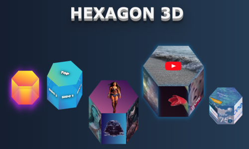
A React based component wrapper for the hexagon-3d service. Hexagon-3d providing styles object for CSS-based 3d hexagons with high interactivity capabilities. You may use these shapes as skeletons for various animations, images adding, videos playing, combining them into different forms, and doing a lot of other things. The capabilities of hexagons will be growing over time.
Live demo:
Explanation tutorial
You can read more about hexagon geometry, construction features, and package details in my Medium article.

Installation
npm install hexagon-3d-react
Usage
import Hexagon3D from 'hexagon-3d';
or
const Hexagon3D = require('hexagon-3d').default;
After importing hexagon service is ready to be used as a regular React component:
render (<Hexagon3D <parameters>>);
Example of usage
`<Hexagon3D
    width={130}
    height={150}
    rotateZ={20}
    rotateX={40}
    growTop={true}
    topChildren={<h1><span>Top</span></h1>}
    side1Children={<h1><span>Side</span><span>1</span></h1>}
    side2Children={<h1><span>Side</span><span>2</span></h1>}
    side3Children={<h1><span>Side</span><span>3</span></h1>}
    side4Children={<h1><span>Side</span><span>4</span></h1>}
    side5Children={<h1><span>Side</span><span>5</span></h1>}
    side6Children={<h1><span>Side</span><span>6</span></h1>}
/>`
Parameters
| Name | Type | Description | Values |
|---|---|---|---|
| width | number | Width of the hexagon (the biggest distance of it's 2 opposite points) | any |
| height | number | Height of the hexagon sides | any |
| rotateZ | number | Rotation degrees round Z axis | 0-360 |
| rotateX | number | Rotation degrees round X axis | 0-360 |
| showShadow | boolean | Flag to indicate whether faces border shadow should be shown (default - false) | true, false |
| shadowColor | string | Color of a faces border shadow | any |
| growTop | boolean | Flag which indicates how hexagone should change it's height - to the top or to the bottom. (default - false) | true, false |
| topBottomColor | string | Color of hexagon top and bottom sides | any |
| sidesColor | string | Color of hexagon sides | any |
| opacity | number | Opacity of hexagon sides | 0.0 - 1.0 |
| showTransition | boolean | Indicate whether height change animation should be shown (default - false) | true, false |
| topChildren | HTML, string | HTML element or string which will be placed on the top side of the hexagon | any |
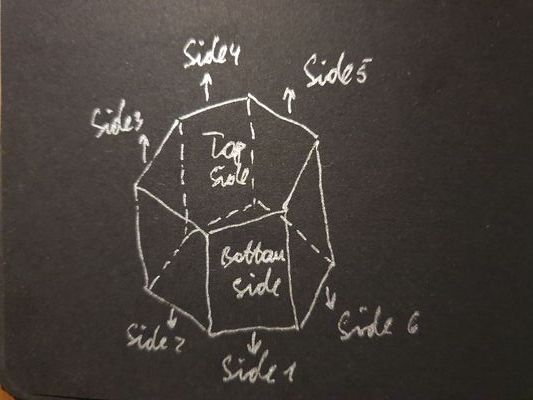
| side1Children | HTML, string | HTML element or string which will be placed on the side 1* of the hexagon | any |
| side2Children | HTML, string | HTML element or string which will be placed on the side 2* of the hexagon | any |
| side3Children | HTML, string | HTML element or string which will be placed on the side 3* of the hexagon | any |
| side4Children | HTML, string | HTML element or string which will be placed on the side 4* of the hexagon | any |
| side5Children | HTML, string | HTML element or string which will be placed on the side 5* of the hexagon | any |
| side6Children | HTML, string | HTML element or string which will be placed on the side 6* of the hexagon | any |
| bottomChildren | HTML, string | HTML element or string which will be placed on the bottom side of the hexagon | any |
*Hexagon sides direction:

Next iterations
- Add tooltips for each side
- Add more styling capabilities
- Add rotations and other animation effects
- Add deeper sides interactions
- Optimize CSS properties