holders v5.0.0
Holders: speak easy to your components
React tutorials for beginners teach you to separately send state to child components, and then receive new state back from those child components through an onChange handler. For instance if you've written a Slider component to edit a numeric value, you might use it like this:
    <Slider value={this.props.cacheSize}
            onChange={value => this.props.onCacheSizeChanged(value)}
            min={1} max={20} step={1} style={ {width:"12em"} }/>
And then, whatever code creates your component has to do the same thing again, sending in its own value for onCacheSizeChanged.
The holders library removes both of these annoyances by bundling the "getter" (this.props.cacheSize) together with the "setter" (value => this.props.onCacheSizeChanged(value)), in order to simplify communication between components to this:
    <Slider value={this.props.cacheSize}
            min={1} max={20} step={1} style={ {width:"12em"} }/>
Plus, you don't have to write a Slider component - this library already includes it.
The getter/setter bundle is called Holder<T>:
/** A wrapper around a value. */
export type Holder<T> = {
  get(): T;
  set: (newValue: T) => void;
}
If cacheSize is a Holder<number> object, cacheSize.get() returns the current value and cacheSize.set(v) is called to update cacheSize with a new value. This package includes three kinds of holders, and you add your own as necessary.
This library consists of two very small parts:
- 'holders' is the basic code for creating holder objects, including the
holdValue,holdStates,holdProps, andholdAllPropsfunctions. This tiny module does not use or need React or JSX. - 'basic-forms' provides small React components named
Label,TextBox,CheckBox,DateBox, etc., which wrap standard forms elements like<label>,<input type="text">, and<input type="checkbox">. Each element can have a label and all standard HTML attributes are supported on each form element. Validation is supported (see below).
It also includes an example (demo.html, demo.tsx, demo.css). It was written in TypeScript, but is published as JavaScript code so it can be used equally well from JavaScript and TypeScript projects.
To install it in your npm project, run this terminal command: npm i holders
Programming should always be this easy
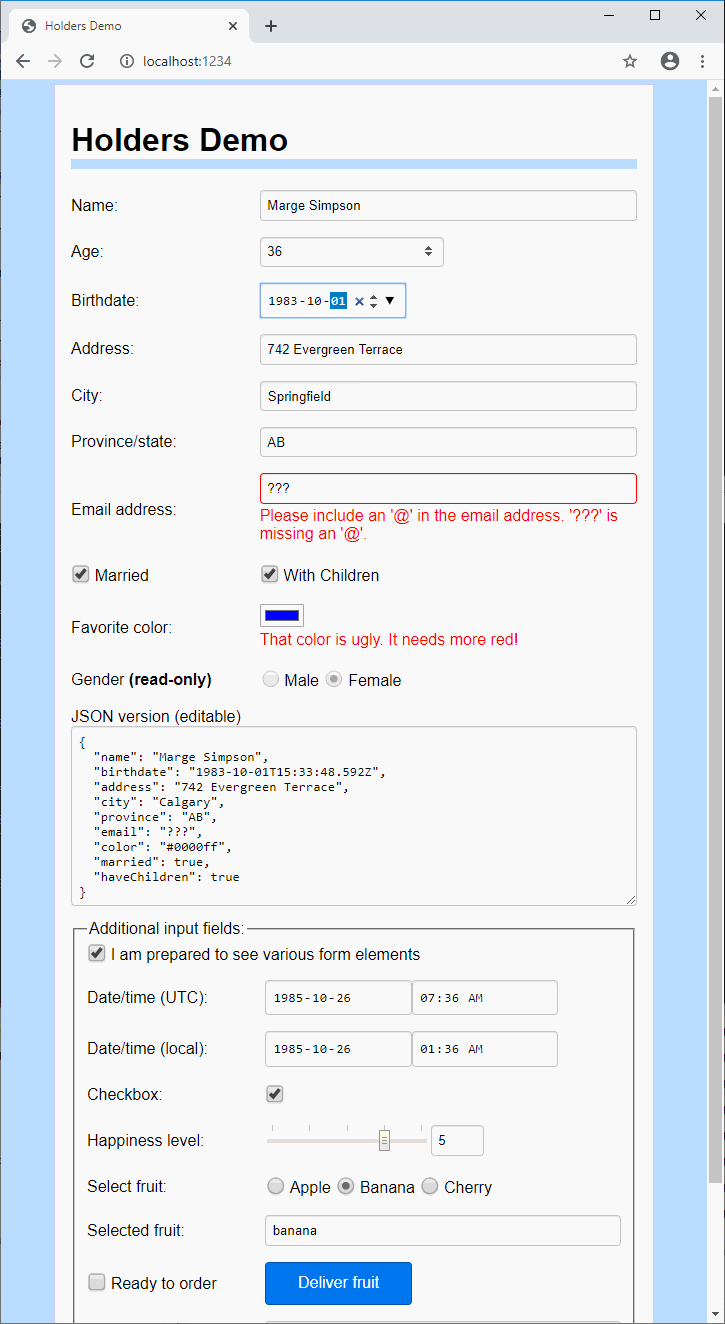
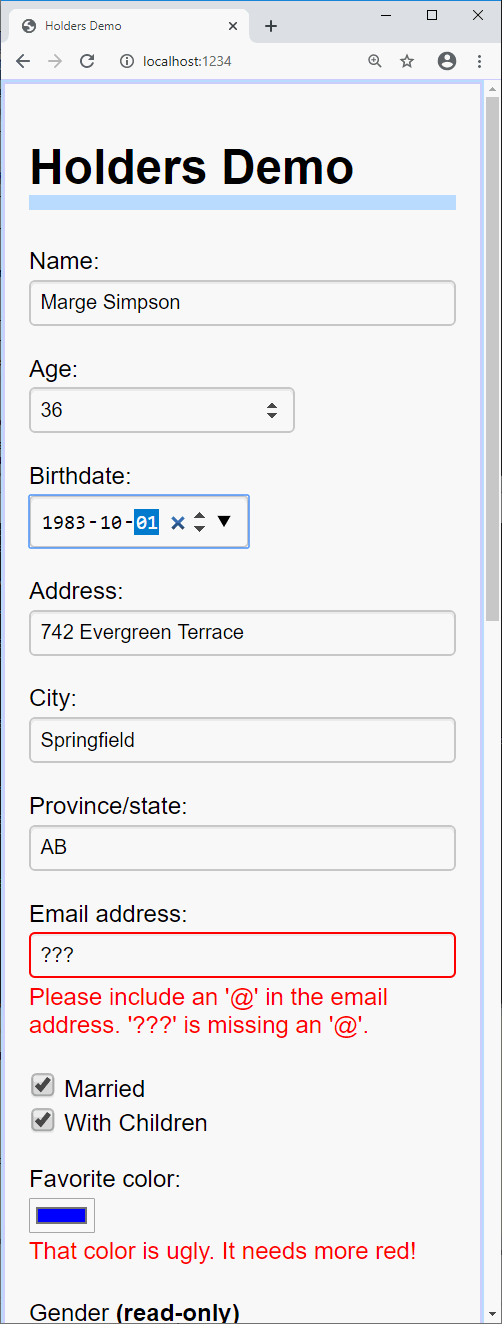
This package lets you describe most lines of a form with only 1 to 4 lines of code.
| Wide | Narrow |
|---|---|
 |  |
For example, the upper part of this demo, including validation support and the underlying model, is described by 38 lines of TypeScript:
class Model {
  name: string = "";
  birthdate?: Date = undefined; // redundancy: because it's only an example
  address: string = "";
  city: string = "";
  province: string = "";
  email: string = "";
  date?: Date = undefined;
  color: string = "#bbff44";
  married: boolean = false;
  haveChildren: boolean = false;
  error: string;
}

// A simple form
function PersonForm(m: Holders<Model>) {
  let age = asAge(m.birthdate);
  return <form>
    <TextBox p label="Name:"  required value={m.name} autoComplete="name" placeholder="First Last"/>
    <TextBox p label="Age:"            value={age}    type="number"
             parse={text => (age.set(parseFloat(text)), age.get())}/>
    <DateBox p label="Birthdate:"      value={m.birthdate} autoComplete="bday"/>
    <TextBox p label="Address:"        value={m.address}  autoComplete="address-line1"/>
    <TextBox p label="City:"           value={m.city}     autoComplete="address-level2" maxLength={30}/>
    <TextBox p label="Province/state:" value={m.province} autoComplete="address-level1" maxLength={30}/>
    <TextBox p label="Email address:"  value={m.email}  type="email" autoComplete="email"/>
    <p>
      <LabelSpan><CheckBox label="Married"  value={m.married} labelAfter={true}/></LabelSpan>
      {m.married.get() ? <CheckBox label="With Children" value={m.haveChildren}/> : undefined}
    </p>
    <ColorPicker p label="Favorite color:" value={m.color}
               error={m.color.get()[1] < '9' ? "That color is ugly. It needs more red!" : ""}/>
    <Label p label={<span>Gender <b>(read-only)</b></span>}>
      <Radio label="Male" value={{ get() { return false; } }}/>{" "}
      <Radio label="Female" value={{ get() { return true; } }}/>
    </Label>
  </form>;
}
This form was clearly designed by an idiot, since there is both an "Age" and a "Birthdate" field. In order to convert ages to dates (and vice versa) we're going to need an adapter. That will require another 18 lines of code:
function asAge(date: Holder<Date|undefined>): Holder<number> {
  const msPerYear = 1000*60*60*24*365.2422; // milliseconds per year
  let age = {
    get() {
      if (date.get())
        return Math.floor((new Date() as any - (date.get() as any)) / msPerYear);
    },
    set(value: number) {
      if (!(value === value) || value < 0 || value > 200)
        throw new Error("Invalid age");
      let changeInYears = (age.get() || 0) - value;
      let newDate = date.get() || new Date();
      newDate.setFullYear(newDate.getFullYear() + changeInYears);
      date.set(newDate);
    }
  };
  return age;
}
You'll also need some glue to combine the model and view, and here it is:
function App(props: { model: Model }) {
  const [holders, setHolders] = React.useState(
    holdAllProps(props.model, () => { this.setHolders(holders); })
  );
  return <PersonForm {...holders}/>
}

ReactDOM.render(<App model={new Model()}/>, document.getElementById('app'));
The built-in holders are not designed for advanced scenarios or hierarchical data. It's on my to-do list to try integrating this with an easy state-management library like MobX (I expect MobX, specifically, to work nicely with this library).
Form elements: design goals
- Be easy and concise to use
- Be small (under 10K minified)
- Be flexible (has global
options, has various props for customization) - Be well-documented
- Be minimal but complete. All advanced functionality (e.g. Date input, autocomplete, validation) is offloaded to the browser as much as possible, and styling is left up to CSS (see demo.css for example styling). The standard browser validation API was designed very badly, though, so this library augments the built-in support.
Validation support
Your app can provide validation errors in four different ways:
- The
parseprop can return or throw anew Errorto display a message - The
value.setfunction can throw anew Errorto display a message - You can set the
errorprop to display a message or a JSX element - You can set HTML5 validation attributes such as
requiredorpattern, or use atypethat has built-in validation behavior provided by the browser (e.g.<TextBox type="email">)
If the Holder Forms component is text-based (TextBox or TextArea), it will notify the element that it is invalid using the setCustomValidity API, and then you can style it with a selector like input[type="text"]:invalid or .user-invalid. The user-invalid class will appear on elements that have a validation error after the user has interacted with them. Typically it is applied when the element loses focus (see the documentation of showErrorEarly in TextAttributesBase for exceptions to this rule).
Since validation support sucks ass in most browsers, the component produces extra HTML for validation errors. For example, consider this humble component:
<TextBox p label="Name:" required value={m.name} autoComplete="name" placeholder="First Last"/>It is marked as required, so if you tab out of the component without filling it in, an error will appear. Here's the HTML it produces:
<p>
  <label>
    <span class="labelspan">Name:</span>
    <span class="inputspan">
      <input required="" autocomplete="name" placeholder="First Last" type="text" value="" class="user-invalid">
      <span class="errorspan">Please fill out this field.</span>
    </span>
  </label>
</p>
These elements can then be styled, as demoed in the demo. If you need TextBox to produce different markup, there are various things you can do. For example, the noErrorSpan prop will suppress the error, the errorFirst prop will put the error before the <input>, and you can replace the entire layout by installing a custom function for composeElementWithLabel.
Documentation
Full doc comments are provided in the source code for 'holders/holders' and 'holders/basic-forms'.
To run the demo
npm install --global parcel
npm run demo
When it succeeds, visit http://localhost:1234 in a browser.
Features
- CommonJS modules targeting ES5 (old browsers supported)
- Minified size: 2.3K for holders.min.js, 9.3K for basic-forms.min.js
- Includes d.ts files (this package is written in TypeScript)
- Elements are expected to be compatible with Preact as well as React
Version history
v5.0.0
- Breaking: change the type of
Holder<T>.getfromTto() => Tso thatHolder<T>is a subinterface of theIComputedValue<T>interface of MobX. This change was made because MobX is the most appropriate state management library to use with this library. During upgrade, users will need to change.getto.get()throughout their codebase, and any custom holders must define aget() {}method instead ofget get() {}(also, replaceget: valuewithget() { return value; }).
v4.0.0
- Remove deprecated
holdStatefunction - Add new
holdStatehelper function.holdState(useState(...))converts a React state tuple toHolder<T>. - Switch module format from "umd" to "CommonJS". This improves compatibility with webpack and parcel, but reduces compatibility with the less popular AMD module system.
v3.1.3
- Bug fix: Avoid accidentally adding class called
undefinedto invalid input elements
v3.1.1
- define
HolderGet<T>(a holder with optional setter). Form elements will recognize a holder without a setter as read-only. - Rename
elementsmodule tobasic-forms(elementsstill exists and exports bothbasic-formsandholders) holders/basic-formsmodule:- Enhance the hell out of the validation support
- Add props
keepBadText,showErrorEarly,noErrorSpan TextBoxis designed to hide the validation error message until it gains and loses focus
- Add props
- Export
optionsobject with newFormOptionstype - Wrap most input elements in
<span class="inputspan">to make css styling easier. Theinputspanwraps both the<input>element and the<span class="errorspan">element which displays validation errors. Theinputspanspan can be suppressed with thenoInputSpanprop. - Add
ColorPickercomponent (alternative to<TextBox type="color">) - Add
DateTimeBoxcomponent - Add
InputSpancomponent - Add
ErrorSpancomponent, plus new props on other form elements to support
displaying errors:LabelProps.error,LabelProps.errorFirst - Add
options.composeElementWithLabelfunction that allows you to control how basic form elements (such as<input type="text">) are combined with a label and error string. The default composer function is calleddefaultComposer. - Add
refInputinInputAttributesBasefor advanced customization - When your
parseprop is called,thisnow refers to theTextBoxorTextAreathat the user is changing
- Enhance the hell out of the validation support
v3.0.0
There are almost no users, so some breaking changes should be okay...
TypeScript version is 3.6.5 to avoid breaking clients that use TypeScript 3.5 or earlier.
- Change signature of all
onChanginghandlers. The new signature is the same for value holders and prop holders; the attribute name is the third parameter rather than the first. - Rename
hold()toholdProp() holdPropsandholdStatesare now optimized to lower memory use of groups of holders, butholdPropandholdStateuse more memory than before (assumption: people usually make multiple holders at once.)- Add
holdStates()which uses new code specialized for the React state holders it creates. This package still does not require React. - Add
delayedWriteparameter to all holders. The old behavior was as ifdelayedWritewas always true, but now the default value ofdelayedWriteis false. - Elements no longer throw initially if
valueprop is missing - Add
RadioAttributesWorkaround<T>. This is used as a workaround for the mysterious difficulty TypeScript has handlingRadioAttributes<string>. You see,<Radio value={h} is="X"/>works fine ifhis aHolder<"X"|"Y">, but ifhisHolder<string>, it says without further explanation that the props of Radio are "not assignable" to it. The workaround is to markisoptional, even though it is required when T is not boolean. - Bug fix: in FireFox the user can change an
without giving it focus, which could cause it to fail to be updated
when
value.getis changed. - Improve css styling of the demo
To Learn More
This library is part of the TypeScript-React Primer; see part 5, example 5 to learn more about how to use holders.