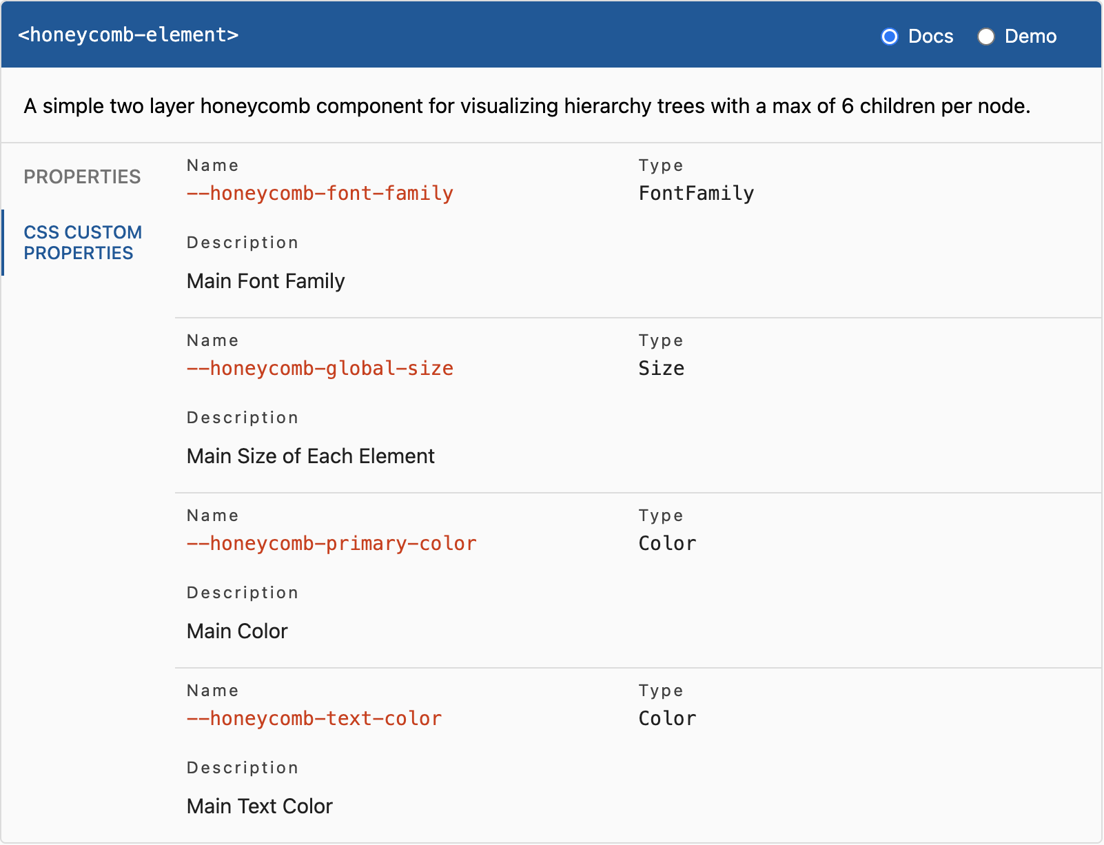
honeycomb-element v1.4.0
\
This webcomponent follows the open-wc recommendation.
Installation
npm i honeycomb-elementUsage
<script type="module">
  import 'honeycomb-element/honeycomb-element.js';
</script>

<honeycomb-element></honeycomb-element>
Another way to use the component is via the CDN UNPKG.
Import as module:
<script type="module">
  import 'https://unpkg.com/honeycomb-element@latest/build/honeycomb-element.bundled.js';
</script>

<honeycomb-element></honeycomb-element>
Import as usual <script> of type module:
<head>
  <title>Honeycomb Element</title>
  <script src="https://unpkg.com/honeycomb-element@1.1.4/build/honeycomb-element.bundled.js" type="module"></script>
</head>
<body>
  <honeycomb-element></honeycomb-element>
</body>
Import as usual <script>:
<head>
  <title>Honeycomb Element</title>
  <script src="https://unpkg.com/honeycomb-element@1.1.4/build/honeycomb-element.bundled.js"></script>
</head>
<body>
  <honeycomb-element></honeycomb-element>
</body>
Note that the keyword @latest always points to the latest version of the honeycomb element. If you rather want to stick to a specific version, just replace latest
with the according version number (e.g. @1.1.7).
Properties
The <honeycomb-element> allows one property naming items. This way, the honeycomb is provided with content.
The items property is of type array which itself holds a maximum of 7 nested arrays. These nested arrays contain
of a maximum of 7 objects following the ItemInterface. Be aware, that the first nested array only contains one object
which represents the center element which does not expand on click.
For an example, see the /demo directory.
It is recommended to attach items to the element as follows:
const honeycombEl = document.querySelector("honeycomb-element");
honeycombEl.items = [ /* items come here */ ];
export interface ItemInterface {
/** Heading of hexagon */
heading: string;
/** Content displayed below heading. Also functions as sub heading. */
content?: string;
/** Image placed within the hexagon */
image?: {
/** URL to image */
src: string;
/** Title of image applied to title attribute */
title?: string;
};
}CSS Custom Properties

Local Demo with web-dev-server
npm startTo run a local development server that serves the basic demo located in demo/index.html