input-range v1.2.9
Input range 🎉
中文文档
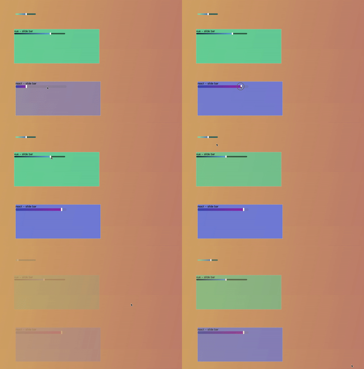
InputRange is a slide bar plugin, he simulates native input range component and makes you can highly customize the dom structure and the css style, if you don't want write dom structure and css style by yourself, InputRange provided react component and vue component. Detailed usage can be seen here
Effect

Installation
npm install input-range --saveor
yarn add input-rangeAbout react and vue component
How to use
InputRange has two ways to initialize
  const { Slide, createSlide } from 'input-range'

  // The first
  const slide = new Slide(options)
  slide.init()

  // The second
  const slide = createSlide(options)
  slide.init()
you can initialize appropriately after slide instance be created, for example, a dom element initially hidden and later displayed
options description
options except point,are all optional
| Name | Description | Type | Default |
|---|---|---|---|
| point | slider button | element || string | undefined |
| direction | slider active direction | 'x' || 'y' | 'x' |
| limit_area | limit range while draging | number | 100 |
| pointer_event | whether to add the pointer-events attribute to the style of the slider | boolean | true |
| prohibit_click | whether to prohibit clicking slider | boolean | false |
| prohibit_move | whether to prohibit draging slider | boolean | false |
| click_el_index | Specifing which element of container triggers the click event (index starts from 0) | number | 0 |
| expand_touch_area | expand touch range | Object | undefined |
expand_touch_area description
| Name | Description | Type |
|---|---|---|
| width | width | number || string |
| height | height | number || string |
Instance attributes
value
siide.value record current slider value, value range is 0 to 1. It should be noted that the slide will be set to the default value according to the css value of the slide progress during initialization. slide doesn't provide default value interface, so you can achieve default value by html structure or dispatch method.
  <div class="container">
    <span class="background"></span>
    <span class="progress">
      <i class="dot"></i>
    </span>
  </div>

  <style>
    .progress {
      width: 30%;
    }
  </style>

  <script>
    // If direction is 'x'
    const slide = new Slide(options)
    slide.init()
    slide.value // 0.3
  </script>
or
  const slide = new Slide(options)
  slide.init()
  slide.dispatch('change', 0.1)
api
Hook functions
init
You can use init method to reset parameters in anytime.
  const slide = new Slide(options)
  slide.init()
dispatch
You can trigger the event manually, yeah! dispatch.
  // event type must be input or change
  // value must be between 0 and 1
  // you can use transition animate
  slide.dispatch('input', 1, true)
prohibit_click
This method use to prohibit clicking slide bar or cancel.
  slide.prohibit_click(true)
  // or
  slide.prohibit_click(false)
prohibit_move
This method use to prohibit draging slide bar or cancel.
  slide.prohibit_move(true)
  // or
  slide.prohibit_move(false)
oninput
You can compare this method to the callback of the input event of the native input range component.
  slide.oninput = function(value, progress_el, slide) {
    ...
  }
You also can achieve similiar effect by rigistering input event on html element.
  <span class="progress" id="p"></span>

  <script>
    p.addEventListener('input', e => {
      const value = e.value
      ...
    })
  </script>
onchange
The onchange hook function is similiar with oninput, which is also simulating the native change event, except that you need to change input to change.
onerror
The onerror hook function accept error which InputRange send.
  slide.onerror = function (err_msg, stacks) {
    ...
}6 years ago
8 years ago
8 years ago
8 years ago
8 years ago
8 years ago
8 years ago
8 years ago
8 years ago
8 years ago
8 years ago
8 years ago
8 years ago
8 years ago
8 years ago
8 years ago
8 years ago
8 years ago
8 years ago
8 years ago
8 years ago
8 years ago
8 years ago
8 years ago
8 years ago
8 years ago
8 years ago
8 years ago
8 years ago
8 years ago


