installable-framer v0.5.1
!IMPORTANT If your component has any problem like missing imports create an issue with the component url, these issues are usually because of updates to the
framerruntime which is kept in sync in this repository in installable-framer/framer-fixed/dist folder
Download framer components as simple files
- Works with any React framework (Next.js, Gatsby, Vite, etc)
- Includes all your components dependencies
- Has Typescript support, inferred from your component variables (like
variant)
Usage
Install the package
npm install installable-framer framer-motionCreate an
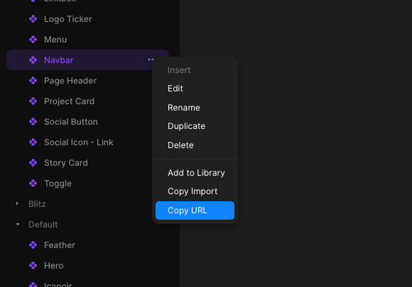
installable-framer.jsonfile like the following (the key will be used for the component folder insideoutDir){ "outDir": "./framer", "components": { "logos": "https://framer.com/m/Logo-Ticker-1CEq.js@YtVlixDzOkypVBs3Dpav", "menus": "https://framer.com/m/Mega-Menu-2wT3.js@W0zNsrcZ2WAwVuzt0BCl" } }Copy your framer component url and add it to your config (remove the part after
@to always use the latest version)
Run the command
npx installable-framerto download the components and their types in theoutDirdirectory- Import the component inside your
jsxfiles, for example
import Menu from './framer/menus'
import { FramerStyles } from 'installable-framer/dist/react'

export default function App() {
    return (
        <div>
            {/* Injects fonts and other framer utility styles */}
            <FramerStyles Components={[Menu]} />
            <Menu componentVariable='some variable' />
        </div>
    )
}
Using responsive variants
import Logos from './framer/logos'
import { FramerStyles } from 'installable-framer/dist/react'

export default function App() {
    return (
        <div>
            {/* Injects fonts and other framer utility styles */}
            <FramerStyles Components={[Logos]} />
            {/* Changes component variant based on breakpoint */}
            <Logos.Responsive
                variants={{
                    Desktop: 'Logo Ticker',
                    Tablet: 'Logo Ticker - M',
                    Mobile: 'Logo Ticker - M',
                }}
            />
        </div>
    )
}
Styling
You can use className or style props to style your components
Notice that you will often need to use !important to override styles already defined in framer like width and height
import Logos from './framer/logos'
import { FramerStyles } from 'installable-framer/dist/react'

export default function App() {
    return (
        <div>
            {/* Injects fonts and other framer utility styles */}
            <FramerStyles Components={[Logos]} />
            {/* Changes component variant based on breakpoint */}
            <Logos.responsive
                className='!w-full'
                variants={{
                    Desktop: 'Logo Ticker',
                    Tablet: 'Logo Ticker - M',
                    Mobile: 'Logo Ticker - M',
                }}
            />
        </div>
    )
}
Supported component props
installable-framer will add TypeScript definitions for your Framer components props and variables, some example variables you can use are:
variant, created when you use variants in Framer- functions, created when you use an
eventvariable in Framer - Any scalar variable like String, Number, Boolean, Date, etc
- Image variables (object with
src,srcSetandalt), created when you use animagevariable in Framer - Link strings, created when you make a link a variable in Framer
- Rich text, created when you use a
richTextvariable in Framer - Color, a string
- React component, created when you use a
componentvariable in Framer, for example in the Ticker component
Known limitations:
- Color styles (also known as tokens) can get out of sync with your Framer project, if this happen you will have to find the corresponding css variable (in the form of
--token-xxxx) in the component code and define it in your CSS, for example:
:root {
    --token-64603892-5c8b-477a-82d6-e795e75dd5dc: #0b5c96;
}
Example
Look at the nextjs-app folder for an example
2 years ago
2 years ago
2 years ago
2 years ago
3 years ago
3 years ago
3 years ago
3 years ago
3 years ago
3 years ago
3 years ago
3 years ago
3 years ago
3 years ago
3 years ago
3 years ago
3 years ago
3 years ago
3 years ago
3 years ago
3 years ago