iobroker.iqontrol v3.0.0

ioBroker.iqontrol
Tests:
| Linux/Mac/Windows: | Cross-Browser-Checking: |
|---|---|
 |  |
iQontrol adapter for ioBroker
Fast Web-App for Visualization.
© by dslraser:
© by muuulle:
© by peks-64:
Runs in any Browser. Easy to set up, although it's fully customizable and responsive.
This adapter uses Sentry libraries to automatically report exceptions and code errors to the developers. For more details and for information how to disable the error reporting see Sentry-Plugin Documentation! Sentry reporting is used starting with js-controller 3.0.
Credits
This adapter would not have been possible without the great work of @o0Shojo0o (https://github.com/o0Shojo0o), who developed former releases of this adapter.
How to report issues and feature requests
Ideally, please use GitHub issues for this, with the best method achieved by setting the adapter to Debug log mode (Instances -> Expert mode -> Column Log level). Then retrieve the logfile from disk via the 'log' ioBroker subdirectory, not from Admin, which will cut lines.
Video-Tutorial (German Language):
Add to Homescreen
You can save it as Web-App on Homescreen, and it looks and feels like a native app:
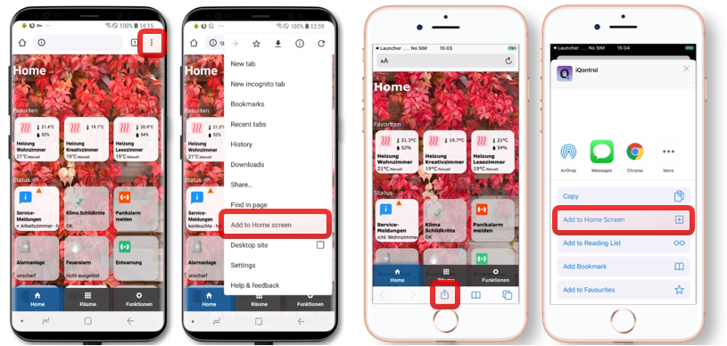
This also works on your PC with Chrome:
- Open iQontrol in Chrome
- Klick on the three-dots-menu - More tools - Create shortcut
- You will then find iQontrol in the start menu under chrome apps and can even add it to your taskbar
You need...
- Nodejs 10 or higher
Web-Adapter with one instance running the same protocol (http or https) as the admin-adapter, socket.IO set to 'integrated' and 'Force Web-Sockets' disabled
- If this stands in conflict to other adapters, simply add another instance with the above settings - iQontrol will search the best fitting web-adapter-instance and use it for communication For connecting over iobroker.pro-Cloud* both, admin- and web-adapter should be set to http (not https)
If you experience any problems, please have a look at the troubleshooting section at the end of this readme
Forum
Visit the Support-Thread iobroker forum. Visit the Developer-Thread iobroker forum.
Wiki
Have a look at the wiki wiki.
How to use
Don't be scared of the many options you have. Most things work right out of the box. You can, but you don't have to use all the configuration-possibilities iQontrol offers! Just start this way:
- Start creating views. You can consider views as something like a page.
- Then create devices on these views. Devices have a role, that determines the function of the device, which icons are used and so on. Depending on that role you can link several states to the device. These will give the device its functionality. If you select 'Link to other view' as role you can create links to other views. I suggest skinning Links to other views with the same Background, the linked view has. You can also try to use the Auto-create-Function to choose an existing device from the iobroker-object-tree. Auto-create tries to find out the role and to match as many states as possible.
- Afterwards you can create a toolbar, which is displayed as footer. Toolbar-Entries are links to views. The first Toolbar-Entry will be your 'Home-View' with will be loaded at start.
- To give everything a fancy style, you can upload your own images.
You can use your images as background-images for views, or for devices.
Images in the folder
/usericonscan be used as icons for devices. The free builtin demo-wallpapers are from www.pexels.com.
Use Auto-create
- You'll find a
Autocreate Views-Button inside theViews-Tab - If you have well maintained ioBroker enumerations like Rooms or Functions, you can use this function to automatically build Views with the devices listed inside this enumerations
- Keep in mind, because of the large numbers of different adapters and devices inside the ioBroker-universe, the auto-creation feature can not maintain all devices 100% correctly. You may need to rework some settings by hand to get the best results. But auto-create offers you a good starting point to build your own visualization in seconds.
URL-Parameters
- The frontend is called via
http[s]://<url or ip of iobroker>:<port of web adapter>/iqontrol/index.html<port of web adapter>is usually 8082
- To open a specified instance you can add
namespace=iqontrol.<instance-number>as URL-parameter - To open a specified view you can add
renderView=<viewID>as URL-parameter.<viewID>needs to be formatted likeiqontrol.<instance-number>.Views.<view-name>* Note: this is case-sensitive!
- To open a specified view as homepage you can add
home=<viewID>as URL-parameter. This will also change the linked view of the first toolbar entry!<viewID>needs to be formatted likeiqontrol.<instance-number>.Views.<view-name>* Note: this is case-sensitive!
- To open a specified dialog while loading the page you can add
openDialog=<deviceID>as URL-parameter<deviceID>needs to be formatted likeiqontrol.<instance-number>.Views.<view-name>.devices.<device-number>where<device-number>starts from 0 (so the first device on a view is device number 0) * Note: this is case-sensitive!
- To set or override return after time settings, use the following parameters:
returnAfterTimeTreshold=<time in seconds>to set the time, after which the destination view is called. Use0to disable return after time feature.returnAfterTimeDestiationView=<viewID>to set the view, which is called after the threshold. If not specified, the home view will be used. These options are helpful, if you call iQontrol from a wall mounted tablet, which should automatically return to home-view after being used
- To load the page without toolbar you can add
noToolbar=true - To load the page without panel you can add
noPanel=true - To load the page without toolbar and panel, swiping deactivated, no loading-spinner and with transparent loading-screen you can add
isBackgroundView=true - Normally iQontrol uses the language that is set in ioBroker. You can overwrite that by adding
language=<xx>*<xx>can bede,en,es,fr,it,nl,pl,pt,ruorzh-cn - If your iQontrol instance is password protected by a passphrase (see Options - Passphrase-Protection), you can submit the passphrase by adding `passphrase='
Example:
https://192.168.1.1:8082/iqontrol/index.html?namespace=iqontrol.1&home=iqontrol.1.Views.Living-Room- Note upper and lower case
Fonts
- You can upload your own font files in the Images/Widgets-Tab into the folder
/userfonts - In the Options-Tab you have several places where these fonts can be chosen
- It depends on your servers MIME-Settings, if the font is presented correctly to the browser - for me best worked .ttf and .woff (tested on a raspi 4b)
- These mime-settings should work:
.otf:
application/x-font-opentype.ttf:application/x-font-ttforapplication/x-font-truetype.woff:application/font-woff.woff2:application/font-woff2.eot:application/vnd.ms-fontobjectYou can convert fonts to other formats onfontsquirrel.comunder generator
- These mime-settings should work:
.otf:
- Keep in mind - webfonts are always a little tricky and not every font with every server and every browser will work
Icons and Background-Images
- You can use the inbuilt images or the images uploaded under the images tab or any free url you like
- You can also use a variable inside the image-url. This may be useful for example for weather-forecasts. Use this pattern:
path/to/firstloaded.png|anotherpath/to/{iobrokerstate|fallback}.png- Example:
./../iqontrol.meta/userimages/demo/bottle.jpg|./../iqontrol.meta/userimages/demo/{javascript.0.myimage|whitestone}.jpgThis loads./../iqontrol.meta/userimages/demo/bottle.jpgwhen you open the view As soon as the state ofjavascript.0.myimageis fetched from the server, the image will be replaced with./../iqontrol.meta/userimages/demo/XXX.jpgwhereXXXis the value ofjavascript.0.myimage* Ifjavascript.0.myimagehas no value the fallbackwhitestonewill be used (using the fallback is optional)
Progress Bars
- It is possible, to use SVG-Definitions in combination with variables instead of imagefiles to display progress-bars
- There are a vew templates integrated to chose from, but you can also create your own SVGs
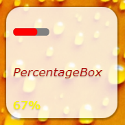
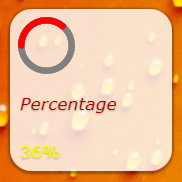
- See Wiki for further information
Charts
- You can add the ''FLOT Chart-Widget'' as BACKGROUND_URL of any device, which will automatically display the main state as a chart in the background of the device-tile
- You need to ensure that the state is logged and recorded by one of the history-adapters of ioBroker
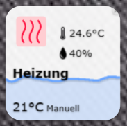
Device-Names
- Just like variables in image-urls you can use variables in device-names. The syntax is almost the same:
Text while loading|Text after loading {iobrokerstate|fallback}* Additionally, can put the iobroker state into square brackets, then the plain value without its unit will be used:Text while loading|Text after loading {[iobrokerstate]|fallback}- Example:
Weather is loading|Weather: {javascript.0.weather|No weather data found}This showsWeather is loadingwhen you open the view As soon as the state ofjavascript.0.weatheris fetched from the server, the text will be replaced byWeather: XXXwhereXXXis the value ofjavascript.0.weather* Ifjavascript.0.weatherhas no value the fallbackNo weather data foundwill be used (using the fallback is optional)
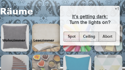
Popup-Messages
- Every instance creates the state
iqontrol.x.Popup.Message* When passing values to this state, a popup-message (or toast) will be displayed on all currently opened iQontrol frontends - Additionally every instance creates the state
iqontrol.x.Popup.PersistentMessageWhen passing values this state, the popup-message will be saved into the PERSISTENT_MESSAGES_PENDING-Array. Persistent messages will not be only displayed on all currently opened iQontrol frontends, but also on all in future opened instances until they are confimed (by click or duration) or they expire.PersistentExpiresdefines, when the persistent message expires as a UNIX-Timestamp (seconds from 1970-01-01 00:00:00). Values lower than 31536000 are interpreted as a duration in seconds from now (31536000 seconds = 1 year).PersistentUndismissibleboolean - If this is set to true, the persistent message will be kept even after it is closed. If you open a new iQontrol instance, it will be displayed again. Otherwise persistent messages are deleted after the popup closes (even by click or when the duration has elapsed).PersistentIdis an optional arbitrary expression that can be used to identify the message. The id can be used to delete corresponding popup messages by sending the id toPERSISTENT_MESSAGES_DELETE_ID. Sendingnullto this datapoint removes all pending messages. The id can also be used to display corresponding popup messages on all currently opened iQontrol-Instances again by sending the id toPERSISTENT_MESSAGES_SHOW_ID. Sendingnullto this datapoint shows all pending messages. Note: You can send a message to only one of the two data points "Message" or "PersistentMessage", not to both. - You can use html-tags to format the message text
- There are some additional states for further customization of the displayed popup (these must be set, before the message datapoint is set):
Duration: This is the time in ms the message is displayed; if set to 0 the message has to be confirmedClickedValueandClickedDestinationState: If the popup is clicked by user, the value fromClickedValuewill be sent toiqontrol.x.Popup.POPUP_CLICKEDand, if specified, additional to the datapoint inClickedDestinationState- If no value is specified,
truewill be usedClickKeepsOpenboolean - if true, the popup can only be closed by clicking on a button, klicking the popup itself will not close it. So make shure you add buttons to your popup-message, as described beneath.
- If no value is specified,
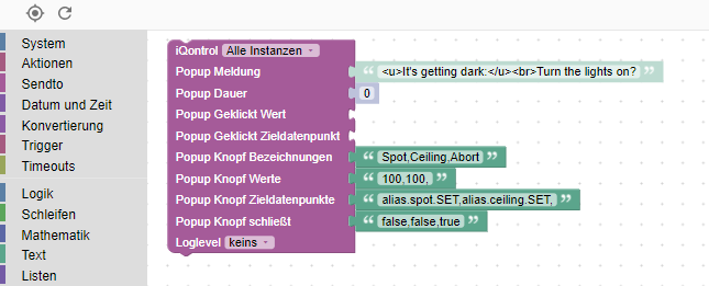
ButtonNames: Here you can specify a comma separated list of buttons, that will be displayed at the bottom of the popup (for example "OK,Abort")ButtonValuesandButtonDestinationStates: These are comma separated lists of values that will be sent toiqontrol.x.Popup.BUTTON_CLICKEDand, if specified, additional to the datapoint inButtonDestinationStates, if the user clickes the corresponding button Instead of a datapoint you can use the commandsCOMMAND:renderViewandCOMMAND:openDialogas a ButtonDestinationState, to render a view or open a dialog The ButtonValue then specifies the view resp. dialog and needs to be in the formatiqontrol.<instance-number>.Views.<view-name>resp.iqontrol.<instance-number>.Views.<view-name>.devices.<device-number>where<device-number>starts from 0 (so the first device on a view is device number 0) If you only use one value (instead of a comma separated list), this value will be used for all buttons If you leaveButtonValuesempty, the name of the button will be used * If you only use one destination state (instead of a comma separated list), this state will be used for all buttonsButtonCloses: This is a comma separated list of booleans (true/false) that specify, if the popup should be closed, when the corresponding button is pressedButtonClears: This is a comma separated list of booleans (true/false) that specify, if the popup settings should be cleared (= set all popup-states to empty), when the corresponding button is pressed
- Alternatively you can set these values via sendTo-command with the parameters
PopupMessage,PopupDuration,PopupClickedValueand so on- Example:
sendTo("iqontrol", "send", {PopupMessage: 'This is my message', PopupDuration: 2500, PopupClickedValue: 'messageConfirmed'});
- Example:
- You can also use blockly to send messages to iQontrol
Widgets
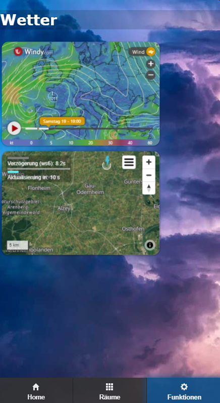
- Every tile has a BACKGROUND_URL and a BACKGROUND_HTML datapoint
- Here you can define a link (via BACKGROUND_URL) to a website or place direct HTML-Code (via BACKGROUND_HTML), that will be displayed as background of the tile
- This gives you the possibility to place (interactive) content inside a tile (like clocks, FLOT-charts, tables, weather-forecasts and so on)
- By default, mouse events will be directed to this content (thus you can't click the tile itself anymore), but you can disable this with the option "Direct mouse events to the tile instead to the content of BACKGROUND_VIEW/URL/HTML"
- iQontrol offers a device-role "Widget" which has some predefined options set that will be mostly used when showing a website as widget. But you can achieve the same result with any other role by modifying the devices options properly.
jQuery
- Technically the content of BACKGROUND_VIEW/URL/HTML is placed inside a HTML-Element called iframe, which is a website inside a website
- In order to use jQuery, you can transfer it from iQontrol to the iFrame with the following code:
window.$=window.jQuery=parent.jQuery.extend(function(s){return parent.jQuery(s,document)},parent.jQuery); - Example:
	```html
	<!doctype html>
	<html>
	<head>
		<meta http-equiv="Content-Type" content="text/html; charset=UTF-8"/>
		<meta name="widget-description" content="This is a demo widget-preset. It has no useful funcion. (C) by Sebastian Bormann"/>
		<meta name="widget-options" content="{'noZoomOnHover': 'true', 'hideDeviceName': 'true', 'sizeInactive': 'xwideIfInactive highIfInactive', 'iconNoPointerEventsInactive': 'true', 'hideDeviceNameIfInactive': 'true', 'hideStateIfInactive': 'true', 'sizeActive': 'fullWidthIfActive fullHeightIfActive', 'bigIconActive': 'true', 'iconNoPointerEventsActive': 'true', 'hideDeviceNameIfActive': 'true', 'hideStateIfActive': 'true', 'sizeEnlarged': 'fullWidthIfEnlarged fullHeightIfEnlarged', 'bigIconEnlarged': 'true', 'iconNoPointerEventsEnlarged': 'false', 'noOverlayEnlarged': 'true', 'hideDeviceNameIfEnlarged': 'true', 'hideStateIfEnlarged': 'true', 'popupAllowPostMessage': 'true', 'backgroundURLAllowPostMessage': 'true', 'backgroundURLNoPointerEvents': 'false'}"/>
		<title>iQontrol Widget Test</title>
	</head>
	<body>
		<div id="testDiv">Loading...</div>
		<script type="text/javascript">
			console.log("JQUERY-TEST");
			window.$=window.jQuery=parent.jQuery.extend(function(s){return parent.jQuery(s,document)},parent.jQuery);
			$(document).ready(function(){
				$('#testDiv').html("<h1>Hello World</h1)");
				console.log("jQuery works!!");
			});
		</script>
	</body>
	</html>
	```
postMessage-Communication
- By enabling the option "Allow postMessage-Communication for BACKGROUND_VIEW/URL/HTML" you can enable postMessage-Communication between the widget in its iframe and iQontrol itself
- To send commands to iQontrol you can use the following javascript-command:
window.parent.postMessage(message, "*");messageis a javascript object of the format{ command: command, stateId: stateId, value: value }- The following message-commands are supported:
{ command: "setWidgetState", stateId: <widgetStateId>, value: <value> }* This will set the ioBroker stateiqontrol.<instance>.Widgets.<widgetStateId>to the value<value>(<value>can be a string, number or boolean or an object like{ val: <value>, ack: true|false }){ command: "getWidgetState", stateId: <widgetStateId> }* This will cause iQontrol to send the value of the ioBroker stateiqontrol.<instance>.Widgets.<widgetStateId>(see below how to receive the answer-message){ command: "getWidgetStateSubscribed", stateId: <widgetStateId> }* This will cause iQontrol to send the value of the ioBroker stateiqontrol.<instance>.Widgets.<widgetStateId>now and every time its value changes (see below how to receive the answer-messages){ command: "setWidgetDeviceState", stateId: <widgetDeviceState>, value: <value> }* This will set the ioBroker datapoint that is assigned to the devices STATE<widgetDeviceState>(for example the datapoint, that is assigned to LEVEL) to the value<value>(<value>can be a string, number or boolean or an object like{ val: <value>, ack: true|false }){ command: "getWidgetDeviceState", stateId: <widgetDeviceState> }* This will cause iQontrol to send the value of the ioBroker datapoint, that is assigned to the devices STATE<widgetDeviceState>(for example the datapoint, that is assigned to LEVEL; see below how to receive the answer-message){ command: "getWidgetDeviceStateSubscribed", stateId: <widgetDeviceState> }* This will cause iQontrol to send the value of the ioBroker datapoint, that is assigned to the devices STATE<widgetDeviceState>(for example the datapoint, that is assigned to LEVEL) now and every time its value changes (see below how to receive the answer-message){ command: "setState", stateId: <stateId>, value: <value> }* This will set the ioBroker state<stateId>to the value<value>(<value>can be a string, number or boolean or an object like{ val: <value>, ack: true|false }){ command: "getState", stateId: <stateId> }* This will cause iQontrol to send the value of the ioBroker state<stateId>(see below how to receive the answer-message){ command: "getStateSubscribed", stateId: <stateId> }* This will cause iQontrol to send the value of the ioBroker state<stateId>now and every time its value changes (see below how to receive the answer-messages){ command: "getOptions"}* This will cause iQontrol to send the user options the user has configured as object{ command: "renderView", value: <viewID> }* This will instruct iQontrol to render a view, where<viewID>needs to be formatted likeiqontrol.<instance-number>.Views.<view-name>(case-sensitive){ command: "openDialog", value: <deviceID> }* This will instruct iQontrol to open a dialog, where<deviceID>needs to be formatted likeiqontrol.<instance-number>.Views.<view-name>.devices.<device-number>where<device-number>starts from 0 (so the first device on a view is device number 0)
- To receive messages from iQontrol, you need to register an event-listener to the "message"-event with the javascript-command
window.addEventListener("message", receivePostMessage, false);- The function
receivePostMessagereceives the objecteventevent.datacontains the message from iqontrol, which will be an object like: event.data ={ command: "getState", stateId: <stateId>, value: <stateObject> }- this will be the answer to agetState-command or agetStateSubscribed-command and gives you the actual<value>-object of the ioBroker state<stateId>*<stateObject>itself is an object like``` event.data.value = { val: <value (rounded)>, unit: "<unit>", valFull: <value (not rounded, no javascript-injection prevention)>, plainText: "<clear text of val, for example taken from valuelist>", min: <minimum>, max: <maximum>, step: <step-width>, valuelist: {<object with possible values and corresponding clear text>}, targetValues: {<target value list>}, ack: <true|false>, readonly: <true|false>, custom: {<object with custom settings>}, id: <id of the iobroker datapoint>, from: "<source of state>", lc: <timestamp of last change>, ts: <timestamp of last actualization>, q: <quality of signal>, role: "<role of state>", type: "<string|number|boolean>", name: "<name of datapoint>", desc: "<description of datapoint>", Date: <Date-object (only present, if value is regognized as a valid time or period)> } ```
- The function
- To instruct iQontrol to generate a widgetState under
iqontrol.<instance>.Widgetsyou can use a meta-tag inside the head-section of the widget-website:- Syntax:
<meta name="widget-datapoint" content="WidgetName.StateName" data-type="string" data-role="text" /> - You can further configure the datapoint by using data-type (which can be set to string, number or boolean), data-role, data-name, data-min, data-max, data-def and data-unit attributes
- You can also use a URL-parameter (see below) as a variable, for example to create distinct instances of the widgets with own data points.
- The Syntax is then:
``` - If the variable
instanceis set, then the part after the|will be used as widgetState-Name and{instance}will be replaced by the value ofinstance - If the variable
instanceis not set, then the part before the|will be used aswigdetState-Name
- The Syntax is then:
- The corresponding datapoint is only then created, if the widget-website is added to a device as URL or BACKGROUND_URL
- Syntax:
- The same concept may be used for the URL/HTML-State, which is used to display a website inside the dialog of a device
- To create an icon for your widget place a .png file with the same filename as the widget into the widgets directory
- See below for an example widget-website:
- You can use the following HTML code and copy it to the BACKGROUND_HTML-State of a widget (which then needs to be configured as "Constant")
- As an alternative you can upload this code as html-file into the
/userwidgetssubdirectory and reference it to BACKGROUND_URL-State (which then also needs to be configured as "Constant") - Activate the option "Allow postMessage-Communication for BACKGROUND_VIEW/URL/HTML"
- It will demonstrate how a two-way communication between the website and iQontrol is done
<!doctype html>
<html>
<head>
	<meta http-equiv="Content-Type" content="text/html; charset=UTF-8"/>
	<meta name="widget-datapoint" content="postMessageTest.test" data-type="string" data-role="text" />
	<meta name="widget-description" content="This is a test widget. To get the WidgetDeviceState-Functions working, please set a valid iobroker-datapoint for STATE. (C) by Sebastian Bormann"/>
	<meta name="widget-urlparameters" content="title/postMessageTest/Please enter a title">
	<meta name="widget-options" content="{'noZoomOnHover': 'true', 'hideDeviceName': 'true', 'sizeInactive': 'xwideIfInactive highIfInactive', 'iconNoPointerEventsInactive': 'true', 'hideDeviceNameIfInactive': 'true', 'hideStateIfInactive': 'true', 'sizeActive': 'xwideIfActive highIfActive', 'bigIconActive': 'true', 'iconNoPointerEventsActive': 'true', 'hideDeviceNameIfActive': 'true', 'hideStateIfActive': 'true', 'sizeEnlarged': 'fullWidthIfEnlarged fullHeightIfEnlarged', 'bigIconEnlarged': 'true', 'iconNoPointerEventsEnlarged': 'false', 'noOverlayEnlarged': 'true', 'hideDeviceNameIfEnlarged': 'true', 'hideStateIfEnlarged': 'true', 'popupAllowPostMessage': 'true', 'backgroundURLAllowPostMessage': 'true', 'backgroundURLNoPointerEvents': 'false'}"/>
 	<title>iQontrol postMessageTest</title>
</head>
<body>
	<br><br>
	<h3><span id="title">postMessageTest</span><h3>
	<button onclick="getWidgetState('postMessageTest.test')">getWidgetState postMessageTest.test</button><br>
	<button onclick="getWidgetStateSubscribed('postMessageTest.test')">getWidgetStateSubscribed postMessageTest.test</button><br>
	<button onclick="setWidgetState('postMessageTest.test', 'Hello world')">setWidgetState postMessageTest.test to 'Hello world'</button><br>
  	<br>
	<button onclick="getWidgetDeviceState('STATE')">getWidgetDeviceState STATE</button><br>
	<button onclick="getWidgetDeviceStateSubscribed('STATE')">getWidgetDeviceStateSubscribed STATE</button><br>
	<button onclick="setWidgetDeviceState('STATE', 'Hello world')">setWidgetDeviceState STATE to 'Hello world'</button><br>
  	<br>
	<button onclick="getState('system.adapter.admin.0.cpu')">getState system.adapter.admin.0.cpu</button><br>
	<button onclick="getStateSubscribed('system.adapter.admin.0.uptime')">getStateSubscribed system.adapter.admin.0.uptime</button><br>
	<button onclick="setState('iqontrol.0.Popup.Message', 'Hey, this is a test Message')">setState popup message</button><br>
  	<br>
	<button onclick="renderView('iqontrol.0.Views.Home')">renderView 'Home'</button><br>
	<button onclick="openDialog('iqontrol.0.Views.Home.devices.0')">openDialog 1st device on 'Home'</button><br>
	<br><hr>
	message sent: <span id="messageSent">-</span><br>
	<br><hr>
	message received: <span id="messageReceived">-</span><br>
	<br><hr>
	this means: <span id="thisMeans">-</span><br>
	<br><hr>
    <script type="text/javascript">
		var countSend = 0;
		var countReceived = 0;

		//Set title from UrlParameter
		document.getElementById('title').innerHTML = getUrlParameter('title') || "No Title set";

		//getWidgetState
		function getWidgetState(stateId){
			sendPostMessage("getWidgetState", stateId);
		}

		//getWidgetStateSubscribed (this means, everytime the state changes, an update will be received)
		function getWidgetStateSubscribed(stateId){
			sendPostMessage("getWidgetStateSubscribed", stateId);
		}

		//setWidgetState
		function setWidgetState(stateId, value){
			sendPostMessage("setWidgetState", stateId, value);
		}


		//getWidgetDeviceState
		function getWidgetDeviceState(stateId){
			sendPostMessage("getWidgetDeviceState", stateId);
		}

		//getWidgetDeviceStateSubscribed (this means, everytime the state changes, an update will be received)
		function getWidgetDeviceStateSubscribed(stateId){
			sendPostMessage("getWidgetDeviceStateSubscribed", stateId);
		}

		//setWidgetDeviceState
		function setWidgetDeviceState(stateId, value){
			sendPostMessage("setWidgetDeviceState", stateId, value);
		}


		//getState
		function getState(stateId){
			sendPostMessage("getState", stateId);
		}

		//getStateSubscribed (this means, everytime the state changes, an update will be received)
		function getStateSubscribed(stateId){
			sendPostMessage("getStateSubscribed", stateId);
		}

		//setState
		function setState(stateId, value){
			sendPostMessage("setState", stateId, value);
		}


		//renderView
		function renderView(viewId){
			sendPostMessage("renderView", null, viewId);
		}

		//openDialog
		function openDialog(deviceId){
			sendPostMessage("openDialog", null, deviceId);
		}

		// +++++ Default Functions +++++
		//getUrlParameter
		function getUrlParameter(name) {
			name = name.replace(/[\[]/, '\\[').replace(/[\]]/, '\\]');
			var regex = new RegExp('[\\?&]' + name + '=([^&#]*)');
			var results = regex.exec(location.search);
			return results === null ? null : decodeURIComponent(results[1].replace(/\+/g, ' '));
		};

		//send postMessages
		function sendPostMessage(command, stateId, value){
			countSend++;
			message = { command: command, stateId: stateId, value: value };
			document.getElementById('messageSent').innerHTML = countSend + " - " + JSON.stringify(message);
			window.parent.postMessage(message, "*");
		}

		//receive postMessages
		window.addEventListener("message", receivePostMessage, false);
		function receivePostMessage(event) { //event = {data: message data, origin: URL of origin, source: id of sending element}
			countReceived++;
			if(event.data) document.getElementById('messageReceived').innerHTML = countReceived + " - " + JSON.stringify(event.data);
			if(event.data && event.data.command) switch(event.data.command){
				case "getState":
				if(event.data.stateId && event.data.value && event.data.value.val){
					document.getElementById('thisMeans').innerHTML = "Got State " + event.data.stateId + " with value " + event.data.value.val;
				}
				break;
			}
		}
	</script>
</body>
</html>
Further configuration of widgets
There are additional meta-tags, you can use inside the head-section of your widget-website to configure the behavior of the widget:
widget-descriptionsyntax:``` <meta name="widget-description" content="Please see www.mywebsite.com for further informations. (C) by me"/> ``` * The content will be displayed when choosing the widget as URL or BACKGROUND_URL or if you auto-create a widget * `widget-urlparameters` * syntax: ``` <meta name="widget-urlparameters" content="parameter/default value/description/type;parameter2/default value2/description2/type2"/> ``` * The user will be asked for these parameters when choosing the widget as URL or BACKGROUND_URL or auto-creates a widget * `type` is optional and may be `text` (this is default), `number`, `checkbox`, `color`, `select`, `multipleSelect`, `combobox`, `historyInstance`, `datapoint`, `listJsonDatapoint`, `icon`, `fontFamily`, `fontSize`, `fontStyle`, `fontWeight`, `language`, `section`, `divider`, `info`, `link` or `hidden` * If type is `select`, `multipleSelect` or `combobox` then you need to specify the possible options by adding `/<selectOptions>`, where `<selectOptions>` is a string of the format `<value1>,<caption1>/<value2>,<caption2>/...` (combobox is a selectbox with the possibility to enter free text) * If type is `number` then can specify min, max and step-width by adding `/<numberOptions>`, where `<numberOptions>` is a string of the format `<min>,<max>,<step>` * The types `section`, `divider`, `info` and `link` have no further function, they are just to display information to the user. For `link` the value should be a URL, but all slashes have to be replaced by backslashes. * Type `hidden` will be passed to the widget, but no configuration dialog is shown * All these parameters will be given to the widget-website via a URL-parameter-string (like `widget.html?parameter=value¶meter2=value2`) * You can use these settings inside your widget-website by requesting the URL-parameters with a function like this: ``` function getUrlParameter(name) { name = name.replace(/[\[]/, '\\[').replace(/[\]]/, '\\]'); var regex = new RegExp('[\\?&]' + name + '=([^&#]*)'); var results = regex.exec(location.search); return results === null ? null : decodeURIComponent(results[1].replace(/\+/g, ' ')); }; ``` * If you used type `icon` for your URL-parameter then you will get either a path relative to the iqontrol-directory or an absolute path to an image. To create a valid link to your image you can use this code: ``` var iconOn = getUrlParameter('iconOn') || './images/icons/switch_on.png'; if(iconOn.indexOf('http') != 0) iconOn = '/iqontrol/' + iconOn; ``` * `widget-options` * syntax: ``` <meta name="widget-options" content="{'noZoomOnHover': 'true', 'hideDeviceName': 'true'}"/> ``` * See the expandable section below for the possible options that can be configured by this meta-tag * `widget-replaceurl` * syntax: ``` <meta name="widget-replaceurl" content="<url>" data-absolute="<true|false>"/> ``` * This reconfigures the used URL/BACKGROUND_URL for this widget (this way you could define widget-presets, that are used to give special or simplified configurations to the user. But when calling the widget, iQontrol uses the given `<url>` instead of the original URL. * By default, only the filename (with extension) is replaced. When setting `data-absolute=`true`` then the whole URL is replaced.
- Icons:
icon_on(Icon on): Default: ""icon_off(Icon off): Default: "" - Device Specific Options:
showState(Show State) - only valid for role Button and Program: Possible values:true|falseDefault:falseshowPowerAsState:(Show POWER as state) - only valid for role Switch, Light and Fan: Possible values:true|falseDefault:falsebuttonCaption(Caption for button) - only valid for role Button: Default: ""returnToOffSetValueAfter(Return to 'OFF_SET_VALUE' after ms) - only valid for role Button: Possible values: number from 10 to 60000 Default: ""alwaysSendTrue(Always send 'true' (do not toggle)) - only valid for role Scene: Possible values:true|falseDefault:falsecloseDialogAfterExecution(Close dialog after execution) - only valid for role Button, Program and Scene: Possible values:true|falseDefault:falseinvertCt(Invert CT (use Kelvin instead of Mired)) - only valid for role Light: Possible values:true|falseDefault:falsealternativeColorspace(Colorspace for ALTERNATIVE_COLORSPACE_VALUE") - only valid for role Light: Possible values: ""|"RGB"|"#RGB"|"RGBW"|"#RGBW"|"RGBWWCW"|"#RGBWWCW"|"RGBCWWW"|"#RGBCWWW"|"RGB_HUEONLY"|"#RGB_HUEONLY"|"HUE_MILIGHT"|"HHSSBB_TUYA" Default: ""linkOverlayActiveColorToHue(Use color of lamp as OVERLAY_ACTIVE_COLOR) - only valid for role Light: Possible values:true|falseDefault:falselinkGlowActiveColorToHue(Use color of lamp as GLOW_ACTIVE_COLOR) - only valid for role Light: Possible values:true|falseDefault:falsecontrolModeDisabledValue(Value of CONTROL_MODE for 'disabled') - only valid for role Thermostat, Homematic-Thermostat and Homematic IP-Thermostat: Default: ""valveStatesSectionType(Appereance of VALVE_STATES) - only valid for role Thermostat, Homematic-Thermostat and Homematic IP-Thermostat: Possible values:true|falsenone|none noCaption|collapsible|collapsible openDefault: "collapsible"stateClosedValue(Value of STATE for 'closed') - only valid for role Window and Door with Lock: Default: ""stateOpenedValue(Value of STATE for 'opened') - only valid for role Window: Default: ""stateTiltedValue(Value of STATE for 'tilted') - only valid for role Window: Default: ""lockStateLockedValue(Value of LOCK_STATE for 'locked') - only valid for role Door with Lock: Default: ""lockOpenValue(Value of LOCK_OPEN for 'open door') - only valid for role Door with Lock: Default: ""invertActuatorLevel(Invert LEVEL (0 = open)) - only valid for role Blind: Possible values:true|falseDefault:falsedirectionOpeningValue(Value of DIRECTION for 'opening') - only valid for role Window: Default: "1"directionClosingValue(Value of DIRECTION for 'closing') - only valid for role Window: Default: "2"directionUncertainValue(Value of DIRECTION for 'uncertain') - only valid for role Window: Default: "3"favoritePositionCaption(Caption for FAVORITE_POSITION) - only valid for role Window: Default: "Favorite Position"stopCaption(Caption for STOP) - only valid for role Window: Default: "Stop"upCaption(Caption for UP) - only valid for role Window: Default: "Down"downCaption(Caption for DOWN) - only valid for role Window: Default: "Down"noConfirmationForTogglingViaIcon(Don't ask for confirmation when toggling via icon) - only valid for role Garage Door: Default: "false" Possible values:true|falsecontrolModeDisarmedValue(Value of CONTROL_MODE for 'disarmed') - only valid for role Alarm: Default: "0"showStateAndLevelSeparatelyInTile(Show STATE and LEVEL separately in tile) - only valid for role Value: Possible values: ""|"devidedByComma"|"devidedByComma preceedCaptions"|"devidedBySemicolon"|"devidedBySemicolon preceedCaptions"|"devidedByHyphen"|"devidedByHyphen preceedCaptions" Default: ""timeCaption(Caption for TIME) - only valid for role DateAndTime: Default: ""timeFormat(Format of TIME (as stored in the datapoint, see readme)) - only valid for role DateAndTime: Default: "x"timeDisplayFormat(Display-Format of TIME (how it should be displayed, see readme)) - only valid for role DateAndTime: Default: "dddd, DD.MM.YYYY HH:mm:ss"timeDisplayDontShowDistance(Show Distance) - only valid for role DateAndTime: Possible values: ""|false|trueDefault: "" (this means, use custom datapoint settings)dateAndTimeTileActiveConditions(Tile is active when all selected items are true) - only valid for role DateAndTime: Possible values (array): "activeIfStateActive", "activeIfTimeNotZero", "activeIfTimeInFuture", "activeIfTimeInPast" Default: "activeIfStateActive,activeIfTimeInFuture"dateAndTimeTileActiveWhenRinging(Tile is always active when RINGING is active) - only valid for role DateAndTime: Default: truedateAndTimeShowInState(Show in state) - only valid for role DateAndTime: Possible values (array): "showStateIfInactive", "showStateIfActive", "showSubjectIfActive", "showSubjectIfInactive", "showTimeIfInactiveAndInPast", "showTimeIfInactiveAndInFuture", "showTimeIfActiveAndInPast", "showTimeIfActiveAndInFuture", "showTimeDistanceIfInactiveAndInPast", "showTimeDistanceIfInactiveAndInFuture", "showTimeDistanceIfActiveAndInPast", "showTimeDistanceIfActiveAndInFuture" Default: "showStateIfInactive,showSubjectIfActive,showTimeDistanceIfActiveAndInFuture"coverImageReloadDelay(Delay reload of cover-image ms) - only valid for role Media: Possible values: number from 0 to 5000 Default: ""coverImageNoReloadOnTitleChange:(No forced reload of cover-image on change of TITLE) - only valid for role Media: Possible values:true|falseDefault:falsestatePlayValue(Value of STATE for 'play') - only valid for role Media: Default: "play"statePauseValue(Value of STATE for 'pause') - only valid for role Media: Default: "pause"stateStopValue(Value of STATE for 'stop') - only valid for role Media: Default: "stop"useStateValuesForPlayPauseStop(Send these values (instead of true) when clicking on PLAY, PAUSE and STOP) - only valid for role Media: Possible values:true|falseDefault: "false"hidePlayOverlay(Hide play icon) - only valid for role Media: Possible values:true|falseDefault:falsehidePauseAndStopOverlay(Hide pause and stop icon) - only valid for role Media: Possible values:true|falseDefault:falserepeatOffValue(Value of REPEAT for 'off') - only valid for role Media: Default:falserepeatAllValue(Value of REPEAT for 'repeat all') - only valid for role Media: Default:truerepeatOneValue(Value of REPEAT for 'repeat one') - only valid for role Media: Default: "2"remoteKeepSectionsOpen(Keep sections open) - only valid for role Media: Possible values:true|falseDefault:falseremoteSectionsStartOpened(Start with these sections initially opened) - only valid for role Media: Possible values: array with "REMOTE_PAD", "REMOTE_CONTROL", "REMOTE_ADDITIONAL_BUTTONS", "REMOTE_CHANNELS", "REMOTE_NUMBERS" and/or "REMOTE_COLORS" Default:falseremoteShowDirectionsInsidePad(Show Vol and Ch +/- inside Pad) - only valid for role Media: Possible values:true|falseDefault:falseremoteChannelsCaption(Caption for section 'Channels') - only valid for role Media: Default: ""remoteAdditionalButtonsCaption(Caption for section 'Additional Buttons') - only valid for role Media: Default: ""togglePowerSwitch(Toggle POWER_SWITCH instead of STATE (for example when clicking on icon)) - only valid for role Media: Possible values:true|falseDefault:falsenoVirtualState(Do not use a virtual datapoint for STATE (hide switch, if STATE is empty)) - only valid for role Widget: Possible values:true|falseDefault:false - General:
readonly(Readonly): Possible values:true|falseDefault:falserenderLinkedViewInParentInstance(Open linked view in parent instance, if this view is used as a BACKGROUND_VIEW): Possible values:true|falseDefault:falserenderLinkedViewInParentInstanceClosesPanel(After opening linked view in parent instance, close panel (if it is dismissible)): Possible values:true|false* Default:false - Tile-Behaviour (general):
clickOnIconAction(Click on Icon Action): Possible values: "toggle"|"openDialog"|"enlarge"|"openLinkToOtherView"|"openURLExternal"|falseDefault: "toggle"clickOnTileAction(Click on Tile Action): Possible values: "toggle"|"openDialog"|"enlarge"|"openLinkToOtherView"|"openURLExternal"|falseDefault: "openDialog"clickOnIconOpensDialog(Click on icon opens dialog (instead of toggling)): deprecated since this option is now included in clickOnIconAction Possible values:true|falseDefault:falseclickOnTileToggles(Click on tile toggles (instead of opening dialog))): deprecated since this option is now included in clickOnTileAction Possible values:true|falseDefault:falseclickOnTileOpensDialog(Click on tile opens dialog): deprecated since this option is now included in clickOnTileAction Possible values:true|falseDefault:true(for most devices)noZoomOnHover(Disable zoom-effect on hover): Possible values:true|falseDefault:false(for most devices)iconNoZoomOnHover(Disable zoom-effect on hover for icon): Possible values:true|falseDefault:falsehideDeviceName(Hide device name): Possible values:true|false* Default:true - Conditions for an Active Tile:
tileActiveStateId(State ID (empty = STATE/LEVEL will be used)): Default: ""tileActiveCondition(Condition): Possible values: ""|"at"|"af"|"eqt"|"eqf"|"eq"|"ne"|"gt"|"ge"|"lt"|"le" Default: ""tileActiveConditionValue(Condition value): * Default: "" - Tile-Behaviour if device is inactive:
sizeInactive(Size of tile, if device is inactive): Possible values: ""|"narrowIfInactive shortIfInactive"|"narrowIfInactive"|"narrowIfInactive highIfInactive"|"narrowIfInactive xhighIfInactive"|"shortIfInactive"|"shortIfInactive wideIfInactive"|"shortIfInactive xwideIfInactive"|"wideIfInactive"|"xwideIfInactive"|"highIfInactive"|"xhighIfInactive"|"wideIfInactive highIfInactive"|"xwideIfInactive highIfInactive"|"wideIfInactive xhighIfInactive"|"xwideIfInactive xhighIfInactive"|"fullWidthIfInactive aspect-1-1IfInactive"|"fullWidthIfInactive aspect-4-3IfInactive"|"fullWidthIfInactive aspect-3-2IfInactive"|"fullWidthIfInactive aspect-16-9IfInactive"|"fullWidthIfInactive aspect-21-9IfInactive"|"fullWidthIfInactive fullHeightIfInactive"|" Default: "xwideIfInactive highIfInactive"stateHeightAdaptsContentInactive(Adapt height of STATE to its content (this overwrites the tile size, if needed), if the device is inactive): Possible values:true|falseDefault:falsestateFillsDeviceInactive(Size of STATE fills the complete device (this may interfere with other content), if the device is inactive): Possible values:true|falseDefault:falsestateBigFontInactive(Use big font for STATE, if the device is inactive): Possible values:true|falseDefault:falsebigIconInactive(Show big icon, if device is inactive): Possible values:true|falseDefault:falseiconNoPointerEventsInactive(Ignore mouse events for the icon, if device is inactive): Possible values:true|falseDefault:falsetransparentIfInactive(Make background transparent, if device is inactive): Possible values:true|falseDefault:falsenoOverlayInactive(Remove overlay of tile, if device is inactive): Possible values:true|falseDefault:truehideBackgroundURLInactive(Hide background from BACKGROUND_VIEW/URL/HTML, if device is inactive): Possible values:true|falseDefault:falsehideDeviceNameIfInactive(Hide device name, if the device is inactive): Possible values:true|falseDefault:falsehideInfoAIfInactive(Hide INFO_A, if the device is inactive): Possible values:true|falseDefault:falsehideInfoBIfInactive(Hide INFO_B, if the device is inactive): Possible values:true|falseDefault:falsehideIndicatorIfInactive(Hide Indicator Icons (ERROR, UNREACH, BATTERY), if the device is inactive): Possible values:true|falseDefault:falsehideStateIfInactive(Hide state, if the device is inactive): Possible values:true|falseDefault:falsehideDeviceIfInactive(Hide device, if it is inactive): Possible values:true|falseDefault:false` - Tile-Behaviour if device is active:
sizeActive(Size of tile, if device is active): Possible values: ""|"narrowIfActive shortIfActive"|"narrowIfActive"|"narrowIfActive highIfActive"|"narrowIfActive xhighIfActive"|"shortIfActive"|"shortIfActive wideIfActive"|"shortIfActive xwideIfActive"|"wideIfActive"|"xwideIfActive"|"highIfActive"|"xhighIfActive"|"wideIfActive highIfActive"|"xwideIfActive highIfActive"|"wideIfActive xhighIfActive"|"xwideIfActive xhighIfActive"|"fullWidthIfActive aspect-1-1IfActive"|"fullWidthIfActive aspect-4-3IfActive"|"fullWidthIfActive aspect-3-2IfActive"|"fullWidthIfActive aspect-16-9IfActive"|"fullWidthIfActive aspect-21-9IfActive"|"fullWidthIfActive fullHeightIfActive"|"stateHeightAdaptsContentActive(Adapt height of STATE to its content (this overwrites the tile size, if needed), if the device is inactive): Possible values:true|falseDefault:falsestateFillsDeviceActive(Size of STATE fills the complete device (this may interfere with other content), if the device is inactive): Possible values:true|falseDefault:falsestateBigFontActive(Use big font for STATE, if the device is active): Possible values:true|falseDefault:falsebigIconActive(Show big icon, if device is active): Possible values:true|falseDefault:falseiconNoPointerEventsActive(Ignore mouse events for the icon, if device is active): Possible values:true|falseDefault:falsetransparentIfActive(Make background transparent, if device is active): Possible values:true|falseDefault:falsenoOverlayActive(Remove overlay of tile, if device is active): Possible values:true|falseDefault:truehideBackgroundURLActive(Hide background from BACKGROUND_VIEW/URL/HTML, if device is active): Possible values:true|falseDefault:falsehideDeviceNameIfActive(Hide device name, if the device is active): Possible values:true|falseDefault:falsehideInfoAIfActive(Hide INFO_A, if the device is active): Possible values:true|falseDefault:falsehideInfoBIfActive(Hide INFO_B, if the device is active): Possible values:true|falseDefault:falsehideIndicatorIfActive(Hide Indicator Icons (ERROR, UNREACH, BATTERY), if the device is active): Possible values:true|falseDefault:falsehideStateIfActive(Hide state, if the device is active): Possible values:true|falseDefault:falsehideDeviceIfActive(Hide device, if it is active): Possible values:true|falseDefault:false - Tile-Behaviour if device is enlarged:
sizeEnlarged(Size of tile, if device is enlarged): Possible values: ""|"narrowIfEnlarged shortIfEnlarged"|"narrowIfEnlarged"|"narrowIfEnlarged highIfEnlarged"|"narrowIfEnlarged xhighIfEnlarged"|"shortIfEnlarged"|"shortIfEnlarged wideIfEnlarged"|"shortIfEnlarged xwideIfEnlarged"|"wideIfEnlarged"|"xwideIfEnlarged"|"highIfEnlarged"|"xhighIfEnlarged"|"wideIfEnlarged highIfEnlarged"|"xwideIfEnlarged highIfEnlarged"|"wideIfEnlarged xhighIfEnlarged"|"xwideIfEnlarged xhighIfEnlarged"|"fullWidthIfEnlarged aspect-1-1IfEnlarged"|"fullWidthIfEnlarged aspect-4-3IfEnlarged"|"fullWidthIfEnlarged aspect-3-2IfEnlarged"|"fullWidthIfEnlarged aspect-16-9IfEnlarged"|"fullWidthIfEnlarged aspect-21-9IfEnlarged"|"fullWidthIfEnlarged fullHeightIfEnlarged"|"stateHeightAdaptsContentEnlarged(Adapt height of STATE to its content (this overwrites the tile size, if needed), if the device is inactive): Possible values:true|falseDefault:falsestateFillsDeviceInactiveEnlarged(Size of STATE fills the complete device (this may interfere with other content), if the device is inactive): Possible values:true|falseDefault:falsestateBigFontEnlarged(Use big font for STATE, if the device is enlarged): Possible values:true|falseDefault:falsebigIconEnlarged(Show big icon, if device is enlarged): Possible values:true|falseDefault:trueiconNoPointerEventsEnlarged(Ignore mouse events for the icon, if device is enlarged): Possible values:true|falseDefault:falsetransparentIfEnlarged(Make background transparent, if device is enlarged): Possible values:true|falseDefault:falsenoOverlayEnlarged(Remove overlay of tile, if device is enlarged): Possible values:true|falseDefault:falsetileEnlargeStartEnlarged(Tile is enlarged on start): Possible values:true|falseDefault:falsetileEnlargeShowButtonInactive(Show Enlarge-Button, if device is inactive): Possible values:true|falseDefault:truetileEnlargeShowButtonActive(Show Enlarge-Button, if device is active): Possible values:true|falseDefault:truetileEnlargeShowInPressureMenuInactive(Show Enlarge in Menu, if device is inactive): Possible values:true|falseDefault:truetileEnlargeShowInPressureMenuActive(Show Enlarge in Menu, if device is active) Possible values:true|falseDefault:truevisibilityBackgroundURLEnlarged(Visibility of background from BACKGROUND_VIEW/URL/HTML, if device is enlarged): Possible values: ""|"visibleIfEnlarged"|"hideIfEnlarged" Default: ""hideDeviceNameIfEnlarged(Hide device name, if the device is enlarged): Possible values:true|falseDefault:falsehideInfoAIfEnlarged(Hide INFO_A, if the device is enlarged): Possible values:true|falseDefault:falsehideInfoBIfEnlarged(Hide INFO_B, if the device is enlarged): Possible values:true|falseDefault:falsehideIndicatorIfEnlarged(Hide Indicator Icons (ERROR, UNREACH, BATTERY), if the device is enlarged): Possible values:true|falseDefault:falsehideStateIfEnlarged(Hide state, if the device is enlarged): Possible values:true|falseDefault:falsehideIconEnlarged(Hide icon, if device is enlarged): Possible values:true|false* Default:false - Timestamp:
stateCaption(Caption of STATE): Default: ""levelCaption(Caption of LEVEL): Default: ""levelFavorites(Favorite values for LEVEL (semicolon separated list of numbers)): Default: ""levelFavoritesHideSlider(Hide slider for LEVEL, if Favorite values are set): Possible values:true|falseDefault:falsehideStateAndLevelInDialog(Hide STATE and LEVEL in dialog): Possible values:true|falseDefault:falseaddTimestampToState(Add timestamp to state): Possible values: ""|"SA"|"ST"|"STA"|"SE"|"SEA"|"SE."|"SE.A"|"Se"|"SeA"|"STE"|"STEA"|"STE."|"STE.A"|"STe"|"STeA"|"T"|"TA"|"TE"|"TEA"|"TE."|"TE.A"|"Te"|"TeA"|"E"|"EA"|"E."|"E.A"|"e"|"eA"|"N" Default: "N"showTimestamp(Show Timestamp in dialog): Possible values: ""|"yes"|"no"|"always"|"never" Default: "" - INFO A/B:
infoARoundDigits(Round INFO_A to this number of digits): Possible values: 0-10 Default: "1"infoBRoundDigits(Round INFO_B to this number of digits): Possible values: 0-10 Default: "1"infoAShowName(Show Name of INFO_A): Possible values:true|falseDefault:falseinfoBShowName(Show Name of INFO_B): Possible values:true|falseDefault:false - BATTERY Empty Icon:
batteryActiveCondition(Condition): Possible values: ""|"at"|"af"|"eqt"|"eqf"|"eq"|"ne"|"gt"|"ge"|"lt"|"le" Default: ""batteryActiveConditionValue(Condition value): * Default: "" - UNREACH Icon:
invertUnreach(Invert UNREACH (use connected instead of unreach)): Possible values:true|falseDefault:falsehideUnreachIfInactive(Hide (resp. ignore) UNREACH, if the device is inactive): Possible values:true|falseDefault:false - ERROR Icon:
invertError(Invert ERROR (use ok instead of error)): Possible values:true|false* Default:false - BACKGROUND_VIEW/URL/HTML:
adjustHeightToBackgroundView(Adjust height of device tile to the size of BACKGROUND_VIEW): Possible values:true|falseDefault:falsebackgroundURLAllowAdjustHeight(Allow widget in BACKGROUND_URL to adjust height of device tile): Possible values:true|falseDefault:falsebackgroundLimitAdjustHeightToScreen(Limit adjustment of height to screen size): Possible values:true|falseDefault:falsebackgroundURLDynamicIframeZoom(Dynamic zoom for BACKGROUND_VIEW/URL/HTML (this is the zoom-level in % that would be needed, to let the content fit into a single 1x1 tile)): Possible values: number from 0.01 to 200 Default: ""backgroundURLPadding(Apply padding to BACKGROUND_VIEW/URL/HTML): Possible values: number from 0 to 50 pixel Default: ""backgroundURLAllowPostMessage(Allow postMessage-Communication for BACKGROUND_VIEW/URL/HTML): Possible values:true|falseDefault:falsebackgroundURLNoPointerEvents(Direct mouse events to the tile instead to the content of BACKGROUND_VIEW/URL/HTML): Possible values:true|falseDefault:falseoverlayAboveBackgroundURL(Position Overlay above BACKGROUND_VIEW/URL/HTML): Possible values:true|falseDefault:false - BADGE:
badgeWithoutUnit(Show badge value without unit): Possible values:true|falseDefault:falseshowBadgeIfZero(Show badge even if value is zero): Possible values:true|falseDefault:false - GLOW:
invertGlowHide(Invert GLOW_HIDE): Possible values:true|false* Default:false - URL/HTML:
popupWidth(Width px for URL/HTML-Box): Default: ""popupHeight(Height px for URL/HTML-Box): Default: ""popupFixed(Fixed (not resizable)): Possible values:true|falseDefault:falseopenURLExternal(Open URL in new window (instead of showing as box in dialog)): Possible values:true|falseDefault:falseopenURLExternalCaption(Caption for Button to open URL in new window): Default: ""popupAllowPostMessage(Allow postMessage-Communication for URL/HTML): Possible values:true|false* Default:false - ADDITIONAL_CONTROLS:
additionalControlsSectionType(Appearance of ADDITIONAL_CONTROLS): Possible values: "none"|"collapsible"|"collapsible open" Default: "collapsible"additionalControlsCaption(Caption for ADDITIONAL_CONTROLS): Default: "Additional Controls"additionalControlsHeadingType(Appearance of ADDITIONAL_CONTROLS Headings): Possible values: "none"|"collapsible"|"collapsible open" Default: "collapsible"additionalControlsHideNameForButtons(Hide Name (with Icon) for Buttons (use caption only)): Possible values:true|false* Default:false - ADDITIONAL_INFO:
additionalInfoSectionType(Appearance of ADDITIONAL_INFO): Possible values: "none"|"collapsible"|"collapsible open" Default: "collapsible"additionalInfoCaption(Caption for ADDITIONAL_INFO): Default: "Additional Infos"additionalInfoListType(List type of ADDITIONAL_INFO): Possible values: ""|plainDefault: ""additionalInfoListColumnCount(Split the list into this number of columns): Possible values:auto|1|2|3|4|5|6Default:autoadditionalInfoListColumnWidth(Do not go below this column width px): Possible values: 0-1200 Default: ""
- You can upload the following HTML code as html-file into the
/userwidgetssubdirectory and reference it to BACKGROUND_URL-State (which then needs to be configured as "Constant") - When adding the widget a description is displayed
- Then you are asked if you would like to apply the contained options
- Three data points are created to control the position of the map:
iqontrol.x.Widgets.Map.Posision.latitude,.altitudeand.zoom
<!doctype html>
<html style="width: 100%; height: 100%; margin: 0;">
<head>
<meta http-equiv="Content-Type" content="text/html; charset=UTF-8"/>
<meta name="widget-description" content="This is a map widget, please provide coordinates at iqontrol.x.Widgets.Map.Posision. (C) by Sebastian Bormann"/>
<meta name="widget-options" content="{'noZoomOnHover': 'true', 'hideDeviceName': 'true', 'sizeInactive': 'xwideIfInactive highIfInactive', 'iconNoPointerEventsInactive': 'true', 'hideDeviceNameIfInactive': 'true', 'hideStateIfInactive': 'true', 'sizeActive': 'fullWidthIfActive fullHeightIfActive', 'bigIconActive': 'true', 'iconNoPointerEventsActive': 'true', 'hideDeviceNameIfActive': 'true', 'hideStateIfActive': 'true', 'sizeEnlarged': 'fullWidthIfEnlarged fullHeightIfEnlarged', 'bigIconEnlarged': 'true', 'iconNoPointerEventsEnlarged': 'false', 'noOverlayEnlarged': 'true', 'hideDeviceNameIfEnlarged': 'true', 'hideStateIfEnlarged': 'true', 'popupAllowPostMessage': 'true', 'backgroundURLAllowPostMessage': 'true', 'backgroundURLNoPointerEvents': 'false'}"/>
<meta name="widget-datapoint" content="Map.Position.latitude" data-type="number" data-role="value.gps.latitude" />
<meta name="widget-datapoint" content="Map.Position.longitude" data-type="number" data-role="value.gps.longitude" />
<meta name="widget-datapoint" content="Map.Position.zoom" data-type="number" data-role="value.zoom" />
<link rel="stylesheet" href="https://unpkg.com/leaflet@1.7.1/dist/leaflet.css" integrity="sha512-xodZBNTC5n17Xt2atTPuE1HxjVMSvLVW9ocqUKLsCC5CXdbqCmblAshOMAS6/keqq/sMZMZ19scR4PsZChSR7A==" crossorigin=""/>
<script src="https://unpkg.com/leaflet@1.7.1/dist/leaflet.js" integrity="sha512-XQoYMqMTK8LvdxXYG3nZ448hOEQiglfqkJs1NOQV44cWnUrBc8PkAOcXy20w0vlaXaVUearIOBhiXZ5V3ynxwA==" crossorigin=""></script>
<title>Simple iQontrol Map Widget</title>
</head>
<body style="width: 100%; height: 100%; margin: 0px;">
<div id="mapid" style="width: 100%; height: 100%; margin: 0px;"></div>
<script type="text/javascript">
//Declarations
var mapPositionLatitude;
var mapPositionLongitude;
var mapPositionZoom;
var mymap = false;
//Subscribe to WidgetDatapoints now
sendPostMessage("getWidgetStateSubscribed", "Map.Position.latitude");
sendPostMessage("getWidgetStateSubscribed", "Map.Position.longitude");
sendPostMessage("getWidgetStateSubscribed", "Map.Position.zoom");
//Initialize map (if all three parameters mapPositionLatitude, mapPositionLongitude and mapPositionZoom were received)
if(mapPositionLatitude != null && mapPositionLongitude != null && mapPositionZoom != null){
console.log("Init map: " + mapPositionLatitude + "|" + mapPositionLongitude + "|" + mapPositionZoom);
mymap = L.map('mapid').setView([mapPositionLatitude, mapPositionLongitude], mapPositionZoom);
L.tileLayer('https://{s}.tile.openstreetmap.org/{z}/{x}/{y}.png', {
'attribution': 'Kartendaten © <a href="https://www.openstreetmap.org/copyright">OpenStreetMap</a> Mitwirkende',
'useCache': true
}).addTo(mymap);
}
//Reposition map
function repositionMap(){
console.log("Reposition map: " + mapPositionLatitude + "|" + mapPositionLongitude + "|" + mapPositionZoom);
if(mymap) mymap.setView([mapPositionLatitude, mapPositionLongitude], mapPositionZoom); else console.log(" Abort, map not initialized yet");
}
//send postMessages
function sendPostMessage(command, stateI1 year ago
1 year ago
2 years ago
3 years ago
3 years ago
4 years ago
4 years ago
4 years ago
4 years ago
4 years ago
4 years ago
4 years ago
4 years ago
4 years ago
4 years ago
4 years ago
4 years ago
4 years ago
4 years ago
4 years ago
4 years ago
4 years ago
4 years ago
4 years ago
4 years ago
4 years ago
4 years ago
4 years ago
4 years ago
4 years ago
4 years ago
4 years ago
4 years ago
4 years ago
4 years ago
4 years ago
5 years ago
5 years ago
5 years ago
5 years ago
5 years ago
5 years ago
5 years ago
5 years ago
5 years ago
5 years ago
5 years ago
5 years ago
5 years ago
5 years ago
5 years ago
5 years ago
5 years ago
5 years ago
5 years ago
5 years ago
5 years ago
5 years ago
5 years ago
5 years ago
5 years ago
5 years ago
5 years ago
5 years ago
5 years ago
5 years ago
5 years ago
5 years ago
5 years ago
5 years ago
5 years ago
5 years ago
5 years ago
5 years ago
5 years ago
5 years ago
5 years ago
5 years ago
5 years ago
5 years ago
5 years ago
5 years ago
5 years ago
5 years ago
5 years ago
5 years ago
5 years ago
5 years ago
5 years ago
5 years ago
6 years ago
6 years ago
6 years ago
6 years ago
6 years ago
6 years ago
6 years ago
6 years ago
6 years ago
6 years ago
6 years ago
6 years ago
6 years ago
6 years ago
6 years ago
6 years ago
6 years ago
6 years ago
6 years ago
6 years ago
6 years ago
6 years ago
6 years ago
6 years ago
6 years ago
6 years ago
6 years ago
6 years ago
6 years ago
6 years ago
6 years ago
6 years ago
6 years ago
6 years ago
6 years ago
6 years ago
6 years ago
6 years ago
6 years ago
6 years ago
6 years ago
6 years ago
6 years ago
6 years ago
6 years ago
6 years ago
6 years ago
6 years ago
6 years ago
6 years ago
6 years ago
6 years ago
6 years ago
6 years ago
6 years ago
6 years ago
6 years ago
6 years ago
6 years ago
6 years ago
6 years ago
6 years ago
6 years ago
6 years ago
6 years ago
6 years ago
6 years ago
7 years ago
7 years ago
7 years ago
7 years ago
7 years ago
7 years ago
7 years ago
7 years ago
7 years ago
7 years ago
7 years ago
7 years ago
7 years ago
7 years ago
7 years ago
7 years ago
7 years ago
7 years ago
7 years ago
7 years ago
7 years ago
7 years ago
7 years ago
7 years ago
7 years ago
7 years ago
7 years ago
7 years ago
7 years ago


