jsinputmoduls v1.0.0
JsInputModuls
js module adding a circular indicator.
Usage
Base
import {circleInput} from 'JsModuls' // import library
const test = document.getElementById("test-div") // getting the dom-element.
const circle = circleInput(test, 300, 300)- the first argument is the container where the component will be placed.
- the second argument is the width of the component.
- the third argument is the height of the component.
Line
The returned object has a getLine method.
const line1 = circle.getLine(0)The method takes a line number and returns an object. The line object has fields:
- color - accepts a string as a hexadecimal color code.
- value - accepts a number, by default from 0 to 100.
line1.color = "#00f"
line1.value = 70
Methods linc
A link method that accepts a function to which it passes the indicator value. works with type="range".
line1.linc((data)=>{

})
Example
import {circleInput} from 'JsModuls'

const test = document.getElementById("test-div")
const circle = circleInput(test, 300, 300)

const line1 = circle.getLine(0)
line1.value = 50
line1.color = "#0ff"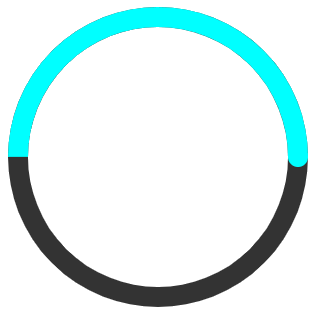
Advanced
The function circleInput takes an object as the fourth parameter.
const circle = circleInput(test, 300, 300,{})object fields:
margin
margin is the distance in pixels from the circle's border to the container's border.
padding
padding is the distance in pixels between the circles.
x, y
the x, y parameters define the center of the circle relative to the container's borders.
circles
circles - accepts an array of objects. each object is a circle and has the following fields:
type
if you pass the string "range" to this argument, then the indicator can be moved as an inputtype=range. the line object has a link method that works in this mode.
Example
const circle = circleInput(test, 300, 300,{circles:[
  {
    type:"range"
  }
]})
style
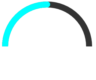
the style field has 3 values.
| circle | semicircle | brokenСircle |
|---|---|---|
 |  | 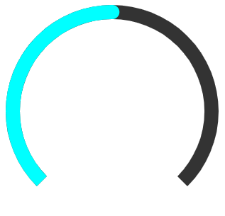 |
Example for brokencircle
const circle = circleInput(test, 300, 300,{circles:[
  {
    style: "brokenСircle"
  }
]})
Min, Max
set the maximum and minimum values.
const circle = circleInput(test, 300, 300,{circles:[
  {
    max: 100,
    min: -100
  }
]})
Radius
sets the radius.
const circle = circleInput(test, 300, 300,{circles:[
  {
    radius: 50
  }
]})
backCircle, indicator, point
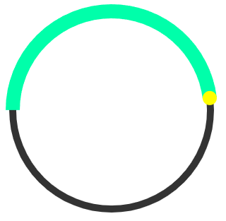
backCircle - sets the back line. indicator - sets the fill line. point - sets the point at the start of the fill line.
These objects have the following fields:
- color
- width - width line
- delete - if set to "true" removes the element.
Examples
const circle = circleInput(test, 300, 300,{circles:[
  {
    type: "range",
    indicator: {
      color: "#0fa"
    },
    point: {
      color: "#ff0"
    },
    backCircle: {
      width: 10
    }
  }
]})
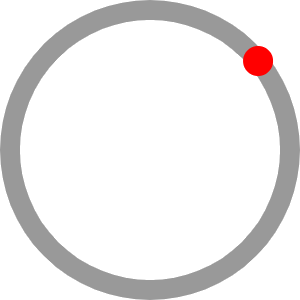
const circle = circleInput(test, 300, 300,{circles:[
  {
    type: "range",
    indicator: {
      delete: true
    },
    point: {
      color: "#ff0",
      width: 30
    },
    backCircle: {
      color: "#aaa"
    }
  }
]})
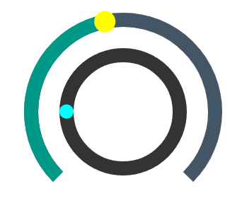
const circle = circleInput(test,400,300,{margin: 5, padding:30, circles:[
  {
    type:"range",
    style: "brokenСircle",
    min:0,
    max:140,
    backCircle:{
      color: "#456",
      width: 20
    },
    indicator:{
      color:"#098",
      width:20
    },
    point:{
      color:"#ff0",
      width:30,
    }
  }
  ,{
    type:"indicator",
    style: "circle",
    min:0,
    max:200,
    indicator:{
      color:"#008",
      width:20
    },
    point:{
      color:"#0ff"
    }
  }
]})
4 years ago