jugger-alert v1.2.1
Jugger Alert - React Native Package
Jugger Alert is a customizable and reusable modal component for React Native Expo applications. It provides an easy way to display alerts and confirmation dialogs with various customization options.
Project Demo Video
Getting Started
To use this library, You can install Jugger Alert using npm or yarn:
npm install jugger-alertor
yarn add jugger-alertKey Features
Modularity: Jugger Alert provides a standalone and reusable modal component, enabling you to effortlessly incorporate alerts throughout your application.
Customization: Customize the appearance and behavior of the modal to match your app's design and user experience requirements.
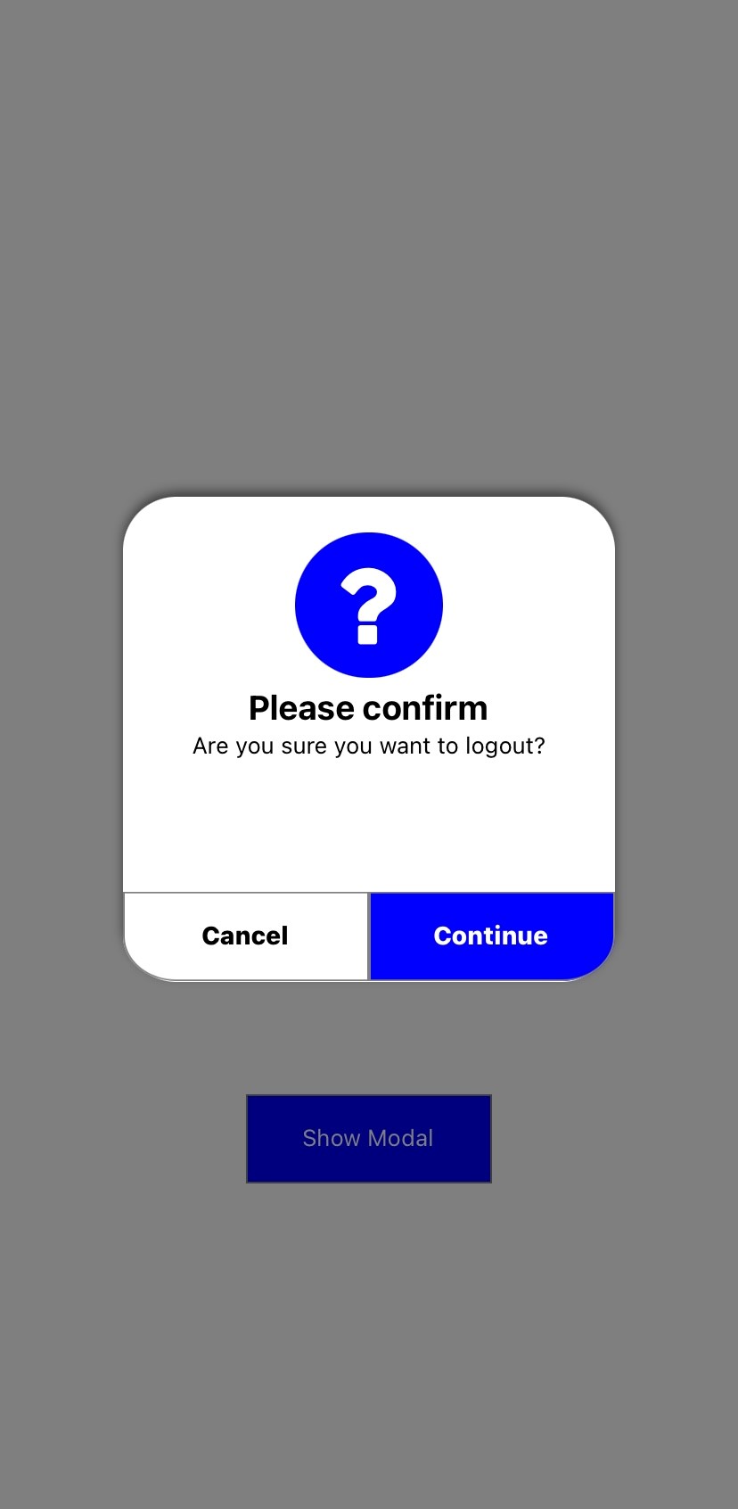
Icon Variety: Choose from different icon options including a question mark, checkmark, thumbs-up, and a "sorry" symbol to suit the context of the alert.
Responsive Design: Jugger Alert is designed to work seamlessly on various screen sizes and orientations.
User Interaction: Users can confirm or cancel actions with the provided buttons, helping prevent accidental actions.
Easy Integration: Integrate Jugger Alert into your app's flow by simply toggling the modal's visibility and handling the continue action.
Props
| Property | Type | Description | Default Value |
|---|---|---|---|
alertVisible | boolean | Determines if the modal is visible. | false |
setAlertVisible | function | Control the visibility of the modal. | |
onContinue | function | Callback when "Continue" is pressed. | |
title | string | The title of the modal. | |
message | string | The message displayed in the modal. | |
juggerColor | string | Background color of the modal. | "blue" |
firstButton | string | Label for the first button. | "Cancel" |
secondButton | string | Label for the second button. | "Continue" |
titleStyle | string | Styling for the title. | "Style" |
messageStyle | string | Styling for the message. | "Style" |
Usage
Import JuggerAlert in your component and use it within your app:
import React, { useState } from 'react';
import { View, Text, TouchableOpacity, StyleSheet, Dimensions } from 'react-native';
import JuggerAlert from 'jugger-alert';

const { width, height } = Dimensions.get('window');

export default function App() {
const [modalVisible, setModalVisible] = useState(false);

const handleContinue = () => {
 console.log("Continue button pressed");
};

return (
 <View style={styles.container}>
   <JuggerAlert
     alertVisible={modalVisible}
     setAlertVisible={setModalVisible}
     onContinue={handleContinue}
     question
     title="Please confirm"
     message="Are you sure you want to logout?"
     juggerColor="blue"
   />
   <View style={styles.buttonContainer}>
     <TouchableOpacity
       style={styles.button}
       onPress={() => setModalVisible(true)}>
       <Text style={styles.textStyle}>Show Modal</Text>
     </TouchableOpacity>
   </View>
 </View>
)
}

const styles = StyleSheet.create({
container: {
 flex: 1,
 justifyContent: 'center',
 alignItems: 'center',
},
buttonContainer: {
 flex: 1,
 justifyContent: 'center',
 alignItems: 'center',
},
button: {
 borderWidth: 1,
 borderColor: 'gray',
 backgroundColor: 'blue',
 height: height / 18,
 width: width / 3,
 justifyContent: 'center',
 alignItems: 'center',
},
textStyle: {
 color: 'white',
},
});
Improvement
If you're interested in enhancing the library by creating additional features, feel free to create an issue and outline the specific improvements you have in mind.
License
Licensed under the MIT.

