lc-color-picker v2.0.0
Pure javascript color picker by LCweb
Long story short: needing a compact solution to insert a standard colorpicker with gradient support in LCweb WordPress plugins, didn't find anything really satisfactory. So I decided to build my own solution in pure javascript aiming to create the most compact and flexible plugin I could for modern web apps.

Top features list:
- sigle 34KB file, no dependencies, 100% pure javascript
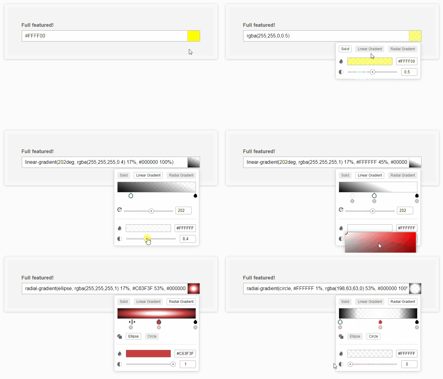
- supports solid color and/on linear gradient and/or radial gradient
- unlimited gradient color steps support
- optional transparency support
- light/dark theme
- adjustable in-field preview
- mobile ready
- multilanguage ready
Tested on all mordern browsers (don't ask for old IE support please) For live demos check: https://lcweb.it/lc-color-picker-javascript-plugin
Installation & Usage
include lc_color_picker.min.js
initialize plugin targeting one/multiple text fields
<script type="text/javascript>
new lc_color_picker('input');
</script>
Seamless Integration Notes
By default, the plugin will wrap targeted fields with an inline-block DIV. However if you are using percentage sizes on inputs, their sizes could be corrupted. In this case you have two options:
enable the copy_input_width parameter (NB: static width)
edit your CSS targeting the the plugin's wrap element, applying sizes also to it. The CSS selector is .lccp-el-wrap
Options
Here are listed available options with default values
<script type="text/javascript>
new lc_color_picker('input', {

    // (array) containing supported modes (solid | linear-gradient | radial-gradient)
    modes : ['solid', 'linear-gradient', 'radial-gradient'],

    // (bool) whether to allow colors transparency tune
    transparency : true,

    // (bool) whether to open the picker when field is focused
    open_on_focus : true,

    // (bool) whether to enable dark picker theme
    dark_theme : false,

    // (bool) whether to stretch the trigger in order to cover the whole input field
    no_input_mode : false,

    // (string) defines the wrapper width. "auto" to leave it up to CSS, "inherit" to statically copy input field width, or any other CSS sizing
    wrap_width : 'auto',

    // (object) defining shape and position of the in-field preview
    preview_style : {
        input_padding   : 35, // extra px padding eventually added to the target input to not cover text
        side            : 'right', // right or left
        width           : 30,
        separator_color : '#ccc', // (string) CSS color applird to preview element as separator
    },

    // (array) defining default colors used when trigger field has no value. First parameter for solid color, second for gradient
    fallback_colors : ['#008080', 'linear-gradient(90deg, #fff 0%, #000 100%)'],

    // (function) triggered every time field value changes. Passes value and target field object as parameters
    on_change : null, // function(new_value, target_field) {},

    // (array) option used to translate script texts
    labels          : [
        'click to change color',
        'Solid',
        'Linear Gradient',
        'Radial Gradient',
        'add gradient step',
        'gradient angle',
        'gradient shape',
        'color',
        'opacity',
    ],
});
</script>
Copyright © Luca Montanari - LCweb