0.2.4 • Published 3 years ago
leolegrandm-simple-dialog v0.2.4

⚛️ leolegrandm-simple-dialog's example
leolegrandm-simple-dialog is a React, reusable component published on npm that anyone can use. The goal of this project was to understand how component publishing on npm works and learn how to document components that can be used by anyone.
Installation
npm install leolegrandm-simple-dialogImport & Usage
Import the Dialog component on your application like that
import Dialog from 'leolegrandm-simple-dialog/dist/components/Dialog
Call the Dialog component like that
<Dialog/>
Here are the parameters available for this component and how to use them
- modal : To use pre-created modals, use strings with the words "errors", "'cookies" or "success". To use a custom modal, pass an object that has the following properties: 'title', 'icon', 'altText', 'content', 'cta' and put the props allowCustomization to true.
- closeIcon : A boolean, the cross icon will appear or not depending on true or false.
- callToAction : A boolean, the call-to-action button will appear or not depending on true or false.
- allowCustomization : A boolean, if set to true, you can pass your own object in the modalType props.
- callToActionCallback : The function that is called when you press the call-to-action button & cross icon.
leolegrandm-simple-dialog is documented with JSdocs, use it freely in order to have more information on the methods of using the component, props and good practice
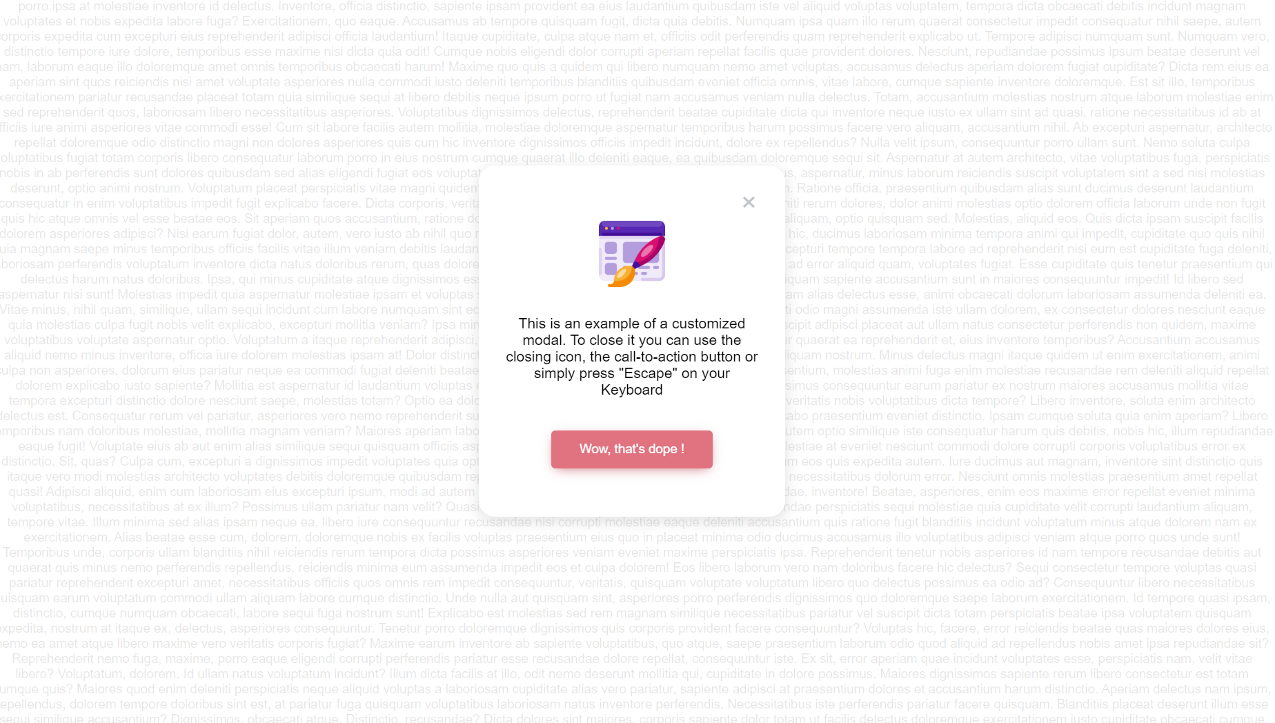
An example is worth a thousand words
import Dialog from 'leolegrandm-simple-dialog/dist/components/Dialog
import webDesign from './web-design.png'

function App() {

  const myModal = {
    title: 'error',
    icon: webDesign,
    altText: 'web design image',
    content:
      'This is an example of a customized modal. To close it you can use the closing icon, the call-to-action button or simply press "Escape" on your Keyboard ',
    cta: "Wow, that's dope !",
  }

  const handleExample = () => {
    console.log('handleExample has been called')
  }

  return (
      <Dialog
        modal={myModal}
        callToAction={true}
        closeIcon={true}
        allowCustomization={true}
        callToActionCallback={handleExample}
      />
  )
}