linelay

Linelay is a utility library on flex layout with multidiretional capabilities that saves more space than usual grid systems.
Installation
Npm
npm install --save linelayor
CDN
https://cdn.rawgit.com/melanke/linelay/master/linelay.min.cssor
Download
Samples
- Complete example with classes on HTML
- The same example but using @include on Scss
- Golden Ratio!
- Browse our codepen collection or click on the images in samples below.
Using with Sass
- If you import
linelay.scssyou will have only the variables, extensions and mixins. - If you import
defaultBuild.scssyou will have the classes too. (RECOMENDED) - If you want to customize the sizes you can import
builder.scssand calllinelayBuildinclude, checkdefaultBuild.scsscode as an example - EXTRA: You can generate Classes by colors if you import
builder.scssordefaultBuild.scssand calllinelayColors, checkcolorSample.scss
Docs
- Orientation
- Sizing
- Margin
- Padding
- Self Alignment
- Items Alignment
- Text Utils
- Font Utils
- Image Utils
- Scroll
- Above the surface
- Sizing
- Breakpoints
- Apply for all children
- Classes by colors
- Force a style
Orientation
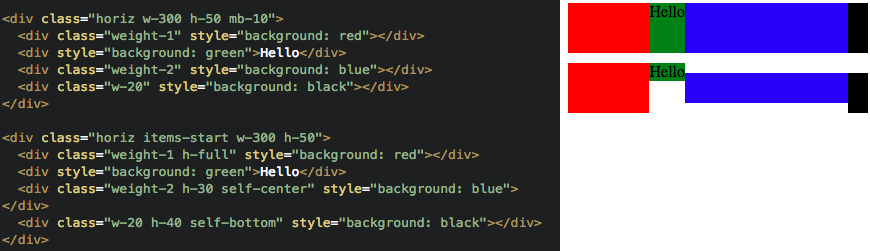
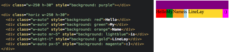
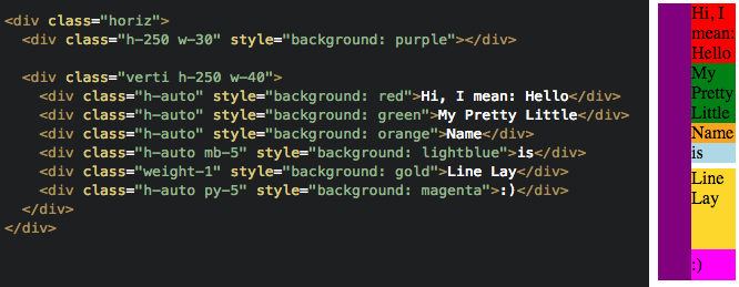
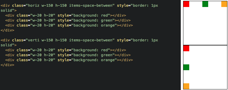
You are able to control your rows the same way you control your columns, make use of it using nested elements with different orientations.
.horiz
Elements inside it will be organized horizontally, like columns.
With Sass you can use @include horiz() or @include horiz($mediaquery)
Click to explore
.verti
Elements inside it will be organized vertically, like rows.
With Sass you can use @include verti() or @include verti($mediaquery)

Click to explore
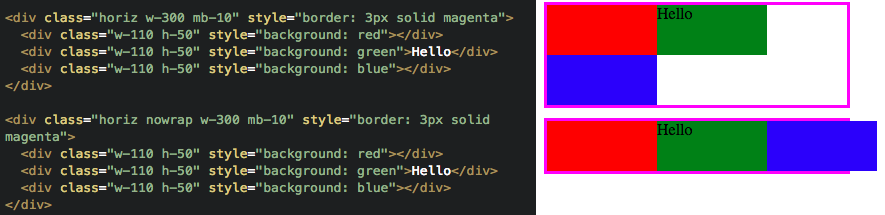
.nowrap
The .horiz has flex-wrap: wrap by default, it means it will break the line when needed. You can disable this behaviour with .nowrap
With Sass you can use @include nowrap() or @include nowrap($mediaquery)
Click to explore
Sizing
You can define fixed or dynamic sizes.
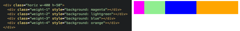
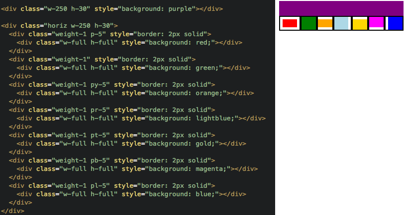
.weight-{number}
Controls the weight of the element compared to it's siblings. Siblings with same weight will occupy the remaining space of it's parent equaly, a weight-2 will occupy twice the space of a weight-1.
With Sass you can use @include weight($number) or @include weight($number, $mediaquery)
Click to explore
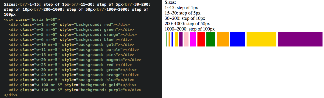
.w-{number}
The element will have a fixed width, w-25 will have width: 25px everytime, this doesn't count on weight sum, so elements that use weight will have to use other space.
With Sass you can use width: {number}px, @include w($number) or @include w($number, $mediaquery)
Click to explore
.h-{number}
The element will have a fixed height, h-25 will have height: 25px everytime, this doesn't count on weight sum, so elements that use weight will have to use other space.
With Sass you can use height: {number}px, @include h($number) or @include h($number, $mediaquery)
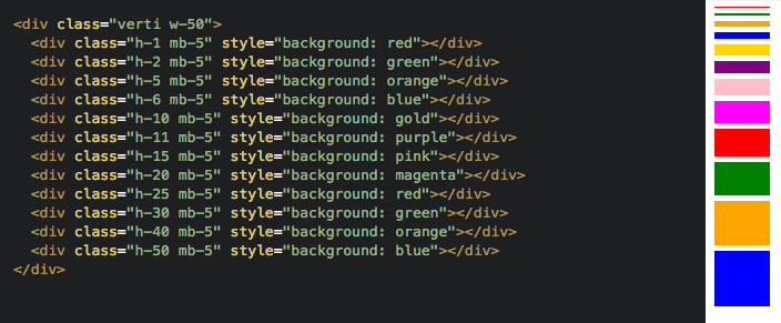
Click to explore
.w-auto
The element will use as many space it needs.
With Sass you can use @include w-auto() or @include w-auto($mediaquery)
Click to explore
.h-auto
The element will use as many space it needs.
With Sass you can use @include h-auto() or @include h-auto($mediaquery)
Click to explore
.w-window
The element will have the browser window's width. You can also use .min-w-window.
With Sass you can use width: 100vw, @include w-window() or @include w-window($mediaquery)
Click to explore
.h-window
The element will have the browser window's height. You can also use .min-h-window.
With Sass you can use height: 100vh, @include h-window() or @include h-window($mediaquery)

Click to explore
.w-full
width: 100%, usually this is not necessary, but in specific cases will be useful (with .truncate maybe).
With Sass you can use width: 100%, @include w-full() or @include w-full($mediaquery)
.h-full
height: 100%, usually this is not necessary, but in specific cases will be useful.
With Sass you can use height: 100%, @include h-full() or @include h-full($mediaquery)
.max-w-{number}
Defines the max width.
With Sass you can use max-width: {number}px, @include max-w($number) or @include max-w($number, $mediaquery)

Click to explore
.max-h-{number}
Defines the max height.
With Sass you can use max-height: {number}px, @include max-h($number) or @include max-h($number, $mediaquery)
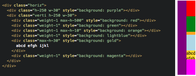
Click to explore
.min-w-{number}
Defines the min width. You can also use .min-w-window.
With Sass you can use min-width: {number}px, @include min-w($number) or @include min-w($number, $mediaquery)
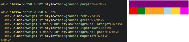
Click to explore
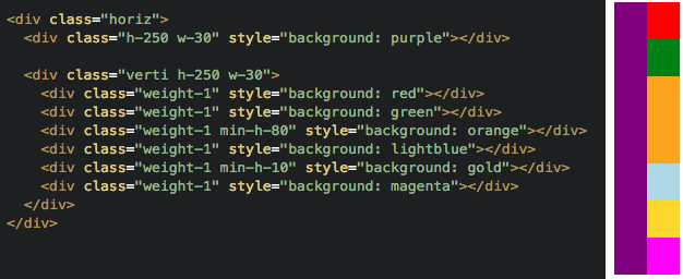
.min-h-{number}
Defines the min height. You can also use .min-h-window.
With Sass you can use min-height: {number}px, @include min-h($number) or @include min-h($number, $mediaquery)
Click to explore
Margin
Margin's can take too much space sometimes, so we define it with fixed values. Weight sum will not count it, like any other fixed value.
Click to explore
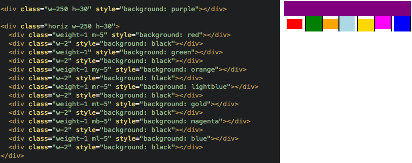
.m-{number}
Defines the margin of all sides.
With Sass you can use margin: {number}px, @include m($number) or @include m($number, $mediaquery)
.mx-{number}
Defines the left and right margin.
With Sass you can use @include mx($number) or @include mx($number, $mediaquery)
.my-{number}
Defines the top and bottom margin.
With Sass you can use @include my($number) or @include my($number, $mediaquery)
.mt-{number}
Defines the top margin.
With Sass you can use margin-top: {number}px, @include mt($number) or @include mt($number, $mediaquery)
.mr-{number}
Defines the right margin.
With Sass you can use margin-right: {number}px, @include mr($number) or @include mr($number, $mediaquery)
.mb-{number}
Defines the bottom margin.
With Sass you can use margin-bottom: {number}px, @include mb($number) or @include mb($number, $mediaquery)
.ml-{number}
Defines the left margin.
With Sass you can use margin-left: {number}px, @include ml($number) or @include ml($number, $mediaquery)
.gutter-{number}
Defines margins between all children elements. Consider using .items-mb-{number} to help when the line breaks.
With Sass you can use @include x-gutter($number), @include y-gutter($number), @include x-gutter($number, $mediaquery) or @include y-gutter($number, $mediaquery)

Click to explore
.split-{number}
The children will split the parent space, if there is more children than the split value they will breakline.
You can use this classes to add margins between the views: .split-{number}-gutter-5, .split-{number}-gutter-10 and .split-{number}-gutter-15
With Sass you can use @include x-split($number, $margin) or @include x-split($number, $margin, $mediaquery)
Padding
Just like margin, padding is defined with fixed values.
Click to explore
.p-{number}
Defines the padding of all sides.
With Sass you can use padding: {number}px, @include p($number) or @include p($number, $mediaquery)
.px-{number}
Defines the left and right padding.
With Sass you can use @include px($number) or @include p($number, $mediaquery)
.py-{number}
Defines the top and bottom padding.
With Sass you can use @include py() or @include py($number, $mediaquery)
.pt-{number}
Defines the top padding.
With Sass you can use padding-top: {number}px, @include pt($number) or @include pt($number, $mediaquery)
.pr-{number}
Defines the right padding.
With Sass you can use padding-right: {number}px, @include pr($number) or @include pr($number, $mediaquery)
.pb-{number}
Defines the bottom padding.
With Sass you can use padding-bottom: {number}px, @include pb($number) or @include pb($number, $mediaquery)
.pl-{number}
Defines the left padding.
With Sass you can use padding-left: {number}px, @include pl($number) or @include pl($number, $mediaquery)
Self Alignment
You can define alignment of the element compared with it's parent.

Click to explore
.self-top
Aligns the element to the top of the parent. To be used only inside a .horiz.
With Sass you can use @include self-start() or @include self-start($mediaquery)
.self-left
Aligns the element to the left of the parent. To be used only inside a .verti.
With Sass you can use @include self-start() or @include self-start($mediaquery)
.self-bottom
Aligns the element to the bottom of the parent. To be used only inside a .horiz.
With Sass you can use @include self-end() or @include self-end($mediaquery)
.self-right
Aligns the element to the right of the parent. To be used only inside a .verti.
With Sass you can use @include self-end() or @include self-end($mediaquery)
.self-center
Aligns the element to the center of the parent. Can be used inside .horiz or .verti.
With Sass you can use @include self-center() or @include self-center($mediaquery)
.self-baseline
Aligns the element to the baseline of the parent. To be used only inside a .horiz.
With Sass you can use @include self-baseline() or @include self-baseline($mediaquery)
.self-start
Aligns the element at the start of the parent. If the parent is .horiz, then .self-start will align it to the top, if the parent is .verti, to the left.
With Sass you can use @include self-start() or @include self-start($mediaquery)
.self-end
Aligns the element at the end of the parent. If the parent is .horiz, then .self-end will align it to the top, if the parent is .verti, to the top.
With Sass you can use @include self-end() or @include self-end($mediaquery)
Items Alignment
You can align all items inside the element at once.
.items-center
Aligns the children elements to the center of this element, horizontally and vertically. To be used with .horiz or .verti.
With Sass you can use @include items-center() or @include items-center($mediaquery)

Click to explore
.items-center-top
Aligns the children elements to the center-top of this element. To be used with .horiz or .verti.
With Sass you can use @include items-center-start() or @include items-center-start($mediaquery)

Click to explore
.items-center-bottom
Aligns the children elements to the center-bottom of this element. To be used with .horiz or .verti.
With Sass you can use @include items-center-end() or @include items-center-end($mediaquery)

Click to explore
.items-left-center
Aligns the children elements to the left-center of this element. To be used with .horiz or .verti.
With Sass you can use @include items-start-center() or @include items-start-center($mediaquery)

Click to explore
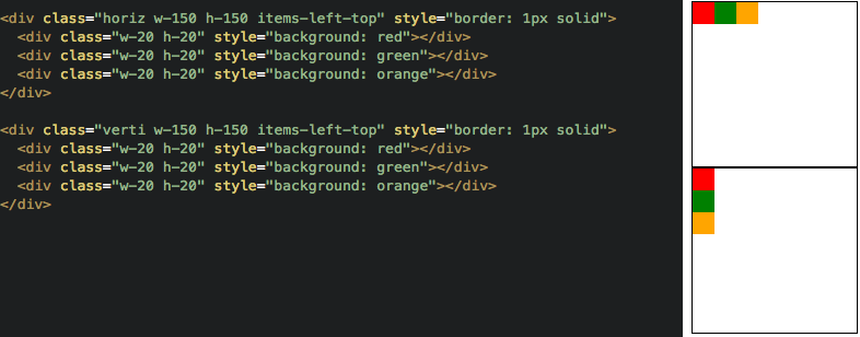
.items-left-top
Aligns the children elements to the left-top of this element. To be used with .horiz or .verti.
With Sass you can use @include items-start() or @include items-start($mediaquery)
Click to explore
.items-left-bottom
Aligns the children elements to the left-bottom of this element. To be used with .horiz or .verti.
With Sass you can use @include items-start-end() or @include items-start-end($mediaquery)

Click to explore
.items-right-center
Aligns the children elements to the right-center of this element. To be used with .horiz or .verti.
With Sass you can use @include items-end-center() or @include items-end-center($mediaquery)

Click to explore
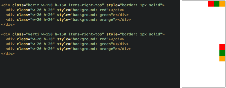
.items-right-top
Aligns the children elements to the right-top of this element. To be used with .horiz or .verti.
With Sass you can use @include items-end-start() or @include items-end-start($mediaquery)
Click to explore
.items-right-center
Aligns the children elements to the right-center of this element. To be used with .horiz or .verti.
With Sass you can use @include items-end-center() or @include items-end-center($mediaquery)

Click to explore
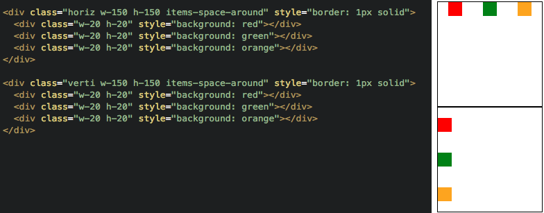
.items-space-around
Arrange elements with equal space around them. To be used with .horiz or .verti.
With Sass you can use @include items-space-around() or @include items-space-around($mediaquery)
Click to explore
.items-space-between
Arrange elements with equal space between them. To be used with .horiz or .verti.
With Sass you can use @include items-space-between() or @include items-space-between($mediaquery)
Click to explore
.items-mb-{number}
Adds a bottom margin to all children elements, useful when you are usign horiz and gutter, so when the children wraps to a second line they get a margin between them.
With Sass you can use @include items-mb($number) or @include items-mb($number, $mediaquery)

Click to explore
Text Utils
Some useful classes to deal with text.
.text-center
Aligns the text to the center inside the element. Avoid using this to center other kind of elements.
With Sass you can use text-align: center, @include text-center() or @include text-center($mediaquery)

Click to explore
.text-left
Aligns the text to the left inside the element.
With Sass you can use text-align: left, @include text-left() or @include text-left($mediaquery)

Click to explore
.text-right
Aligns the text to the right inside the element.
With Sass you can use text-align: right, @include text-right() or @include text-right($mediaquery)

Click to explore
.text-justify
Aligns the text justifying inside the element.
With Sass you can use text-align: justify, @include text-justify() or @include text-justify($mediaquery)

Click to explore
.truncate
Truncate the text putting "..." in the end if the text is too big for it's container. Maybe you will need to put it inside the container and use .w-full.
With Sass you can use @include truncate() or @include truncate($mediaquery)

Click to explore
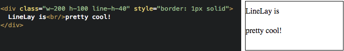
.line-h-{number}
Defines the line height, usefull to center text vertically. Avoid using this to center other kind of elements.
With Sass you can use line-height: {number}px, @include line-h($number) or @include line-h($number, $mediaquery)
Click to explore
Font Utils
Useful classes to control the fonts
.f-bold and .f-normal
Use .f-bold to make the text bold or .f-normal to make it normal.

Click to explore
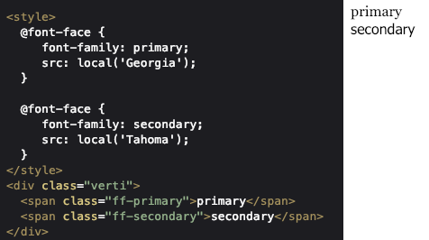
.ff-primary and .ff-secondary
You can use this classes to quickly swap between fonts, but to make it work properly you will need to define the font-face in your CSS.
With Sass you can use @include ff($fontname) or @include ff($fontname, $mediaquery)
Click to explore
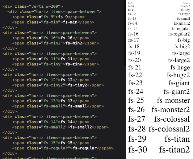
.fs-{number} and it's alias
Changes the font-size using a number or a name
With Sass you can use @include fs($number) or @include fs($number, $mediaquery)
Click to explore
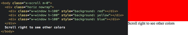
Scroll
Try to use a scrollable div inside your page instead of letting the whole page scrollable, you will have more control over what is fixed and what is scrollable.
Image Utils
Useful classes to style the images
.img-crop
Scale the image uniformly (maintain the image's aspect ratio) so that both dimensions (width and height) of the image will be equal to or larger than the corresponding dimension of the view
With Sass you can use @include img-crop() or @include img-crop($mediaquery)
.img-inside
Scale the image uniformly (maintain the image's aspect ratio) so that both dimensions (width and height) of the image will be equal to or less than the corresponding dimension of the view
With Sass you can use @include img-inside() or @include img-inside($mediaquery)
.scroll
Allow scroll in all directions.
With Sass you can use overflow: scroll, @include scroll() or @include scroll($mediaquery)

Click to explore
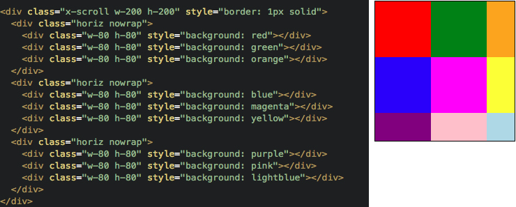
.x-scroll
Allow vertical scroll.
With Sass you can use @include x-scroll() or @include x-scroll($mediaquery)
Click to explore
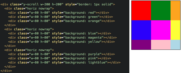
.y-scroll
Allow horizontal scroll.
With Sass you can use @include y-scroll() or @include y-scroll($mediaquery)
Click to explore
Above the surface
You can easily create floating elements above the others with 3 classes.
.absolute
The element is positioned relative to its first positioned (not static) ancestor element. It's recommended to be placed as the last element on Html.
With Sass you can use position: absolute, @include absolute() or @include absolute($mediaquery)

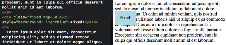
.fixed
The element is positioned relative to the browser window.
With Sass you can use position: fixed, @include fixed() or @include fixed($mediaquery)
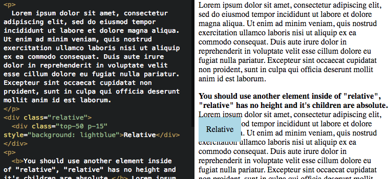
.relative
The child element is positioned relative to its normal position, so left: 20px adds 20 pixels to the element's LEFT position.
With Sass you can use @include relative() or @include relative($mediaquery)
Positioning those elements
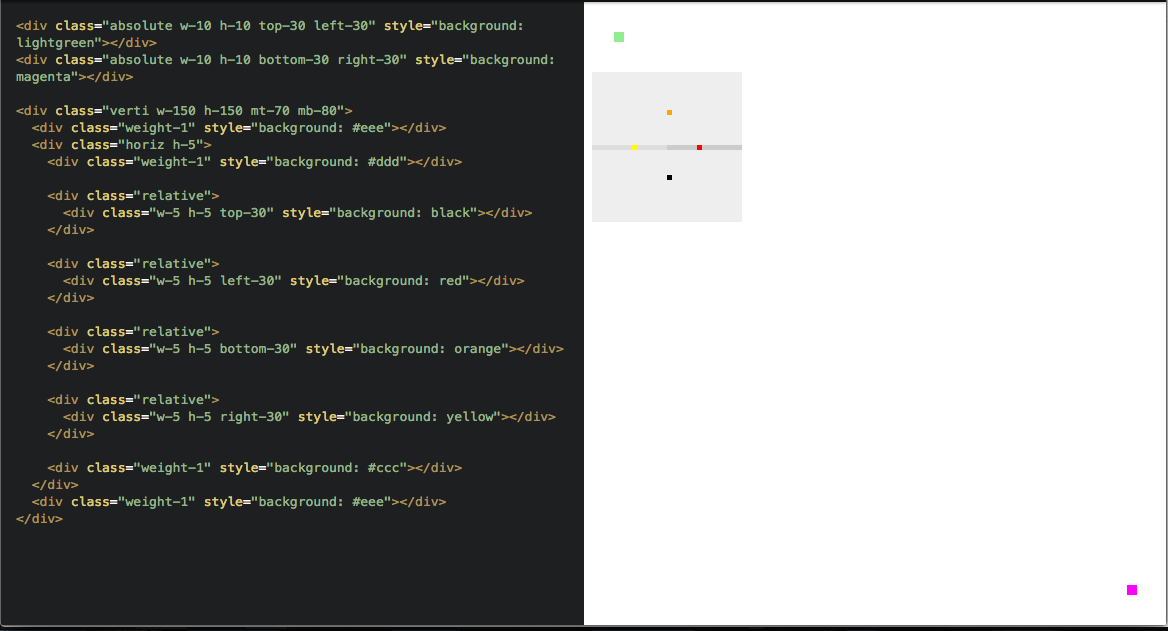
.top-{number}
With Sass you can use top: {number}px, @include top($number) or @include top($number, $mediaquery)
.right-{number}
With Sass you can use right: {number}px, @include right($number) or @include right($number, $mediaquery)
.bottom-{number}
With Sass you can use bottom: {number}px, @include bottom($number) or @include bottom($number, $mediaquery)
.left-{number}
With Sass you can use left: {number}px, @include left($number) or @include left($number, $mediaquery)
.z-{number} or it's alias
Changes the Z order, overlapping elements with a larger z-index cover those with a smaller one.
.z-0;
.z-auto;
.z-1 or .z-pop;
.z-2 or .z-header;
.z-3 or .z-scrim;
.z-4 or .z-modal;
.z-5 or .z-alert;
.z-6 or .z-high;
.z-7 or .z-higher;
.z-99999 or .z-highest;
.z-low (-1);
.z-lower (-2);
.z-lowest (-99999)
Breakpoints
Breakpoints are useful when you want to change the layout depending on user's device.
| Desktop | Tablet | Mobile |
|---|---|---|
| window width greater than 768px | window width between 544px and 768px | window width less than 544px |

.desktop
Show this element only on desktop devices.
With Sass you can use @extend %desktop
.tablet
Show this element only on tablet devices.
With Sass you can use @extend %tablet
.mobile
Show this element only on mobile devices.
With Sass you can use @extend %mobile
.desktop-tablet
Show this element only on desktop or tablet devices.
With Sass you can use @extend %desktop-tablet
.mobile-tablet
Show this element only on mobile or tablet devices.
With Sass you can use @extend %mobile-tablet
.des-{class}
Modify any class described here with .des- to make it work only on desktop devices.
With Sass you can pass $only-desktop in the last argument of the mixin
.tab-{class}
Modify any class described here with .tab- to make it work only on tablet devices.
With Sass you can pass $only-tablet in the last argument of the mixin
.mob-{class}
Modify any class described here with .mob- to make it work only on mobile devices.
With Sass you can pass $only-mobile in the last argument of the mixin
Apply for all children
Modify any class described here with .children- to apply the style to all children instead of the actual element

Classes by colors
If you choose to build linelay with Sass you can customize the colors you want and use classes that customize the view colors.
.bg-{colorname}
It's used to change the background color. If you build using a grey variable with #eee value you will be able to use .bg-grey class that will apply background: #eee
.tc-{colorname}
It's used to change the text color. If you build using a blue variable with #00f value you will be able to use .tc-blue class that will apply color: #00f
Force a style
Modify any class described here with .force- to add an !important and have a CSS rule priority