1.0.5 • Published 5 years ago
loading-wrapper v1.0.5
Loading Wrapper
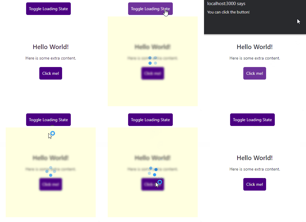
A React component that wraps a tree of components and renders a wrapper div element when provided when flag is true. The content can be blurred, overlayed, deactivated; and a custom loading indicator can be added in addition to aforementioned features.

Installation
npm install loading-wrapperUsage
import React from 'react';
import { LoadingWrapper } from 'loading-wrapper';

const App = () => {
    const [loading, setLoading] = useState(false);

    const toggleLoading = () => setLoading(loading => !loading);

    return (
        <React.Fragment>
            <button onClick={toggleLoading}>Toggle Loading State</button>
                <LoadingWrapper
                    when={loading}
                    blur={2}
                    opacity={1}
                    indicator={<Spin size="large" />}
                    overlay="lightyellow"
                    cursor="progress"
                >
                    <SampleContent />
                </LoadingWrapper>
        </React.Fragment>
}
LoadingWrapper Props
| Prop | Type | Default | Description |
|---|---|---|---|
| when | boolean | false | Controls when the following styles applied to the wrapped component |
| blur | number | 2 | Pixel unit blur value for css blur() function |
| opacity | number | 0.5 | Percentage unit opacity value for css opacity property |
| inactive | boolean | false | Controls pointer-events and user-select css properties |
| overlay | string | none | Background color of the wrapper component for custom indicator |
| cursor | string | default | Cursor value for css property cursor when mouse hovered on LoadingWrapper component |
| indicator | JSX.Element | null | Custom indicator that is rendered in the center of LoadingWrapper when = true |