luxor-component-library v0.1.42
Luxor Component Library
React UI Component Library
Install
npm install --save luxor-component-library
export REACT_APP_RAPIDAPI_KEY='...' # needed for Weather widget
The Design Principles
Container Based Design
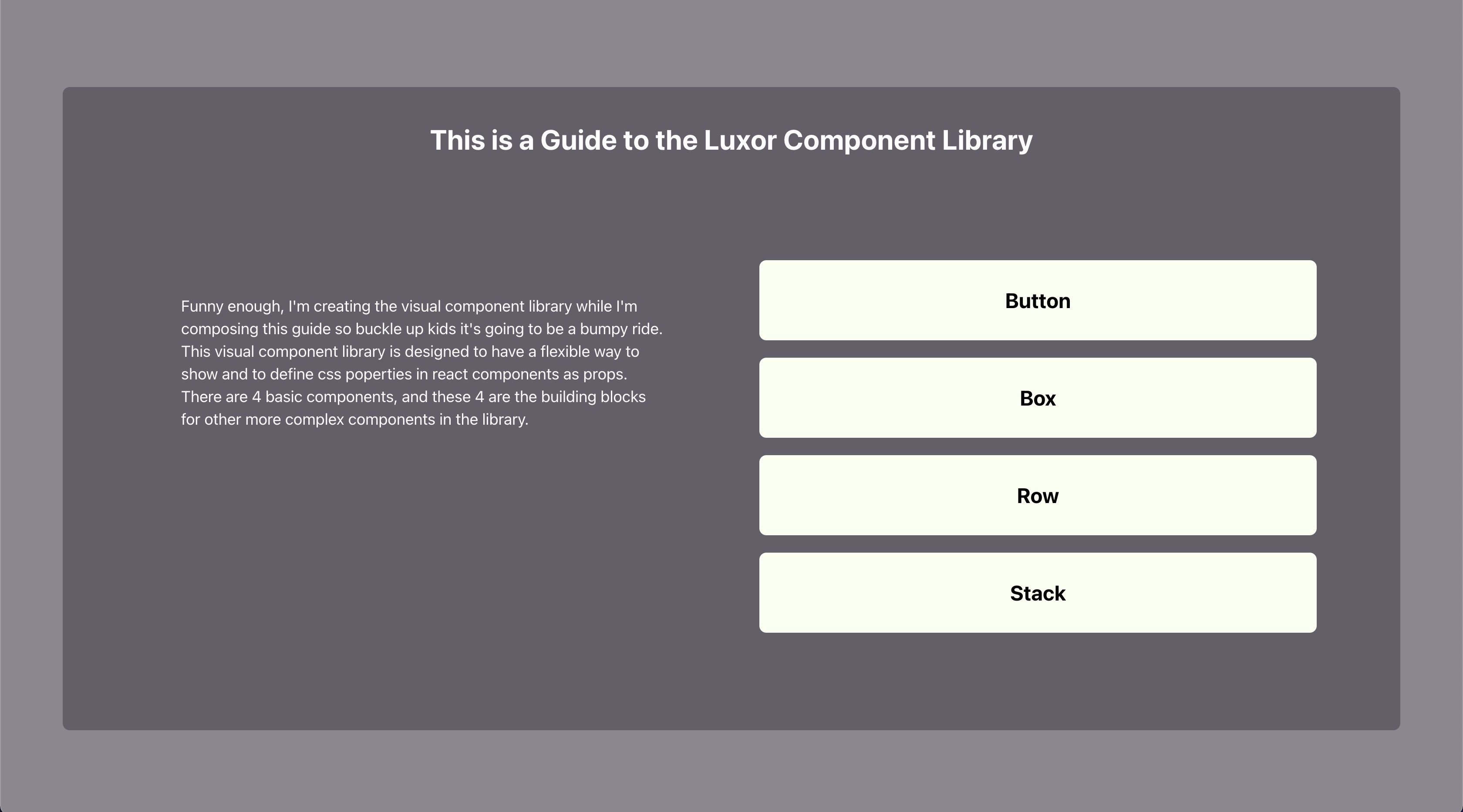
The concept behind this design is using visual containers for everything. Whether it be a Box for simple content or a Stack/Row to align multiple Boxes of content vertically/horizontally respectively.
The button component and weather widget are the beginning of a custom component library.
Themes
Themes can be customized and you can add your own theme.js file.
Use src/utils/theme.js as a template.
For working code examples of the library at work, look at the /example/src/App.js
Component Documentation
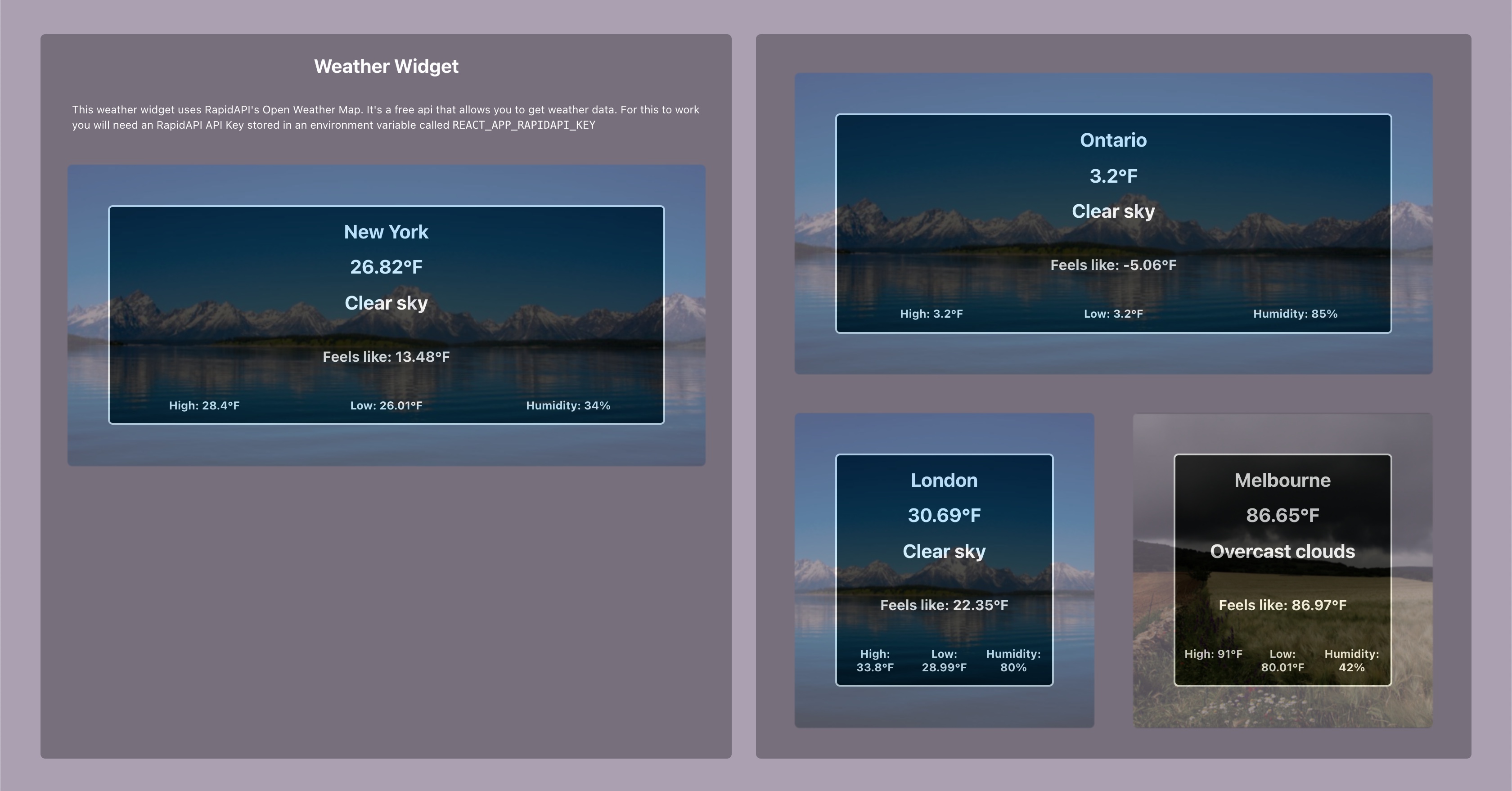
Weather Widget
A note on the weather widget in that it requires an RapidAPI API key to function. Store the API key in an environment variable called REACT_APP_RAPIDAPI_KEY either with an export statement or in a .env file in the root folder.
Supply the <WeatherWidget> compoent with a city prop more info on fomatting and any margin/padding/other props you would pass to adjust the a Box component.
Button Component
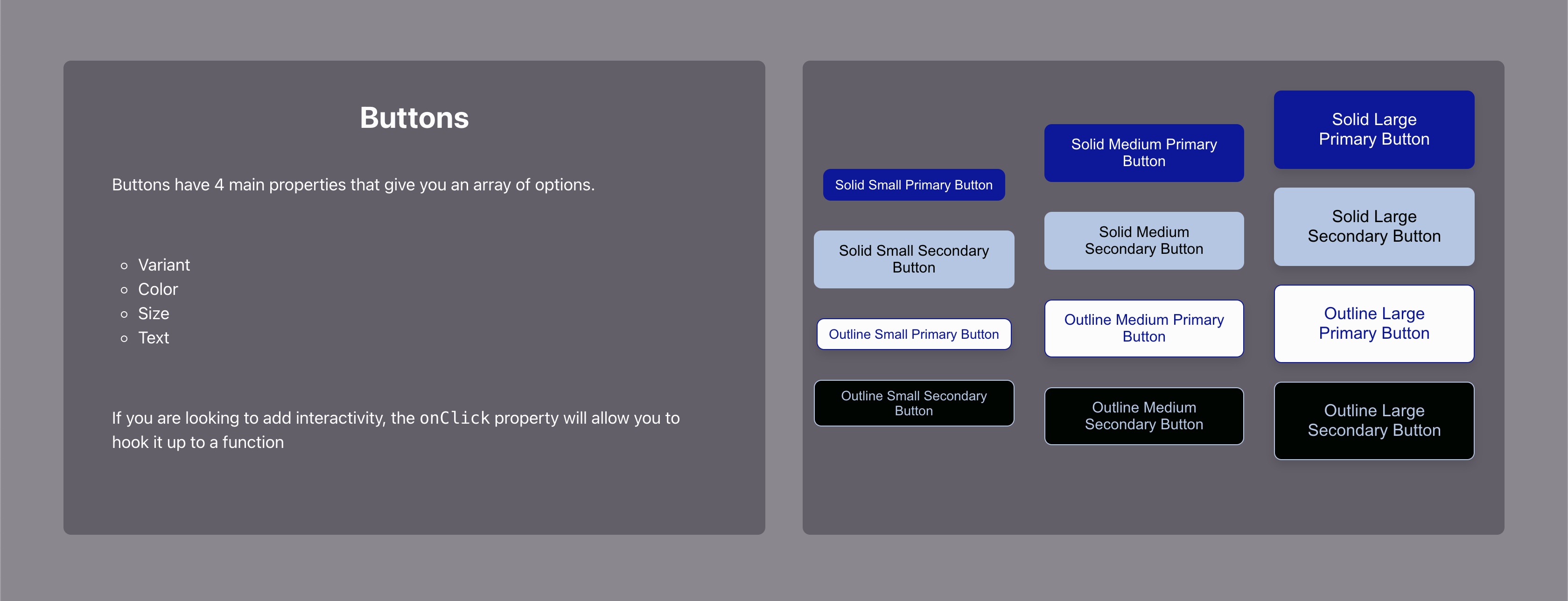
For the most part it's the same as an html button with a few added styles available via props.
- variant: ('solid'|'outline') where should color be placed?
- color: ('primary', 'secondary', 'error') which part of the theme's color scheme did you want to design the button with
- size: ('small'|'medium'|'large') size of the button
- text: string text that will be displayed on the button
- any other CSS properties you would assign to a button
onClickjavascript event
Input Component
The Input component supports the same fields as it's html counterpart.
- color: 'primary', 'secondary', 'error', 'default' | sets the color scheme of the input component
- size: 'small', 'medium', 'large' | sets the size of the text (and the input box)
- roundedCorners: (px|em|rem|...) | sets border radius
- width: (px|em|rem|...) | width of component
- placeholder: (string) | placeholder text
- variant: (optional 'solid', 'outline') | sets color scheme to fill or outline the component
<Input
  color='primary'
  size='small'
  roundedCorners='2rem'
  width='500px'
  placeholder='This is a primary color, solid, small input field, 500px wide'
/>
Box Component
The Box is the equivalent of a pre-styled div with all the css and js properties/functions can be applied via props.
The Box supports margin, padding, display, backgroundColor/Image... and any other div supported attributes via props.
<Box margin='small' padding='medium', backgroundColor='red' color='white' display='block'>
  <p>
    Some paragraph text.
  </p>
</Box>
Stack and Row Components
Stack and Row components work in the same way but with different directions.
Their main purpose is to organize Box components either horizontally (Row) or vertically (Stack).
- Both components accept the same attributes as the
Boxcomponent - space: ('small', 'medium', 'large') | Space in-between the child components of the Row/Stack
<Stack space='medium' margin='small' padding='medium', backgroundColor='red' color='white' display='block'>
  <Box>
    Some text.
  </Box>
  <Box>
    Some text that will be positioned under that ^.
  </Box>
</Stack>
<Row space='medium' margin='small' padding='medium', backgroundColor='red' color='white' display='block'>
  <Box>
    Some text that will be positioned in the left.
  </Box>
  <Box>
    Some text that will be positioned in the middle.
  </Box>
  <Box>
    Some text that will be positioned to the right.
  </Box>
</Row>
you can also nest a Row inside of a Stack and vice versa to achieve a kind of grid stucture
Demo | Documentation
The demo (and conveniently live documentation) is available with a download of the source code.
To run the live demo (screenshots below). Pull down the source code from github and navigate to example/ and run:
>> npm install
>> npm start
NOTE: If you do not have the package installed locally you will need to run the same calls from the root folder in a separate terminal
Development
- Fork the github repo
- Setup (RapidAPI API key needed for weather module):
>> npm install
>> export REACT_APP_RAPIDAPI_KEY='...' - Develop
- Send a PR
TODO
- Navbar component
- Dropdown component
- Text input component
- Slider input component
Screenshots


License
MIT © jmoussa


