madhyasth-ui v1.1.2
Madhyasth UI


Installation
npm i madhyasth-uiand import package by following code
import {Card, Button, P, Heading, Input, Br, Screen} from 'madhyasth-ui';Usage/Examples
Theming
You are needed to create a color JSON for Components. Following is the example JSON with accepted parameters.
 const Theme = {
    primary: 'red',
    textLight: '#fff',
    white: '#fff',
    textBox: '#ededed',
    statusBar: "red"
  };
Above JSON should be provided to Components.
Button
Parameters are listed below
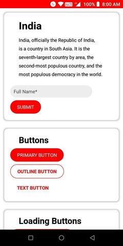
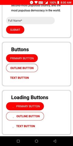
theme: Acceptstheme JSONstyle: AcceptsstyleObjectonPress: AcceptsonPresseventtitle: Button Text or if this is not provided Component will act as container tag and search forchildren.progress: Acceptsbooleanto showActivityIndicatorin button.mode: Accepts"primary","outline"or"text"for different button types.
Example is below
<Button
 theme={Theme}
 onPress={()=>alert('Hello')}
 progress={false}
 mode="outline"
>
    Button Text
</Button>
Input
Text Box that accepts Text input from user. Accepts following parameters.
hintwidth, default is 80%valuemultiline, default isfalseonChangeTextpassword, default isfalsereturnKeyTypeonKeyPresshintColor, default is#0000000themerefpaddingVerticalborderRadiusicon
Example is below.
<Input
    hint="Full Name"
    value={name}
    onChangeText={setName}
/>
Heading
Accepts
size, accepts number for size of Heading, default is30children, must provided as container tag, no need of<Text>here, provide raw string for heading.
Example:
    <Heading>
        Hello World
    </Heading>
P
For Paragraph, or a simple descriptive text. Accepts
children, must be provided as container tag, no<Text>is required, directly provide string. Example
    <P>
        Some Long Paragraph
    </P>
Card
Creates a card. Accepts
childrenmust be provided as container tag.sizeaccepts"fill"if you want card width to fill all horizontal space. Example
<Card>
    <Heading size={25}>How Are you?</Heading>
    <P>Expecting that you are completely fine!</P>
</Card>
Br
Just adds vertical space of 8px
Example
<Br />Screen
Sets up StatusBar, ScrollView, SafeAreaView for Stand Alone app.
If you are using any "vertical" list like <FlatList> or <ScrollView>, then set verticalFlatlist to true else ignore it. If you ignore this, app may crash.
If you have not made your App responsive for wide screen, but want to release for wide screens too, then set responsive to false, this will add a Mobile Phone View in web.
    import React from 'react';
    import {Screen, Heading, P} from 'madhyasth-ui';
    const Theme = {
        statusBar: "red"
    }
    function App(){
        return(
            <Screen theme={Theme} verticalFlatlist={false}>
                <Heading>Hello</Heading>
                <P>How are you?</P>
            </Screen>
        );
    }
Alert
Alert is a method alternative to Alert imported from react-native. You are not needed to set Alert.alert from react-native package.
Alert method will show native web alert without error, as Alert.alert don't works in web.
Example:
    useEffect(()=>{
        Alert("TITLE", "SOME NOTIFICATION");
        // TITLE WILL BE IGNORED IN WEB VERSION.
    }, []);
Device
Device is an object which have following function
OS: Returns current OSwidth: Returns device widthheight: Return device heighttheme: Currect device theme ("light"/"dark")killApp: Method, that kills app.