MapLibre GL Style Flipper 
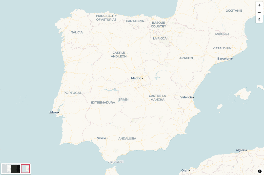
A custom control to switch between different map styles in MapLibre GL JS.
Features
- Easy Integration: Add a style switcher control to your MapLibre GL JS map with just a few lines of code.
- Customizable Styles: Define your own map styles with names, images, and URLs.
- Responsive Design: Buttons adapt to different screen sizes.
- Callback Support: Execute custom logic when the map style changes.
Installation
Install the package via npm:
npm install maplibre-gl-style-flipperOr include it directly via a CDN:
<script src="https://unpkg.com/maplibre-gl-style-flipper@latest/dist/style-flipper-control.js"></script>Usage
Basic Example
Here’s how to use the StyleFlipperControl in a simple HTML file:
<!DOCTYPE html>
<html lang="en">
<head>
    <meta charset="UTF-8">
    <meta name="viewport" content="width=device-width, initial-scale=1.0">
    <title>MapLibre GL Style Flipper</title>
    <script src="https://unpkg.com/maplibre-gl@latest/dist/maplibre-gl.js"></script>
    <link href="https://unpkg.com/maplibre-gl@latest/dist/maplibre-gl.css" rel="stylesheet" />
    <style>
        body, html {
            margin: 0;
            padding: 0;
            height: 100%;
        }
        #map {
            height: 100%;
            width: 100%;
        }
    </style>
</head>
<body>
    <div id="map"></div>
    <script type="module">
        import StyleFlipperControl from "maplibre-gl-style-flipper";

        // Define map styles
        const mapStyles = {
            "carto-positron": {
                code: "carto-positron",
                url: "https://basemaps.cartocdn.com/gl/positron-gl-style/style.json",
                image: "https://carto.com/help/images/building-maps/basemaps/positron_labels.png",
            },
            "carto-dark": {
                code: "carto-dark",
                url: "https://basemaps.cartocdn.com/gl/dark-matter-gl-style/style.json",
                image: "https://carto.com/help/images/building-maps/basemaps/dark_labels.png",
            },
            "carto-voyager": {
                code: "carto-voyager",
                url: "https://basemaps.cartocdn.com/gl/voyager-gl-style/style.json",
                image: "https://carto.com/help/images/building-maps/basemaps/voyager_labels.png",
            },
        };

        // Initialize the map
        const map = new maplibregl.Map({
            container: "map",
            style: mapStyles["carto-positron"].url, // Default style
            center: [0, 0], // Initial center
            zoom: 1, // Initial zoom
        });

        // Add navigation control
        map.addControl(new maplibregl.NavigationControl());

        // Create an instance of StyleFlipperControl
        const styleFlipperControl = new StyleFlipperControl(mapStyles);

        // Set the initial style code
        styleFlipperControl.setCurrentStyleCode("carto-positron");

        // Add the control to the map
        map.addControl(styleFlipperControl, "bottom-left");
    </script>
</body>
</html>
Explanation
Map Styles:
- The
mapStylesobject contains the styles you want to switch between. Each style has:code: A unique identifier for the style.url: The URL of the MapLibre GL style.image: The path to an image that represents the style (used in the control buttons).
- The
Map Initialization:
- The map is initialized with a default style (
carto-positronin this case).
- The map is initialized with a default style (
Style Flipper Control:
- The
StyleFlipperControlis created with themapStylesobject and an optional callback function that triggers when the style changes. - The control is added to the map using
map.addControl().
- The
Customization:
- You can customize the position of the control by changing the second argument of
map.addControl()(e.g.,"top-right","bottom-left").
- You can customize the position of the control by changing the second argument of
API Reference
StyleFlipperControl
Constructor
new StyleFlipperControl(styles, onStyleChange);
styles: An object containing map styles. Each key is a style name, and the value is an object with:code: A unique identifier for the style.url: The URL of the MapLibre GL style.image: The path to an image that represents the style.
onStyleChange(optional): A callback function that is triggered when the style changes. It receives two arguments:styleClass: The name of the selected style.styleCode: The code of the selected style.
Methods
setCurrentStyleCode(code):- Sets the current style code and highlights the corresponding button.
code: The code of the style to set as active.
saveCustomSourcesAndLayers():- Saves the current custom sources and layers.
restoreCustomSourcesAndLayers():- Restores the saved custom sources and layers.
Customization
CSS Styling
You can customize the appearance of the control by overriding the default CSS. Here’s an example:
<style>
.style-flipper-control {
    background: rgba(255, 255, 255, 0.8);
    border-radius: 8px;
    padding: 8px;
}

.style-flipper-control .map-style {
    width: 40px;
    height: 40px;
    border-radius: 4px;
}

.style-flipper-control .map-style.active {
    border: 2px solid #ff6b6b;
}
</style>
Contributing
Contributions are welcome! If you find a bug or have a feature request, please open an issue.
License
This project is licensed under the MIT License. See the LICENSE file for details.