material-table-core-formik v0.1.0
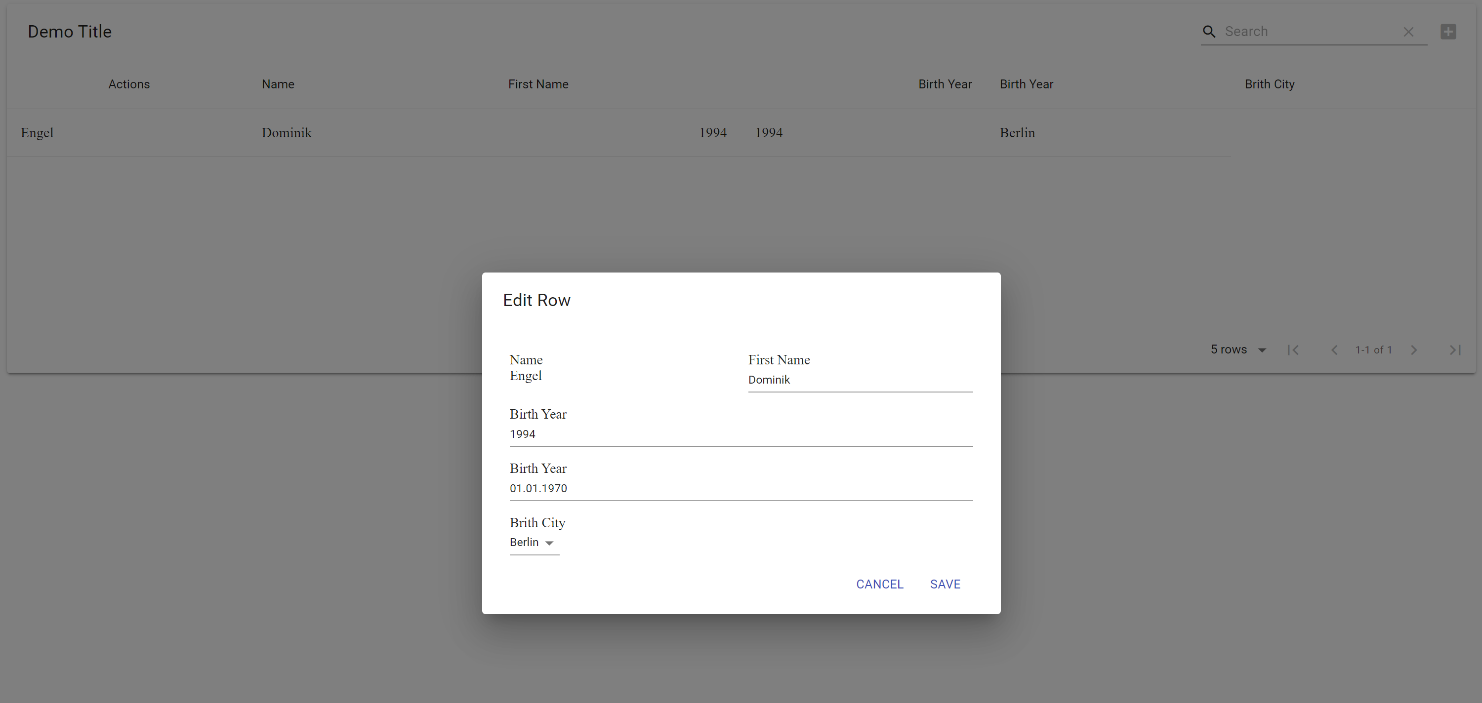
Material Table Formik with Dialogs (cloned from material-table-formik)
This package is a simple wrapper for @material-table/core.
It displays dialogs instead of the inline edit for the Add, Update and Delete actions.
Additionally, it allows the validation with Formik and YUP for these actions as well.
Now with Grid Support
Add Material-Ui Grid Props with gridProps to the columns to order the edit fields within the dialog.
gridProps: { xs: 12, md: 6 }Screenshot

Requirement
To use material-table-core-formik, you must use react@16.8.0 or greater which includes hooks.
Installation
This package is distributed via npm.
$ yarn add material-table-core-formik
# or
$ npm install --save material-table-core-formik
Getting Started
Simply exchange the material table import:
import MaterialTable from "@material-table/core";with
import MaterialTable from "material-table-core-formik";This will display the edit/update/delete action in a separate dialog instead inline.
Props
In addition to the material table props, it also accepts these optional props:
| Name | Type | Description |
|---|---|---|
| validate | (value: RowData) => void | object | Promise<FormikErrors>; | The Formik validation to be applied to each field |
| validationSchema | any | (() => any) | The YUP validation schema |
| localization | deleteHeader?: string deleteAction?: string | The added localizations for the dialog |
| columns.gridProps | Material-ui Grid Props | The columns are extended to allow grid props for positioning of the fields within the dialog |
Author
This project follows the all-contributors specification. Contributions of any kind welcome!
Built with TSDX
4 years ago