2.0.0 • Published 8 years ago
material-ui-enhanced-fields v2.0.0
material-ui-enhanced-fields
A collection of enhanced fields for use with material-ui (v1 beta).

See storybook for live demos.
Install
yarn add material-ui-enhanced-fields@nextnpm i material-ui-enhanced-fields@nextComponents
ComboboxField
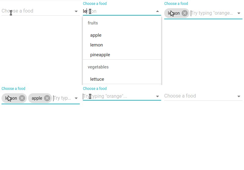
A customisable 'combobox' field that allows both text input and selection from a drop-down menu.
With multiple set to false (default) the selected value is displayed as text in the <input/> element.
With multiple set to true selectedItems are stored in a prefix. The default rendering is Chip's.
Items can be grouped into sublist by supplying the a groupField prop (default is 'group').
Based on the Downshift library.
Basic Examples
const DATA = ['apples', 'oranges'];

<ComboboxField
  items={DATA}
  TextFieldProps={{ floatingLabelText: 'Pick a food' }}
/>
const DATA = [{text: 'apple', type: 'fruit'}, {text: 'tomato', type: 'veg'}];
<ComboboxField
items={DATA}
itemToString={item => item === null ? '' : item.text}
groupField={'type'}
TextFieldProps={{ floatingLabelText: 'Pick a food' }}
/>Props
| prop | type | default | description |
|---|---|---|---|
classes | Object | Override the CSS classes (see implementation). | |
className | 'string' | CSS class for the root element. | |
filterFunc | function(items: Array, query: string) | Override the default function for filtering the items based on the field's input value. | |
items | Array | [] | The array of possible items to select. |
groupField | string | 'group' | The name of the key to group each item object by. (Optional, if items aren't objects or don't have a field to group by, they won't be grouped.) |
menuBottomElement | Object | An element to display at the bottom of the menu. | |
menuBottomFixed | boolean | true | Fix the menuBottom element so it's reachable without scrolling. |
MenuProps | Object | Props to be merged into the Menu component. | |
multiple | boolean | false | Allow multiple selected items. |
noMatchProps | Object | Props to be merged to the component displayed when there are no matched items. | |
noMatchText | node | Text to be displayed if there are no matched items to display in the menu. | |
renderMenuItem | function({downShiftProps: {}, index: number, item: any, key: string, selectedItems: Array}) | Override the default rendering of each menu item. Should return an element that employ's the Downshift getItemProps 'prop getter' function. See source code and Downshift. | |
renderSelectedItem | function({deselect: function, hasFocus: boolean, item: any, itemToString: function}) | Override the default rendering (uses Chips) of each selected item. (Only applies when the multiple is true.) deselect: A callback that will deselect the item. hasFocus: True if item has been focused with keyboard. item: The item to render. itemToString: The itemToString prop supplied for convenience. | |
SubheaderProps | Object | Props to be merged ino each Subheader. | |
TextFieldProps | Object | Props for the TextField component. |
In addtion, you can pass all the props of the
Downshiftcomponent, except theinputValue. See here.