1.0.18 • Published 6 years ago
message-temp-demo v1.0.18
React-message-dialog component
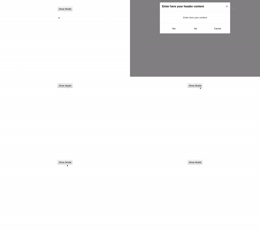
A React.js MessageDialog component is used for showing dialog with message.
You can change number of buttons on that . You can also hide header and cross icon.
Table of contents
- Browser Support
- Demo
- Getting started
- Import styles
- Usage
- Available Props
- Methods
- Want to Contribute?
- Need Help / Support?
- Collection of Other Components
- Changelog
- Credits
- License
Browser Support
 |  |  |  |  |
|---|---|---|---|---|
| 83.0 ✔ | 77.0 ✔ | 13.1.1 ✔ | 83.0 ✔ | 11.9 ✔ |
Demo
Getting started
npm install react-weblineindia-message-dialog-box
# or use npm
yarn add react-weblineindia-message-dialog-box
Usage
<template>
  <div id="app">
    <button @click="onShowModal">Show Modal</button>
    <AlertBox
      :id="'alertbox'"
      :name="'alertbox'"
      :visible="isShowErrorInModal"
      :content="'Enter here your content'"
      :buttons="alertButtons"
      :show-header="true"
      :header-content="'Enter here your header content'"
      :closable="true"
      :no-of-button="3"
      :index="1"
      @onButtonClick="onClickButton"
      @close="onCrossClick"
      @hide="onHideMessageBox"
    />
  </div>
</template>
import AlertBox from "vue-weblineindia-message-dialog-box";
export default {
components: {
AlertBox
},
data() {
return {
alertButtons: [
{ id: 0, title: "Yes" },
{ id: 1, title: "No" },
{ id: 1, title: "Cancel" }
],
isShowErrorInModal: false
};
},
methods: {
onShowModal() {
this.isShowErrorInModal = true;
},
onClickButton(value) {
this.isShowErrorInModal = false;
switch (value.title) {
case "Yes":
// do something on Yes button
break;
case "No":
// do something on No button
break;
case "Cancel":
// do something on Cancel button
break;
}
},
onCrossClick() {
this.isShowErrorInModal = false;
},
onHideMessageBox() {
this.isShowErrorInModal = false;
}
}
};Available Props
| Prop | Data Type | Default | Description |
|---|---|---|---|
id | string | id of the component | |
name | string | name of the component | |
visible | Boolean | false | Show/Hide Modal. |
content | String | Content of the modal | |
buttons | Array | [] | Buttons objects to contain the button label, button click event, no buttons etc. |
showHeader | boolean | false | To hide or show the header of the component. |
headerContent | String | header Content of the modal. | |
closable | Boolean | false | Adds a close icon to the header to hide the dialog. |
noOfButton | Number | 0 | number of button on modal. |
index | Number | 0 | index of the component |
value | String | value of the component |
Methods
| Name | Description | Value |
|---|---|---|
onButtonClick | Emitted when the button click | Event |
close | Emitted when click on the close modal | Event |
hide | Emitted when input is clicked | Event |
Want to Contribute?
- Created something awesome, made this code better, added some functionality, or whatever (this is the hardest part).
- Fork it.
- Create new branch to contribute your changes.
- Commit all your changes to your branch.
- Submit a pull request.
Need Help?
We also provide a free, basic support for all users who want to use this ReactJS modal dialog in their software project. In case you want to customize this modal dialog to suit your development needs, then feel free to contact our ReactJS developers.
Collection of Components
We have built many other components and free resources for software development in various programming languages. Kindly click here to view our Free Resources for Software Development.
Changelog
Detailed changes for each release are documented in CHANGELOG.md.
Credits
react-weblineindia-message-dialog-box is inspired by bootstrap-vue.
