2.2.4 • Published 1 year ago
metacodya v2.2.4
metacodya NPM Package
Npm package created to supply reusable components to metacodya developers.
How to use it ?
Before installing package, you should have tailwindCSS installed and configured in your project as the package styling is built using tailwindCSS.
You should also include the index.css file of the package in the top of your app ( eg. in the top of App.tsx - your main file that contains the whole application - ) as following :
import React from "react";

// The following import must be included to apply styles used
// in the package
import "../node_modules/metacodya/dist/index.css";

// This is an example for importing some components from package
import { SearchInput} from "metacodya";

function App() {
  return (
    <div className="container">
      <SearchInput setInputValue={(e) =>console.log(e)}  />
    </div>
  );
}
Table of components
🛠 Components included in the package :
9- UserInput
The UserInput takes same props as default input field with extra props :
- label ?
- labelStyle?: for styling label
- success ?: success message if validation is OK
- error ?: error message if there is a problem with validation
- onChangeFn ?: useState function to get change in value
<UserInput label="Username" type={"text"} placeholder="type your username" />
<UserInput disabled label="Password" type={"password"} />
//=================================================
Go back to the table of components
//=================================================
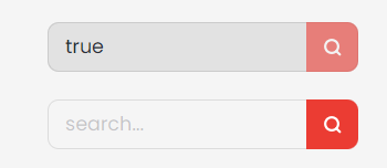
13- SearchInput
The SearchInput takes 4 props :
- setInputValue : setState function to get the value of the input field
- disabled ?
- props ?: default input props
- className ?: addition TailwindCSS classes to apply
<SearchInput setInputValue={setInputValue} disabled />
<SearchInput setInputValue={setInputValue}/>
//=================================================
Go back to the table of components
//=================================================