Minibook
Minibook is a minimalistic interface for documentation and examples of components.
It allows writing documentation pages in Markdown with embedded React components examples.
Install
npm install minibookExample
import MiniBook from 'minibook'

import MarkdownStory from './markdown.md'

const items = {
	section: {
		name: 'Section name',
		component: SomeComponent,
		items: {
			'props-story': {
				name: 'Component',
				description:
					'Story that displays React component with some props',
				props: {
					/* props for the component */
				},
			},

			'render-story': {
				name: 'Render function',
				description: 'Custom render function for a story',
				props: {
					/* props for the component */
				},
				render: (Component, props) => <Component {...props} />,
			},

			'iframe-story': {
				name: 'Iframe',
				description: 'Page displayed in the iframe',
				src: '/page.html',
			},

			// Markdown with embedded components examples
			'markdown-story': {
				name: 'Markdown story',
				markdown: MarkdownStory,
			},
		},
	},
}

// You should set 'height: 100%' to html, body, and container element
ReactDOM.render(
	<MiniBook title="Minibook" items={items} />,
	document.querySelector('#root')
)
Markdown Stories
minimark-loader compiles markdown to React JSX.
At the top of the markdown document you can add YAML section with name and description attributes of the story and list of imported modules for examples.
---
name: 'Markdown'
description: 'Description'
imports:
  'Button': './Button.js'
---
You can use following blocks in markdown documents:
Table of contents
Auto-generated table of contents from headers in the document.
```@toc

```
You can change headers level, and list type:
```@toc
levels: [1, 2, 3]
loose: true
ordered: true
```
Code fences
You can specify language to enable syntax highlighting. Also you can highlight some lines of your code.
```jsx{1,2-3}
const a = 'name'
console.log(`Hello, ${name}!`)
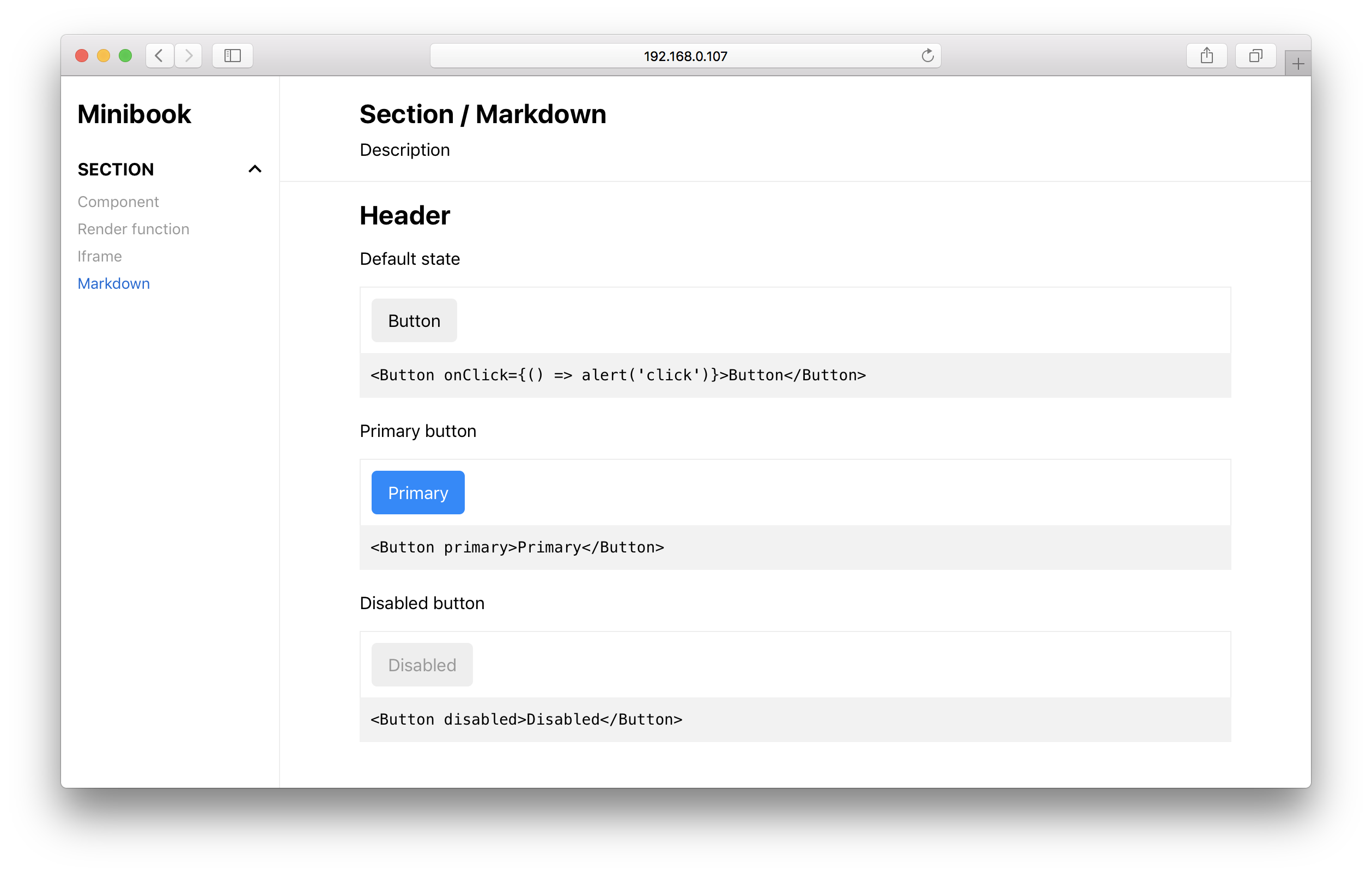
```Render and example
- Blocks with
@rendertag allows to render React components. - Block with
@exampletag outputs the rendered component followed by the source code.
```@render
<Button onClick={() => alert('click')}>Button</Button>
```

```@example
<Button onClick={() => alert('click')}>Button</Button>
```
File source
Include source code of the file. You can configure tab width, lines range, height of the block and highlighting of lines.
```@source
file: ./Button.js
tabs: 4
from: 4
to: 27
maxLines: 25
highlightLines: 1, 2-3, 6
```
Props docs
Documentation for component's props generated with react-docgen. You can even use markdown in props description.
```@propsdoc
file: ./Button.js
allowMarkdown: true
```
// Button.js
Button.propTypes = {
/** Some description. */
number: PropTypes.number,
}Setup
To be able to load markdown stories with webpack, you need to use
minimark-loader in combination with babel-loader for *.md files:
{
    test: /\.md$/,
    use: [
        {
            loader: 'babel-loader',
            options: { /* options for babel-loader */ }
        },
        {
            loader: 'minimark-loader',
            options: require('minibook/minimark-preset')
        }
    ]
}
You can view full config example at packages/example/webpack.config.js
Props
title
Type: ReactNode
items
Type: Array<Item>
Item can be a section or a story.
Sections have the following properties:
- name
string– Section name - items
Object<Item>– Section items
Stories have the following proerties:
- name
string– Story name - description
string– Story description - component
Component– React component that will be rendered - props
object– Props for the component - render
(Component, props) => ReactNode– Custom render function - src
string– URL of the page to be displayed in the iframe - markdown - Markdown document
License
This software is released into the public domain. See the LICENSE file.