2.0.0 • Published 8 years ago
mm-responsive-image v2.0.0
mm-responsive-image
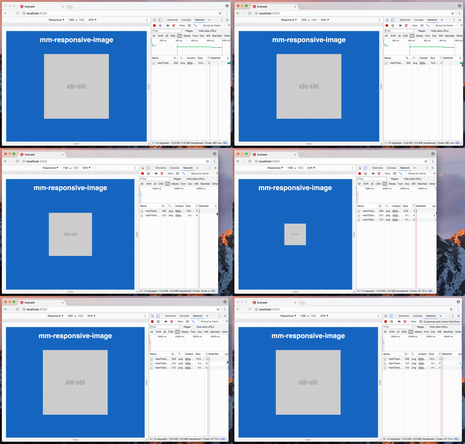
Responsive image component for Angular.
Wraps the HTML5 picture element to make it easier and more convenient to use.

Installation
To install the component with npm run:
$ npm install mm-responsive-image --saveUsage
To use the mm-responsive-image component, add it to your AppModule:
import { BrowserModule } from '@angular/platform-browser';
import { NgModule } from '@angular/core';

import { AppComponent } from './app.component';

// Import the component
import { MmResponsiveImageComponent } from 'mm-responsive-image';

@NgModule({
  declarations: [
    AppComponent,

    // Specify your component as an declaration
    MmResponsiveImageComponent
  ],
  imports: [
    BrowserModule
  ],
  providers: [],
  bootstrap: [AppComponent]
})
export class AppModule { }
Once the component is declared, you can start using it:
<mm-responsive-image [sources]="[{width: 1280, src: 'http://placehold.it/800x800'}, {width: 860, src: 'http://placehold.it/600x600'}]"
    [fallbackSource]="'http://placehold.it/400x400'"
[alt]="'Just a placeholder'"></mm-responsive-image>Note: There's no need to sort the sources by their width, this will be done by the component itself.
Polyfill
Because picture element are not supported by all browsers you may need to use a polyfill library, like picturefill.
Inputs
The component accepts the following inputs:
sourcesAn array of sources ({width: number, src: string})fallbackSourceThe default image source. If not set, it will be the smallest source from thesourcesarrayaltThe alt-attribute value of the image
License
MIT © mediaman GmbH