0.1.1 • Published 7 years ago
more-select v0.1.1
More Select
Description
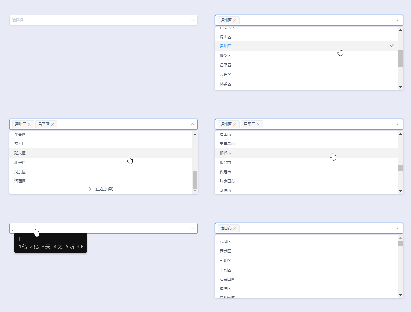
More Select, a vue component, can split steps to load options. Can used in iView, Element to emit Form events, also the events and style can be customized.
More Select拥有分步加载传入Options的功能,滚动触底触发。可以避免一次性渲染所有Options造成浏览器的响应卡顿。用于iView或Element的Form组件中时,可以触发Form事件从而实现校验。同时可以自定义更多事件和显示样式。
Demo

Installation
npm i more-select -SUsage
Global register
import MoreSelect from 'more-select'
import 'more-select/dist/more-select.css'
Vue.use(MoreSelect)
In singgle component
import { MoreSelect, MoreOption } from 'more-select'
import 'more-select/dist/more-select.css'
export default {
  components: { MoreSelect, MoreOption }
}
example
<more-select
  v-model="user"
  multiple
  filterable
  clearable
  allow-create
  :load-more="20"
  style="width: 600px;"
  >
    <more-option
      v-for="(item, index) in districts"
      :key="index"
      :value="item"
      >
        {{ item }}
    </more-option>
</more-select>
Select Props
| prop | description | type | default | required |
|---|---|---|---|---|
| value | The value of the selected item. Use v-model to enable a two-way binding. It only accepts String or Number in single-choice mode. And it only accepts Array in mutli-choices mode. | String | Number | Array | "" | true |
| multiple | Set select to support multiple | Boolean | false | false |
| disabled | Set select to disable | Boolean | false | false |
| clearable | Set select to clear option where used in single mode | Boolean | false | false |
| filterable | Set select to support filter | Boolean | false | false |
| load-more | Set select to support loadmore. Number type is to set options limit number, default limit is 50 | Boolean | Number | "" | false |
| size | The size of select. The value could be large, small, default or none. | String | default | false |
| placeholder | The text for placeholder | String | "" | false |
| autocomplete | The autocomplete attribute of select input | String | "" | false |
| allow-create | Whether creating new items is allowed. filterable must be true | String | "" | false |
| events | The events are emitted when value changed. Array item format must be {componentName: 'dispatch component name', event: 'event name'} | Array | -- | false |
| not-found-text | The text to show when the select is null | String | "" | false |
| popper-class | Add class name to dropdown list | String | -- | false |
| load-more-class | Add class name to loadmore loading item | String | -- | false |
Select Events
| name | description | params |
|---|---|---|
| on-change | Emitted when selected Option changed. It will return value. | current selected item |
| on-query-change | Emitted when query word is changed. | query |
| on-clear | Emitted when click clear icon. | -- |
| on-open-change | Emitted when dropdown show or hide. | true / false |
Select Slot
| name | description |
|---|---|
| loadmore | Custom loadmore item content |
Option Props
| prop | description | type | default | required |
|---|---|---|---|---|
| value | The option value, filter by the property | String | Number | -- | true |
| label | The content of the option, read slot default. | String | -- | false |
| disabled | Set to disable the option. | Boolean | false | false |


