mp-calendar v3.0.0
<mp-calendar>
It's a web components, providing calendar date functionality and events support, build with Polymer 3.0. For quick navigation between month and year, you can select one from the list. You can get previous version for polymer 1.x or 2.x by chosing different branch.
Demo
Install the component using Bower:
npm install --save mp-calendarUsage
- Import files
import '../mp-calendar/mp-calendar.js'<script type="module">
import '../mp-calendar/mp-calendar.js';
</script>- Add the element
<custom-element-demo>
<template>
<script src="../webcomponentsjs/webcomponents-lite.js"></script>
<script type="module">
    import '../mp-calendar/mp-calendar.js';
</script>
<next-code-block></next-code-block>
</template>
</custom-element-demo>-->
<mp-calendar day-labels='["Su","Mo","Tu","We","Th","Fr","Sa"]'
             disable-prev-days
             disabled-dates="[8, 17, 29]"
             disabled-days='["Tu"]'
             events-file=demo/events.json>
</mp-calendar>
Properties
| Property | Type | Description | Default |
|---|---|---|---|
| day-labels | Array | This property can be used to localize the elements day labels. Do not change the order | Default: Sunday, Monday, Tuesday, Wednesday, Thursday, Friday, Saturday |
| month-labels | Array | This property can be used to localize the elements month labels. | January, February, March, April, May, June, July, August, September, October, November, December |
| disabled-dates | Array | Disable current month's weekdays. Set the disabled dates. ex. disabled-dates="[4, 10, 12, 19, 30]" | None |
| disabled-days | Object | Disable week days. Set the disabled days. This will read the days from dayLabels. If you use custom day labels, same values must be applyied here. ex. For default values: disabled-days='["Monday", "Thursday"]'. For custom labes: day-labels='["Su","Mo","Tu","We","Th","Fr","Sa"]' then disabled-days='["Mo", "Th"]'. | None |
| disabled-in-months | Array | Related to disabled-dates & disabled-weeks. In which months, the disabled days or weeks will be disabled. ex. disabled-in-months="[5, 6]". The disabled-dates & disabled-weeks will effective on May & June. | All months |
| disabled-weeks | Array | Disable month's weeks, starting from 0 to 4 for default. If show-days-in-month=42 then total weeks are from 0 to 5 | None |
| disable-prev-days | Boolean | Disable previous month days. | false |
| disable-next-days | Boolean | Disable next month days. | false |
| events-file | String | Set a json file that includes the events. ex. events-file="events.json" | None |
| events-object | Object | Set an object containing events. ex. events-object='[{"title":"Red style category","content":"Skype call at 15:40","date":"2018-07-20","category":"red", "color": "#000"}]' | None |
| first-day-of-week | Number | Set the first day of the week. Sunday is 0, Monday is 1 and so on | 0 |
| show-days-in-month | Number | How many day will be visible on each month, including previous and next month days. | 35 |
| min-year | Number | Set the min year list. | 5 |
| max-year | Number | Set the max year list. | 5 |
| event-day-color | String | Event border color for a day with more than 3 events. Color can be set as rgb(a), hex or hsl(a) | #b56ce2 |
Themes
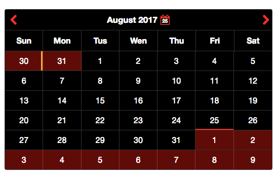
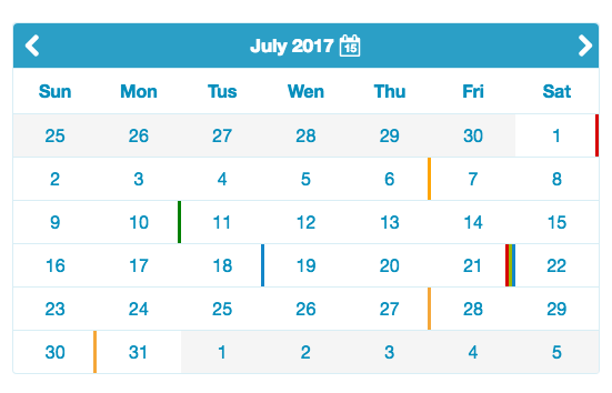
There are 2 additional theme to chose, dark and light-blue.


You can also customize the calendar your self with the following properties:
| Property | Description |
|---|---|
| --main-bg | Calendar's main background color |
| --header-bg | Calendar's header background color |
| --main-header-color | Calendar's header color |
| --header-icon-bg | Calendar's icons background |
| --header-icon-opacity | header's icon opacity on hover event |
| --labels-color | The color of the days |
| --border-width | Calendar's border width |
| --border-right-width | Calendar's right border (if you set it to 0 then the dates will have top and bottom border) |
| --border-color | Calendar's border color |
| --prev-days-bg | Calendar's previous month dates background color |
| --prev-days-color | Calendar's previous month dates color |
| --curr-days-bg | Calendar's current month dates background |
| --curr-days-color | Calendar's current month dates color |
| --next-days-bg | Calendar's next month dates background |
| --next-days-color | Calendar's next month dates color |
| --disabled-color | Calendar's disabled dates color |
| --disabled-text-shadow | Calendar's disabled dates text shadow effect |
| --selected-day-bg | Calendar's selected day background color |
| --today-boxshadow-color | Calendar's current date shadow style, it's adding a small border style effect |
| --selected-day-hover-bg | Calendar's selected day background color on hover |
Events
There are 4 ready to use categories: red, blue, green and orange.
Each day which have an event will also have a color line at the right side, based on the category.
If a day have 4 or more events than the display color will get the event-day-color.
Date format YYYY-MM-DD. If you change the json file on events-file or an event on events-object, calendar will automatically show the changes.
Example:
[
    {
        "title": "Red style category",
        "content": "Skype call at 15:40",
        "date": "2017-06-02",
        "category": "red",
        "color": "#000"
    },
    {
        "title": "orange style category",
        "content": "Meeting at 14:00",
        "date": "2017-06-05",
        "category": "orange"
    },
    {
        "title": "Green style category",
        "content": "Just a notification",
        "date": "2017-06-10",
        "category": "green"
    },
    {
        "title": "Blue style category",
        "content": "Doctor's appointment at 20:00",
        "date": "2017-06-18",
        "category": "blue"
    }
]
Icons
Big Thanks
Cross-browser Testing Platform and Open Source <3 Provided by Sauce Labs

License
MIT License


