native-select-dropdown v0.2.8
select-dropdown
A select dropdown component for plain HTML.
- NO libraries, frameworks or transpilers required.
- It works with vanilla HTML / JS and it doesn't have any dependency.
- Easy integration, as it's a single javascript file. Available as node package as well.
- FULL styling control with CSS.
- Inner HTML allowed.
- Full control with keyboard for better accessibility.
Just type:
<select-dropdown>
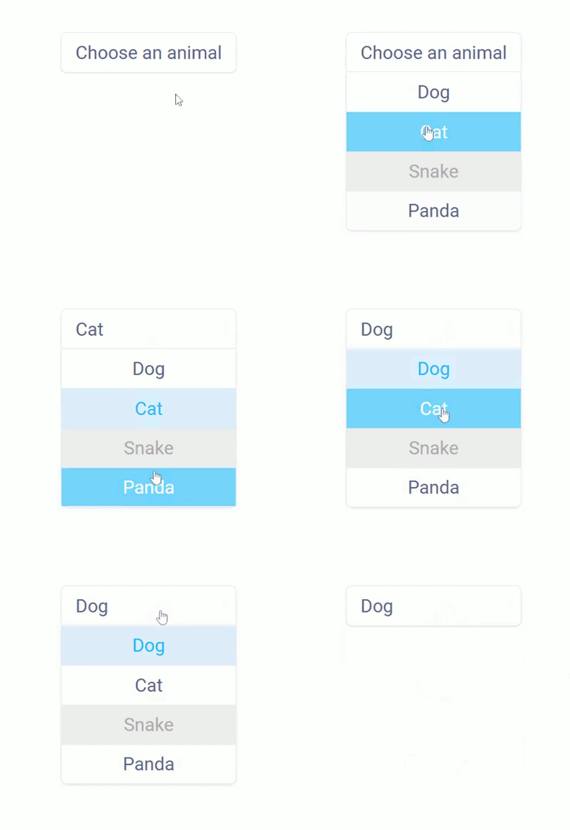
    <select-option placeholder hidden>Choose an animal</select-option>
    <select-option>Dog</select-option>
    <select-option>Cat</select-option>
    <select-option disabled>Snake</select-option>
    <select-option>Panda</select-option>
</select-dropdown>
to render this:
How to install
Setup for vanilla HTML / JS
Just take the file select-dropdown.js file from the src folder. Then, add it to you application as usual.
<script src="select-dropdown.js" />Setup for Node
First, add the package to your project.
npm install native-select-dropdown --saveSecond and last, add the package to the files for which you will use it.
require('native-select-dropdown')How to use it
After the setup, you will have 3 new HTML tags available to use: select-dropdown, select-option and select-arrow. They first two are the analogous to the builtin tags select and option respectively, the last one allows you to define, optionally, an arrow icon, image, text or even a html block.
<select-dropdown>
Defines a new select-dropdown element. All its children must to be <select-option> elements, the non select-option children will be ignored.
Attributes
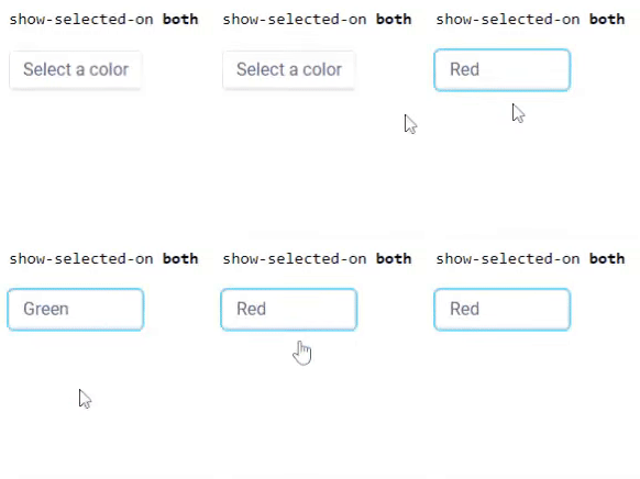
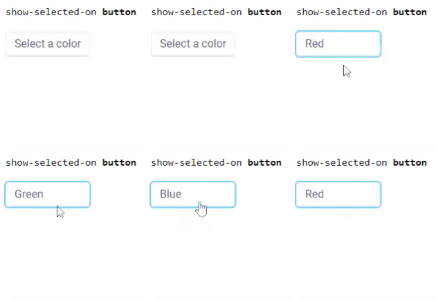
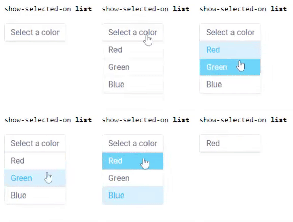
show-selected-on: Depending of its value, it changes the behaviour of the placeholder and the selected option as described below:both: This is de default behaviour if notshow-selected-onattribute has been set. When the option list is opened, it renders the selected option in both: the option list itself and the dropdown button.button: The selected option is removed from the option list when selected, so it's only rendered on the dropdown button.list: When the option list is opened, the selected option is rendered on the list but the button will render the placeholder. As soon the the list closed the dropdown button will render the selected option again.
disabled: Makes the dropdown disabled, preventing any user interaction. This attribute doesn't need any value, if present, the dropdown becomes disabled. By default a disabled dropdown has a style opacity of 0.5; you can change this with standard CSS, see the styling section for more info.For clarity, consider the following example:
<select-dropdown show-selected-on=" ... ">
    <select-option placeholder hidden>Select a color</select-option>
    <select-option>Red</select-option>
    <select-option>Green</select-option>
    <select-option>Blue</select-option>
</select-dropdown>
Reading a value
To read the value of the current selected option you just need to access to the value property of its parent select-dropdown. Like:
const select_dropdown = document.getElementById('my-select-dropdown')
const value = select_dropdown.value
By default, the value is the text content of the selected option. If an option has html content like My <b>Option</b> the html tags will be ignored and the value will be My Option. If you want to know more about how the text content is calculated read about Node.textContent. An exception for this are select-options with the placeholder attribute set: as placeholder, if they are selected the value will be an empty string.
You can (and should) use custom values which are independent of the text representation of the option. To do this just add a value attribute to you <select-option> elements. You can of course do this for placeholder options as well. For example:
<select-dropdown>
    <select-option placeholder hidden value="0">Choose an animal</select-option>
    <select-option>Dog</select-option>
    <select-option value="kitty">Cat</select-option>
    <select-option value="" disabled>Snake</select-option>
    <select-option>Panda</select-option>
</select-dropdown>
For the example above, the value of the select-dropdown element will be:
- if the placeholder is "selected" (as placeholder, it is by default): A string
"0". - if the Dog option is selected: A string
"Dog". - if the Cat option is selected: A string
"kitty". - if the Snake option is selected: A string
"". - if the Panda option is selected: A string
"Panda".
Finally, have in mind that values are always returned as string type.
Setting a value
The value property of the select-dropdown element has a setter you can use to select an option (and change the dropdown value) programmatically.
const select_dropdown = document.getElementById('my-select-dropdown')
select_dropdown.value = 'Dog'
The above will set the value to Dog and will select the option with that value. An option with the given value attribute or textContent property must be children of the select-dropdown, otherwise the value change won't take effect. Example:
const select_dropdown = document.getElementById('my-select-dropdown')
select_dropdown.value = `this line does nothing because there's no
                         option with this value nor text content` // nothing happens
A different way to set a value is adding a selected attribute to an option. Explained below.
<select-option>
Defines a new select-option element. Its direct parent needs to be a select-dropdown element or it won't work.
Attributes
placeholder: This attribute marks the option as placeholder, so it will be selected by default and will have a empty value by default as well. It will also be rendered on the dropdown button when the option list is opened if the attributeshow-selected-onhas been set tolist, as was explained above.hidden: The option won't be visible in the option list. However it can be selected programmatically.disabled: The option can't be selected by the user, but it will appear visible in the option list. Can be selected programatically.value: Sets a specific value to the option. This will be the value of its select-dropdown parent when the option is selected.selected: Says if the option is selected. This attribute is set/removed automatically when the user interacts with the dropdown selecting a new option. You can also add / remove programmatically this attribute to select an option from code (just an alternative toselect_dropdown.value = 'value'). Only one option can be selected at a time, so adding a selected attribute to an option will remove the selected attribute of its siblings.label: An alternative text/html that will be used in the dropdown "button" when the option is selected.button-content(INTERNAL / ADVANCED attribute): Everyselect-dropdownelement creates automatically a newselect-optionchild with the attributebutton-content. This special select-option has the content of the select-dropdown button, in fact, you can treat it as the dropdown button itself in terms of content (in terms of styling, please, read the styling section by the end of this document). As dropdown button content container, it's not part of the option list and its content is updated when a new option is selected.You don't need to worry or modify this special
button-contentoption as it's managed automatically, however, you need to be aware of it if you are modifying the DOM tree programmatically, so for your html being:<select-dropdown id="my-select-dropdown"> <select-option placeholder hidden>Choose an animal</select-option> <select-option>Dog</select-option> </select-dropdown>if you do something like:
const select_dropdown = document.getElementById('my-select-dropdown')
console.log( select_dropdown.children )
You will get an HTMLCollection of size 3, the 2 options you have defined and the
button-contentone which includes the content of the dropdown button itself, the DOM will look like:<select-dropdown id="my-select-dropdown"> <select-option button-content>Choose an animal</select-option> <select-option placeholder hidden>Choose an animal</select-option> <select-option>Dog</select-option> </select-dropdown>The technical reason behind this special select-option is because when
show-selected-onhas the valuebothand the option list is opened, the content of the selected option needs to be rendered twice: one time in the option list itself and another in the dropdown button. At the moment is not possible render twice a single DOM node in a browser, so we need to transfer the content to another one, acting as clone. And the reason to no do that in the shadow DOM is because we want to keep the styling of your select-options intact in case you are using HTML and not only text on them: doing this in the shadow DOM will leave your CSS out of the scope of where the dropdown button content is.TLDR;
select-dropdown's will always create an extraselect-optionwith the attributebutton-content. You can and probably should ignore it, just be aware of its existence if you modify the DOM tree manually.
<select-arrow>
Defines an arrow. Its direct parent needs to be a select-dropdown element or it won't work.
Attributes
position: Where the arrow will be rendered as part of the button, valid values areleftorright. If no position is defined, it defaults toright.
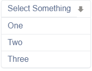
As example, use:
<select-dropdown data-test-id="sd15" show-selected-on="button">
    <select-arrow position="right" class="grey"> 🡇 </select-arrow>
    <select-option placeholder hidden>Select Something</select-option>
    <select-option>One</select-option>
    <select-option>Two</select-option>
    <select-option>Three</select-option>
</select-dropdown>
to render:
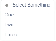
or:
<select-dropdown data-test-id="sd15" show-selected-on="button">
    <select-arrow position="left" class="grey"> 🡇 </select-arrow>
    <select-option placeholder hidden>Select Something</select-option>
    <select-option>One</select-option>
    <select-option>Two</select-option>
    <select-option>Three</select-option>
</select-dropdown>
to render:
Styling
Styling your <select-dropdown> using classes
This custom element uses a shadow DOM, so the CSS selectors you need to customize the appearance are not obvious if you are not familiar with shadow DOM, HTML templates and some advanced CSS selectors. Fortunately we have here for you a list of all (or most) the selectors you need to fully control the style of your select-dropdowns. Let's create a new class "dark" as example.
/* First: let's apply some global style to the whole component,
   in this case, set the font to monospace */
 .dark {
    font-family: monospace;
}

/* Now let's customize the "button", the button is the visible part
   of the component when the option list is closed.

   Because button is a part of the shadow DOM, we use the ::part pseudo-element.
*/
.dark::part(button) {
    border: 2px solid #000000;
    background: #3d3d3d;
    color: #05ff86;
    /* the default style includes a light shadow and a border radius, we override them */
    box-shadow: none;
    border-radius: 0;
}

/* For better accessibility, we recommend to highlight the element
   when the browser thinks heuristically that it should. A simple outline will
   do the trick.

   This happens for example when navigating between elements
   using the keyboard (<TAB> key).
*/
.dark::part(button):focus-visible {
    outline:2px solid #37d85a
}

/* Options is the option list box. Just as we did for the button
   we use a selector with ::part */
.dark::part(options) {
    background: #3d3d3d;
    padding: 10px;
    box-shadow: none;
    border: 2px solid #000000;
    /* To make our dark version even more different, we add some space
    between the "button" and the "options" */
    margin-top: 10px;
}

/* And finally, we can style the select-options themselves. No need to access the shadow DOM for this. */
.dark select-option {
    background: #1b1b1a;
    color: #c8c8c8;
    border: 0
}

/* This replaces the :hover state of the options. There are a few technical
   reasons to use an attribute like pre-selected instead of the :hover CSS pseudo-class.
   For example, we want to navigate between options with the keyboard and highlight them
   using arrow down / up keys and not only when the mouse is over.

   So PLEASE, avoid select-option:hover and use select-option[pre-selected] instead
*/
.dark select-option[pre-selected], .dark select-option:focus-within {
    color: #05ff86;
}

.dark select-option[disabled] {
    color: #92908c;
    text-decoration: line-through;
}

.dark select-option[selected] {
    color: #05ff86;
    font-weight: 800;
}
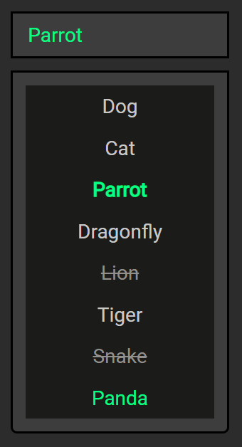
The above will result in
(I know you eyes are bleeding right now, but this is just an example).
In the image above the Panda option is pre-selected using the keyboard keys arrow up / arrow down (same effect as putting the mouse cursor over it). Snake and Lion are disabled. Parrot is selected. Others are just a regular options.
Styling your <select-dropdown> globally
To do the same globally, instead using a class, we can just replace our dark class by select-dropdown.
select-dropdown {}

select-dropdown::part(button) {}

select-dropdown::part(button):focus-visible {}

select-dropdown::part(options) {}

select-option {}

select-option[pre-selected], select-option:focus-within {}

select-option[disabled] {}

select-option[selected] {}
The above selectors correspond one by one with the ones we used before using the dark class. This will style all the select-dropdowns elements in you application without using classes.
Using HTML
Just use nested HTML inside your options as you regularly do. It's a good idea to wrap your HTML into a container like a div, so you can control the layout of your content. Example:
<style>
    select-option > div {
        display: flex;
        flex-direction: column;
        align-items: center;
    }

    select-option > div > img {
        width: 100px;
        height: 100px;
        border-radius: 10px;
    }
</style>

<select-dropdown show-selected-on="list">
    <select-option placeholder hidden>What's your favorite Arthur?</select-option>
    <select-option>
        <div><img src="https://i.postimg.cc/qBPgG8v4/arthur-1.jpg">Arthur 1</div>
    </select-option>
    <select-option>
        <div><img src="https://i.postimg.cc/5N8yK6Xv/arthur-2.jpg">Arthur 2</div>
    </select-option>
    <select-option>
        <div><img src="https://i.postimg.cc/Gmr2WdDf/arthur-3.jpg">Arthur 3</div>
    </select-option>
    <select-option>
        <div><img src="https://i.postimg.cc/R0pZJtYr/arthur-4.jpg">Arthur 4</div>
    </select-option>
    <select-option>
        <div><img src="https://i.postimg.cc/rpwppjQC/arthur-5.jpg">Arthur 5</div>
    </select-option>
    <select-option>
        <div><img src="https://i.postimg.cc/3xBR7VCx/arthur-6.jpg">Arthur 6</div>
    </select-option>
</select-dropdown>
will render:
1 year ago
1 year ago
2 years ago
3 years ago
3 years ago
3 years ago
3 years ago
3 years ago
4 years ago
4 years ago
4 years ago
4 years ago
4 years ago
4 years ago
4 years ago
4 years ago
4 years ago
4 years ago
4 years ago
4 years ago
4 years ago
4 years ago
