Licence
MIT
Version
1.0.12
Deps
3
Size
11 kB
Vulns
0
Weekly
0
native-x-button
This helps you add interactive buttons. This module works with native-x-theme package.
Install
Yarn
yarn add native-x-buttonNPM
npm install native-x-buttonUsage
import { Button } from 'native-x-button'

function MyComponent() {
  return (
    <Stack>
      <Button>Click Me</Button>
      <Button outline>Click Me</Button>
      <Button clear>Click Me</Button>
      ...
      <Button rounded>Click Me</Button>
      <Button rounded outline>
        Click Me
      </Button>
      ...
      <Button loading>Click Me</Button>
      <Button rounded loading>
        Click Me
      </Button>
      <Button icon={<Icon name='trash' />}>Delete</Button>
    </Stack>
  )
}
DEMO
| Button Types | Button Sizes | Colors / Disabled |
|---|---|---|
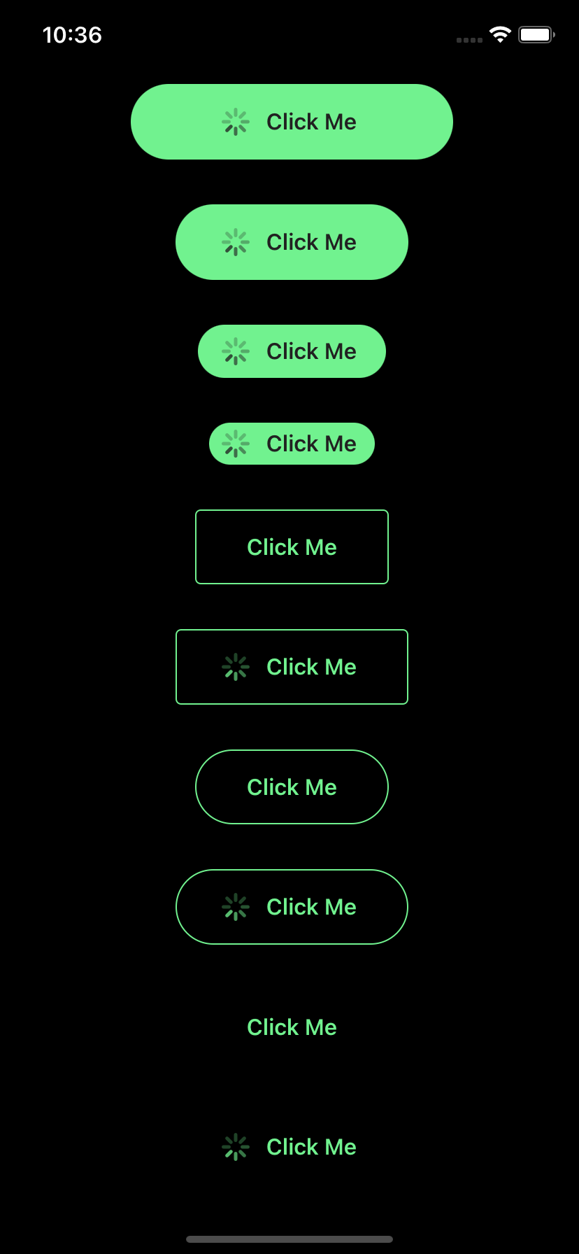 |
 |
 |
API
| Property | Default Value | Usage |
|---|---|---|
| disabled?: boolean | false | Disable the user interaction and change visual appearance |
| outline?: boolean | false | Button with no background but with border color |
| clear?: boolean | false | Button with no background and border color |
| rounded?: boolean | false | Show rounded corners |
| loading?: boolean | false | Show a spinner |
| icon?: ReactNode | Show an icon | |
| size?: string | 'normal' | Valid values: 'x-small', 'small', 'normal', 'large', 'x-large' |
| backgroundColor?: string | COLOR.ACCENT | Any valid name of the color defined by ThemeProvider |
| textColor?: string | COLOR.PRIMARY | Any valid name of the color defined by ThemeProvider |
| borderColor?: string | COLOR.DIVIDER | Any valid name of the color defined by ThemeProvider |
| fill?: boolean | Fill the container horizontally and vertically | |
| fillHorizontal?: boolean | Fill the container horizontally | |
| width?: number | Width of the button | |
| height?: number | Height of the button | |
| minWidth?: number | Minimum width of the button | |
| minHeight?: number | Minimum height of the button | |
| maxWidth?: number | Maximum width of the button | |
| maxHeight?: number | Maximum height of the button | |
| onTap: (data: TData) => void | Action handler for user interaction | |
| data: TData | undefined | Optional data |
Automatic Release
Here is an example of the release type that will be done based on a commit messages:
| Commit message | Release type |
|---|---|
| fix: [comment] | Patch Release |
| feat: [comment] | Minor Feature Release |
| perf: [comment] | Major Feature Release |
| doc: [comment] | No Release |
| refactor: [comment] | No Release |
| chore: [comment] | No Release |