nativescript-slideshow-busy-indicator v3.0.1
Nativescript-slideshow-busy-indicator
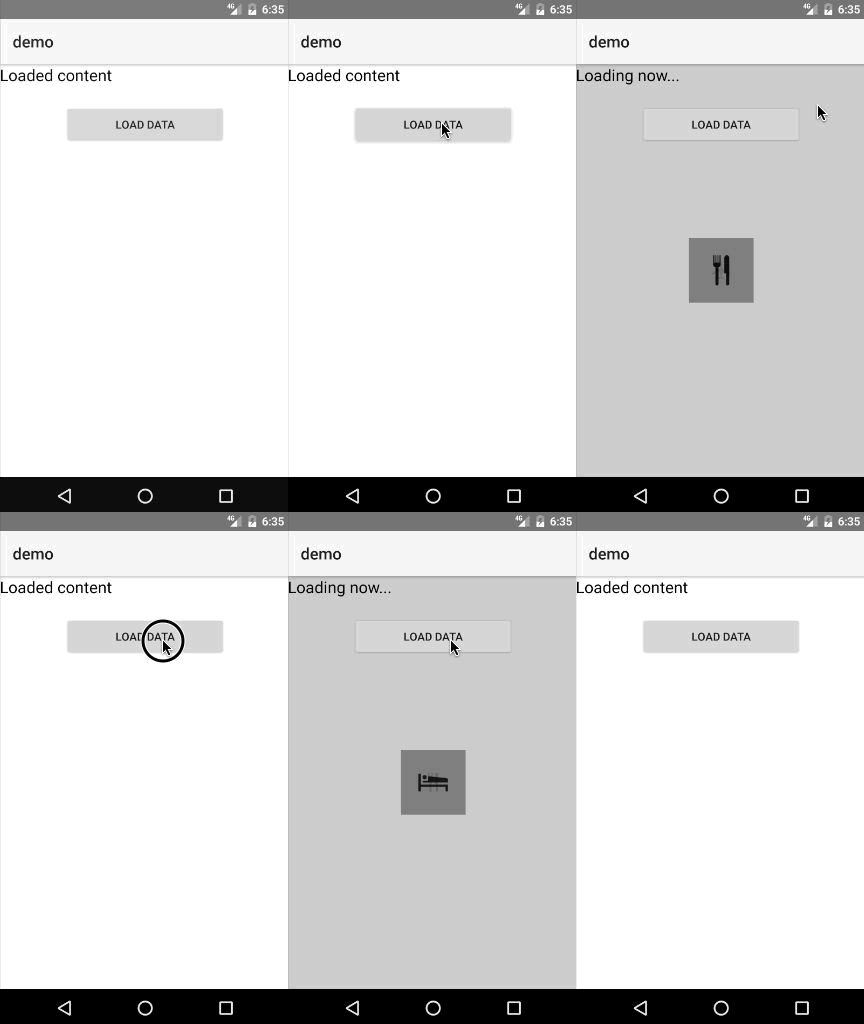
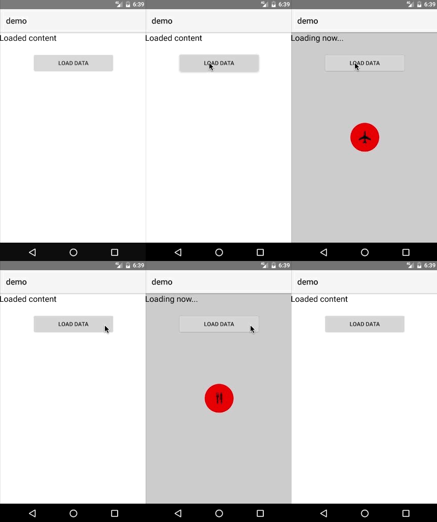
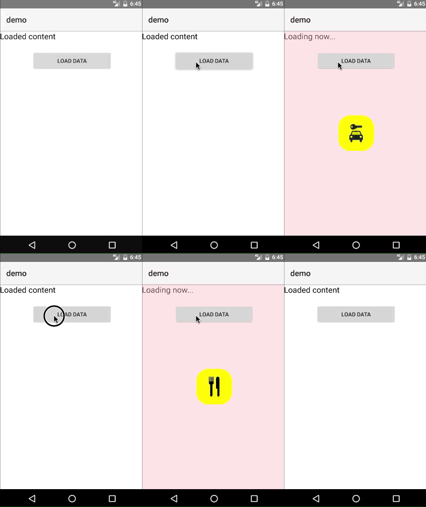
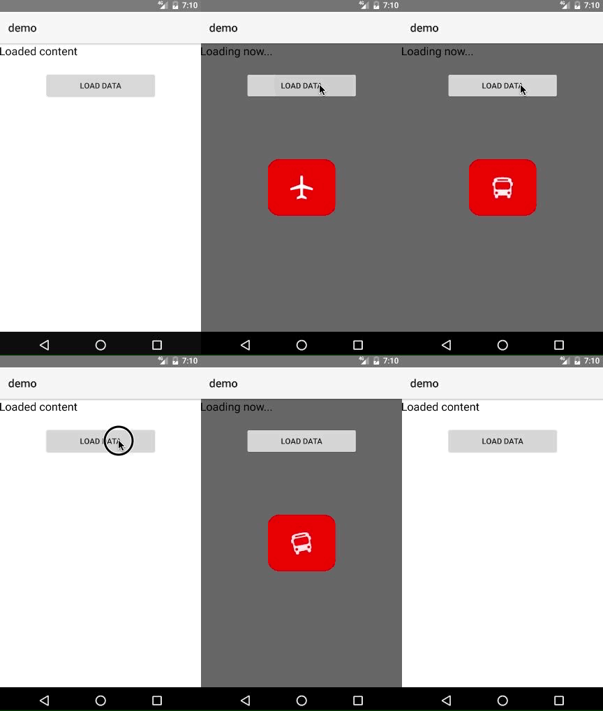
This plug-in allows you to easily create a busy indicator (loader) like the one illustrated using a set of images that you provide. What it does is cycle through the images with a nice transition.

Prerequisites
You need a set of images that will be used to be cycled through. The format can be any format that the NS Image module supports. For best looks icon-like images (with transparency like PNGs) do the job. See demo.
Installation
npm install nativescript-slideshow-busy-indicator --saveUsage
You will have to add xmlns:indicator="nativescript-slideshow-busy-indicator" namespace to your page tag, and then simply use <indicator:BusyIndicator/> in order to add the widget to your page.
The must-set properties are: images - set this property to an array of strings that represent paths to the images you would like to display, like:
public images = ["~/images/01.png", "~/images/02.png", "~/images/03.png", "~/images/04.png"];isBusy - when set to true, the indicator is visible, when false - it is not
Then you can use the indicator like:
<indicator:BusyIndicator isBusy="{{ isBusy }}"
 images="{{ images }}"
 indicatorWidth="60"
 indicatorHeight="60"
 indicatorBorderRadius="30"
 indicatorColor="red" />
A few examples:
| Output | Code |
|---|---|
 | <indicator:BusyIndicator isBusy="{{ isBusy }}" images="{{ images }}" indicatorWidth="60" indicatorHeight="60" indicatorBorderRadius="30" indicatorColor="red" /> |
 | <indicator:BusyIndicator isBusy="{{ isBusy }}" images="{{ images }}" indicatorWidth="90" indicatorHeight="90" indicatorBorderRadius="30" indicatorColor="yellow" backOpacity="0.4" backColor="pink" /> |
 | <indicator:BusyIndicator isBusy="{{ isBusy }}" images="{{ images }}" indicatorWidth="120" indicatorHeight="100" indicatorBorderRadius="20" indicatorColor="red" backOpacity="0.6" backColor="black" /> |
API
| Property | Description |
|---|---|
| backOpacity | Sets the opacity of the background layer (floating point value from 0 to 1) |
| backColor | Sets the color of the background layer (e.g. "red", "#FF0000") |
| indicatorOpacity | Sets the opacity of the indicator layer (floating point value from 0 to 1) |
| indicatorColor | Sets the color of the indicator layer (e.g. "green", "#00FF00") |
| indicatorHeight | Sets the height of the indicator layer in pixels |
| indicatorWidth | Sets the width of the indicator layer in pixels |
| indicatorBorderRadius | Sets the border radius of the indicator layer (by default is 0, can be set to 0.5 * indicatorHeight if you want to make the indicator circle for example) |
License
Apache License Version 2.0, January 2004