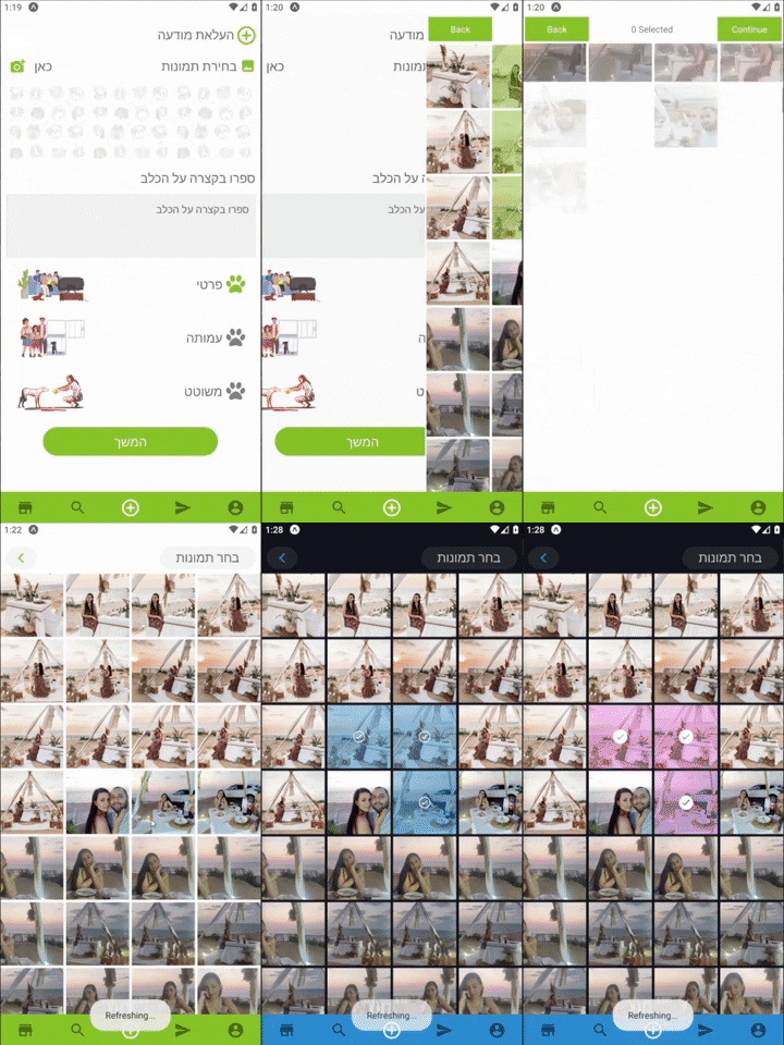
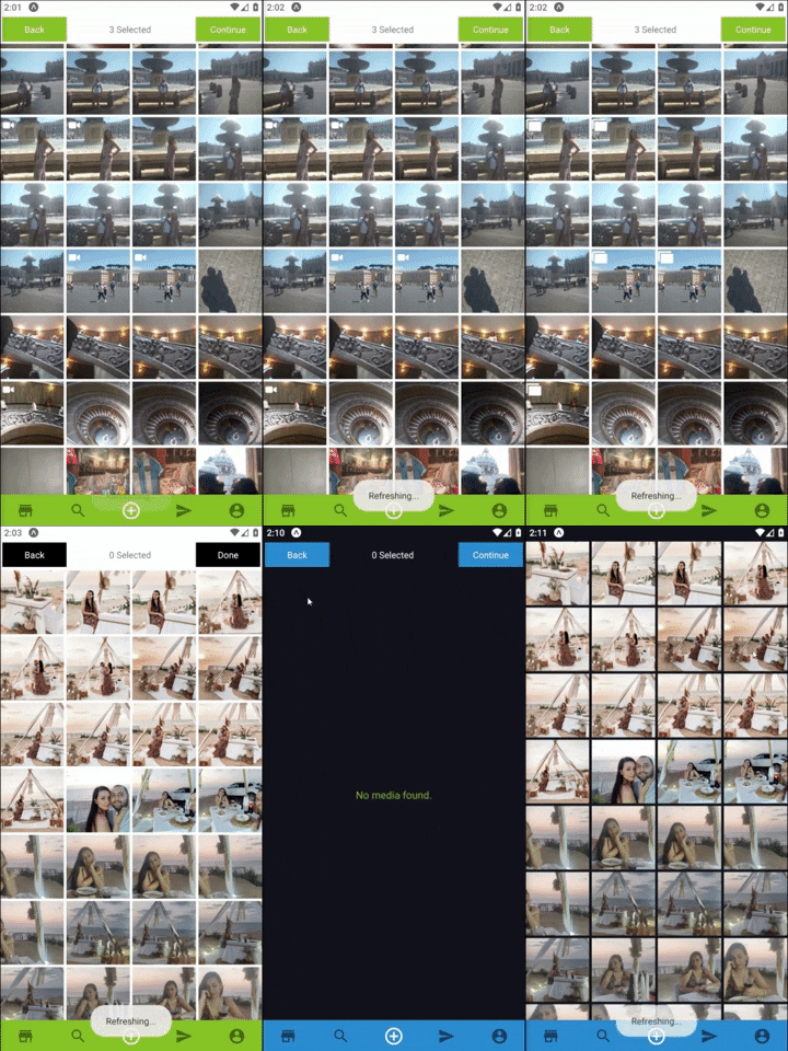
natysoz-test v1.0.4
expo-images-picker
Multiple Asset Photos | Videos selecting package for Expo SDK 38+
Best Practice
- For users who use React + Styled Components Flow.
Check out how I use it with my Latest app => https://youtu.be/
Features
- Permission requests built in.
- Getting Multi Assets from the device.
- Support Both landscape and portrait.
- Simple Indicator for the selected Assets.
- Custom Indicator for the selected Assets.
- Using custom navbar components.
- Allow selecting multiply Photos or Videos and sound Assets.
- Super optimized , using react hooks , memo and callback to fully optimize performances.


Usage
- Install with
or$ npm install --save expo-images-picker$ yarn add expo-images-picker import to the top of your file like
import { AssetsSelector } from 'expo-images-picker'install @expo-vectors package and send icons as props to the widget
import {Ionicons} from '@expo/vector-icons'- Use the imported as Following =>
        <AssetsSelector
            options={{
                assetsType: ['photo', 'video'],
                noAssetsText: 'No media found.',
                maxSelections: 5,
                margin: 3,
                portraitCols: 4,
                landscapeCols: 5,
                widgetWidth: 100,
                widgetBgColor: theme.bg,
                selectedBgColor: theme.main,
                videoIcon: {
                    Component: Ionicons,
                    iconName: 'ios-videocam',
                    color: 'white',
                    size: 20,
                },
                selectedIcon: {
                    Component: Ionicons,
                    iconName: 'ios-checkmark-circle-outline',
                    color: theme.polar_text_1,
                    bg: theme.mainWithOpacity,
                    size: theme.XL,
                },
                defaultTopNavigator: {
                    continueText: 'Finish',
                    goBackText: 'Back',
                    buttonBgColor: theme.main,
                    buttonTextColor: theme.solid_button_text,
                    midTextColor: theme.polar_text_2,
                    backFunction: goBack,
                    doneFunction: data => onDone(data),
                },
                noAssets:{
                    Component:CustomNoAssetsComponent
                },
            }}
        />
##📚 Params
Options:
assetsType: Could be 'video' , 'photo' or an array with both 'photo','video'.noAssetsText: Text to display when there are no assets at all.maxSelections: Maximum number of assets selection.margin: Margin the Grid items by Pxs.portraitCols: Number of columns in portrait Mode.by default4.landscapeCols: Number of columns in landscape Mode, by default6.widgetWidth: Widget container width , by default100.widgetBgColor: Widget background color expect to get Hex color.
selectedIcon:
Component: Send in the Library you wanna use ,LikeIonicons.iconName: Send in the name property for the icon, Like'ios-checkmark-circle-outline'.color: Send in the color property for the icon,Likewhite.bg: The Fill color of selected component, Like#ffffff50.size: Send in the size property for the icon, Like22.
- Not sending "defaultTopNavigator" will hide the default top nav bar.
You can control the colors , texts of the default nav with the following:
defaultTopNavigator:continueText: Text for next Button , by defaultContinue.goBackText: Text for Back Button , by defaultBack.buttonBgColor: Color Of the Buttons, by defaultblack.buttonTextColor: Color of Buttons Text,#ffffff50.midTextColor: Color Of the counter text, by defaultblack.backFunction: Send in a function to go back to your screen.doneFunction: Send in a function to go back and send the returned data.
noAssets:
Component: Send your custom No assets Component.
Sending "CustomTopNavigator" will display your Custom component and hide the defaults.
CustomTopNavigator:Component: Send in your Custom nav bar.props: Send any props your Custom Component needs.
- usage With Custom Component
        <AssetsSelector
                options={{
                    ...otherProps,
                    CustomTopNavigator: {
                        Component: CustomNavImageSelection,
                        props: {
                            backFunction: true,
                            text: translator(T.PICK_IMAGES),
                            doneFunction: (data: Asset[]) => onDone(data),
                        },
                    }
                }}
        />