ncbi-design-system v2.2.0
NCBI Web Design System (NWDS)
NCBI-themed USWDS!
- USWDS theme settings are set to NCBI defaults in
/_ncbi-theme.scss. - Roboto has been installed as the default font.
- Color themes follow the NCBI specification at https://www.ncbi.nlm.nih.gov/style-guide/basics/colors/
A live demo of all components included in the design package can be accessed at https://ncbi-codeathons.github.io/nds1-team-2-design-package/.
Note that Github Pages deployments need to be active on the gh-pages branch for this to be accessible, otherwise this will show a 404.
Requirements
- Node.js (v16.x.x)
- npm
- uswds
- uswds-compile
Team
- James Hancock
- 4:00 am – 12:30 pm US / 9:00 am - 5:30 pm UK
- Pradeep Chand
- 9:00 am – 5:00 pm US / 2:00 pm - 10:00 pm UK
Since the team members are working in different timezones, we have agreed upon following work handoff protocol:
- Each developer will work on a feature branch and create a pull request for any completed feature for other developer to review
- Other developer will review the pull request, make necessary changes and merge the changes.
- The other developer will start new work off the merged code base.
How to use
Install via direct download
Developers can download all NWDS assets (including CSS, JavaScript, fonts and icons) from the latest release in the repository releases page.
These assets can be added to a webpage in the following manner:
<!DOCTYPE html>
<html lang="en">
  <head>
    <!-- Include meta-tags here -->
    <link rel="stylesheet" href="/assets/css/styles.css" />
    <script src="/assets/js/uswds-init.min.js"></script>
  </head>
  <body>
    <!--
      Include your USWDS components here.
      If they include a reference to an icon which isn't loading, you can update the `src` to the correct asset path.
      Favicons, icons and images can be found in `/assets/img`.
    -->
    <script src="/assets/js/uswds.min.js"></script>
  </body>
</html>
Install via NPM
Installing via NPM with your own build process allows you to create further custom styles on top of NWDS.
First, run `npm install ncbi-design-system @uswds/uswds'
Update your build process so the Sass compiler can find the project SCSS files. Here's an example configuration for WebPack sass-loader.
{
  loader: "sass-loader",
  options: {
    sassOptions: {
      includePaths: [
        "./node_modules/@uswds/uswds/packages",
        "./node_modules/ncbi-design-system/src/theme/sass",
      ],
    },
  },
},
Next, create an index.scss file, the root from which all your project styles will be compiled.
// Load the USWDS styles with the NCBI theme settings applied.
@forward "ncbi-theme";
@forward "uswds";

// Load extra NCBI specific custom styles and settings
@import "ncbi-settings";
@import "ncbi-typography";

// Load the custom NCBI component styles
@import "ncbi-components/site-alert";
@import "ncbi-components/collection";
For documentation on how to modify or add to these styles, please read the customizing styles documentation.
Your build process should now be able to compile index.scss into the NCBI styles. For an example build process using Webpack, see the NCBI Django Reference App. This project uses uswds-compile to build releases with Gulp - this approach will need some adaptation to include the NCBI design system node_module path when compiling the SCSS, as well as updates to uswds.paths.src settings.
Architecture
- This package is built on top of
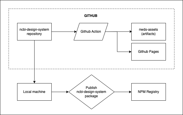
@uswds/uswdsv3.3. [uswds-compile](https://github.com/uswds/uswds-compile)builds the releases of this project, compiling SCSS and copying assets.- Github Actions builds and publishes the release files automatically when code is pushed to
main.

Contributing to this package
Override USWDS settings in /ncbi-theme.scss or add further custom components in /ncbi-components. Make sure to update styles.scss with an import to your new component. You can copy and paste components to index.html from the USWDS component library to verify that your new styles work or you can use storybook following the instructions below.
Running storybook
First run npm run build, this will move assets such as fonts and images into the assets folder, then run npm run watch along with npm run storybook.
Any SCSS changes made will now appear in storybook, note that changes can take 5-10 seconds to display.
Commands
npm run build- compiles Sass files and copies other USWDS assets into theassetsdirectory.npm run compile- compiles only SCSS filesnpm run watch- watches the SCSS files for changes and re-compiles on save.npm run format- formats files with Prettier.npm run lint- lints files with Stylelint.
Refer uswds-compile functions documentation to understand the role of each function.
Documentation and assets
Documentation is found inside /docs/ directory and related images should be stored inside /docs/images/.