1.0.6 • Published 7 years ago
neat-react-button v1.0.6
neat-react-button
neat-react-button is a button component that makes button creation a breeze

Installation
yarn add neat-react-button
or
npm install neat-react-button
Work in Progress
Implemented as a handy tool and any pull requests welcomed!
Usage
Import neat-react-button in your React component:
import Button from 'neat-react-button'Color Props
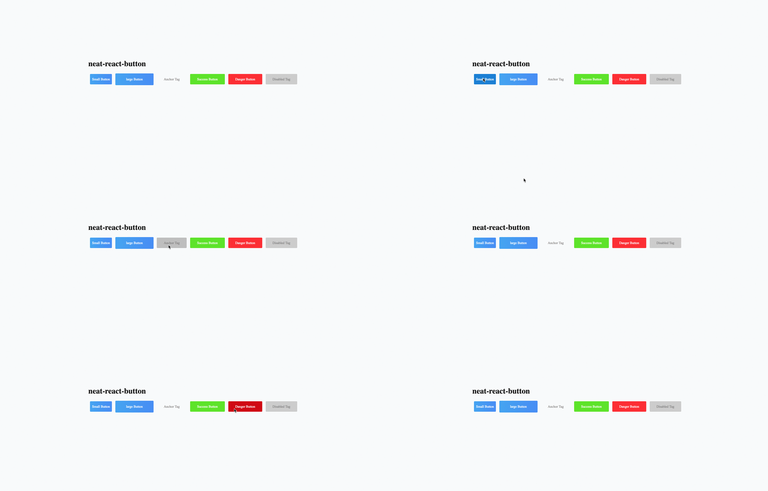
there are currenctly four colors optional, primary(blue) the default one, success(green), info(white whith black font), and danger(red)
Size Props
There are currently three sizes optional, sm, md(default) and lg.
Element
The button becomes anchor if there is a link existing. Otherwise a button.
Supported props
| Prop | Type | Default | Description |
|---|---|---|---|
| size | string | md | Button size |
| color | string | primary | colors described by keywords |
| element | string | button | Type of element |
| text | string | default text | The buttons's text |
| disabled | bool | false | to disable button |
| debounce | number | 0 | Interrupts button click in ms |
| onClick | function | ()=>{} | fired after click |
| btntype | string array | button | button, submit, reset |
You can find example of usage in the demo directory, which you can run in a local development server using npm start or yarn run start