0.1.2 • Published 8 years ago
ng2-gauge-with-color-band v0.1.2
ng2-gauge-with-color-band

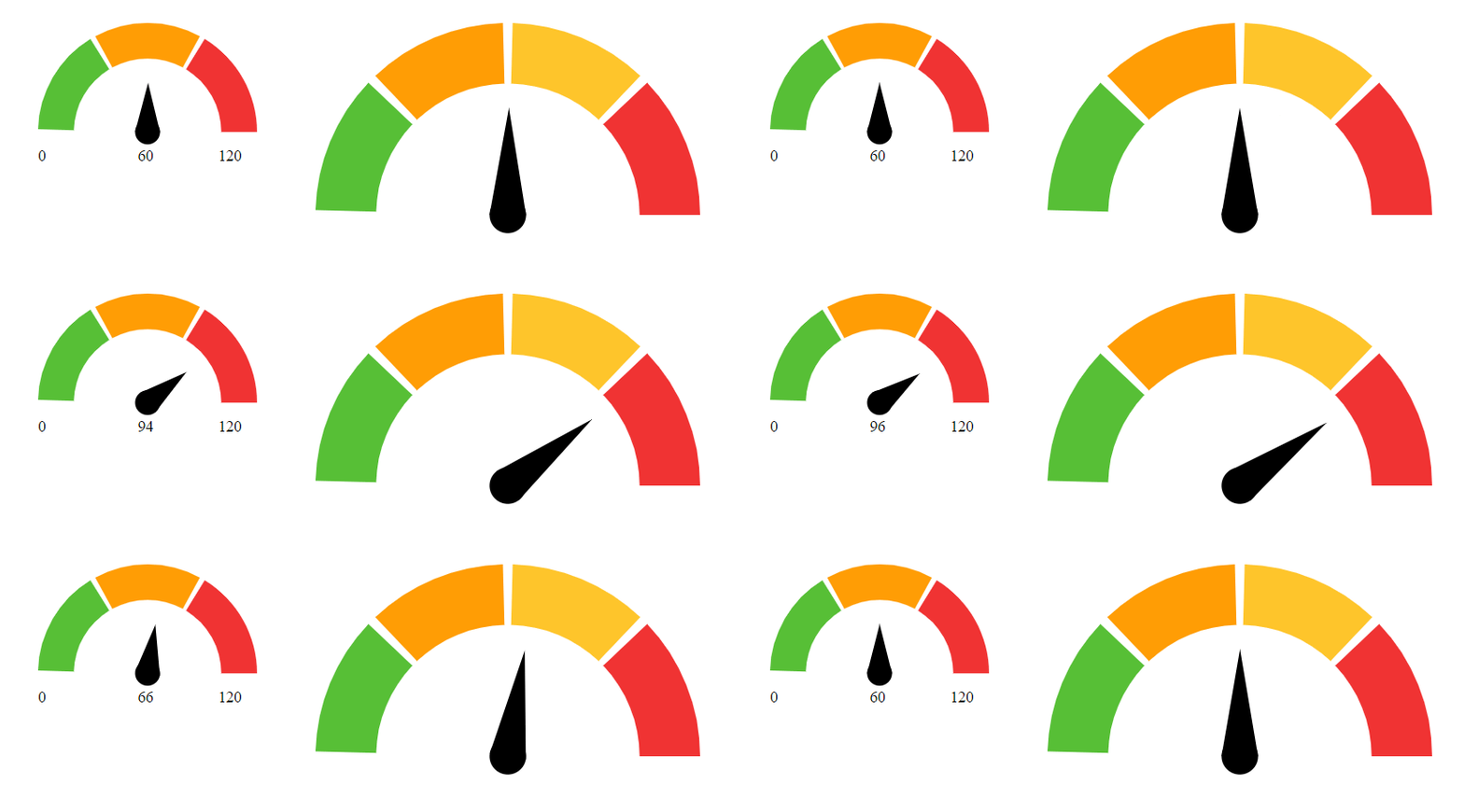
About the guage
The gauge is based on Jake Trent's D3 based work. Original codepen can be found here. https://codepen.io/jaketrent/ I created this simple library to wrapped it as an reusable angular 2 component. All value and rages are represented in percentage so you can map it easily to your own data range. You can also give any number of data ranges on the dial.
Installation
To install this library, run:
$ npm install ng2-gauge-with-color-band --saveConsuming the library
Once you have published your library to npm, you can import your library in any Angular application by running:
$ npm install ng2-gauge-with-color-bandand then from your Angular AppModule:
import { BrowserModule } from '@angular/platform-browser';
import { NgModule } from '@angular/core';

import { AppComponent } from './app.component';

// Import your library
import { ColorGuageModule } from 'ng2-gauge-with-color-band';

@NgModule({
  declarations: [
    AppComponent
  ],
  imports: [
    BrowserModule,

    // Specify your library as an import
    ColorGuageModule
  ],
  providers: [],
  bootstrap: [AppComponent]
})
export class AppModule { }
Once your library is imported, you can use its components, directives and pipes in your Angular application:
<!-- You can now use your library component in app.component.html -->
<h1>
  {{title}}
</h1>
<color-band-gauge fxFlex="25%" [options]="gaugeOptions"></color-band-gauge>
<color-band-gauge fxFlex="40%" [options]="gaugeOptions1"></color-band-gauge>
Gauge Options
  gaugeOptions: IGaugeOptions = {
    valuePercent: .65,
    bandColor: ['#56bf36', '#ff9c04', '#f03333'],
    bandPercent: [.5, .75, .1],
    minValue: 0,
    maxValue: 120,
    unit: 'KM/h'
  };
  gaugeOptions1: IGaugeOptions = {
    valuePercent: .65,
    bandColor: ['#56bf36', '#ff9c04', '#ffc52b', '#f03333'],
    bandPercent: [.5, .6, .75, .1]
  };
Development
To generate all *.js, *.d.ts and *.metadata.json files:
$ npm run buildTo lint all *.ts files:
$ npm run lintLicense
MIT © SiShuo Yang