1.0.0 • Published 6 years ago
ngm-popover v1.0.0
ngm-popover

###to angular 4, 5, 6 , 7 use the 0.1.5 version This library support to angular 8. There are options to
Demo
https://demo-ngm-popover.stackblitz.io
https://stackblitz.com/edit/demo-ngm-popover
Installation
To install this library, run:
$ npm install ngm-popover --save Options
| Function name | Description |
|---|---|
maxWidth | The default value is 400px. this value it's going to set in the style max-width |
minWidth | The default value is 200px. this value it's going to set in the style min-width |
placement | The default value is auto but you can to change the value with these options bottom-right , bottom-left, top-left, top-right, right, left, top and bottom |
Consuming your library
Once you have published your library to npm, you can import your library in any Angular application by running:
$ npm install ngm-popover --save and then from your Angular AppModule:
import { BrowserModule } from '@angular/platform-browser';
import { NgModule } from '@angular/core';

import { AppComponent } from './app.component';

// Import your library
import  { NgmPopoverModule }  from  'ngm-popover';

@NgModule({
  declarations: [
    AppComponent
  ],
  imports: [
    BrowserModule,

    // Specify your library as an import
    NgmPopoverModule.forRoot()
  ],
  providers: [],
  bootstrap: [AppComponent]
})
export class AppModule { }
Once your library is imported, you can use its components, directives and pipes in your Angular application:
<!-- You can now use your library component in app.component.html -->
<div id="specify" class="content active">
	<a class="btn btn-default" [popover]="popoverId">
		 <i class="glyphicon glyphicon-cloud"></i>
	</a>
</div>

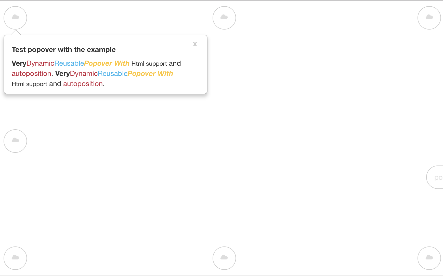
<ngm-popover #popoverId placement="auto">
 <b>Very</b> <span style="color: #C21F39">Dynamic</span>
 <span style="color: #00b3ee">Reusable</span>
 <b><i><span style="color: #ffc520">Popover With</span></i></b>
 <small> Html support</small>
  and <span style="color: #C21F39"> autoposition</span>.
  <b>Very</b> <span style="color: #C21F39">Dynamic</span> <span style="color: #00b3ee">Reusable</span>
 <b><i><span style="color: #ffc520">Popover With</span></i></b>
 <small> Html support</small>
  and <span style="color: #C21F39"> autoposition</span>.
</ngm-popover>
License
MIT © Milver Flores Acevedo