ngx-graphical-view v0.0.2
ngx-graphical-view
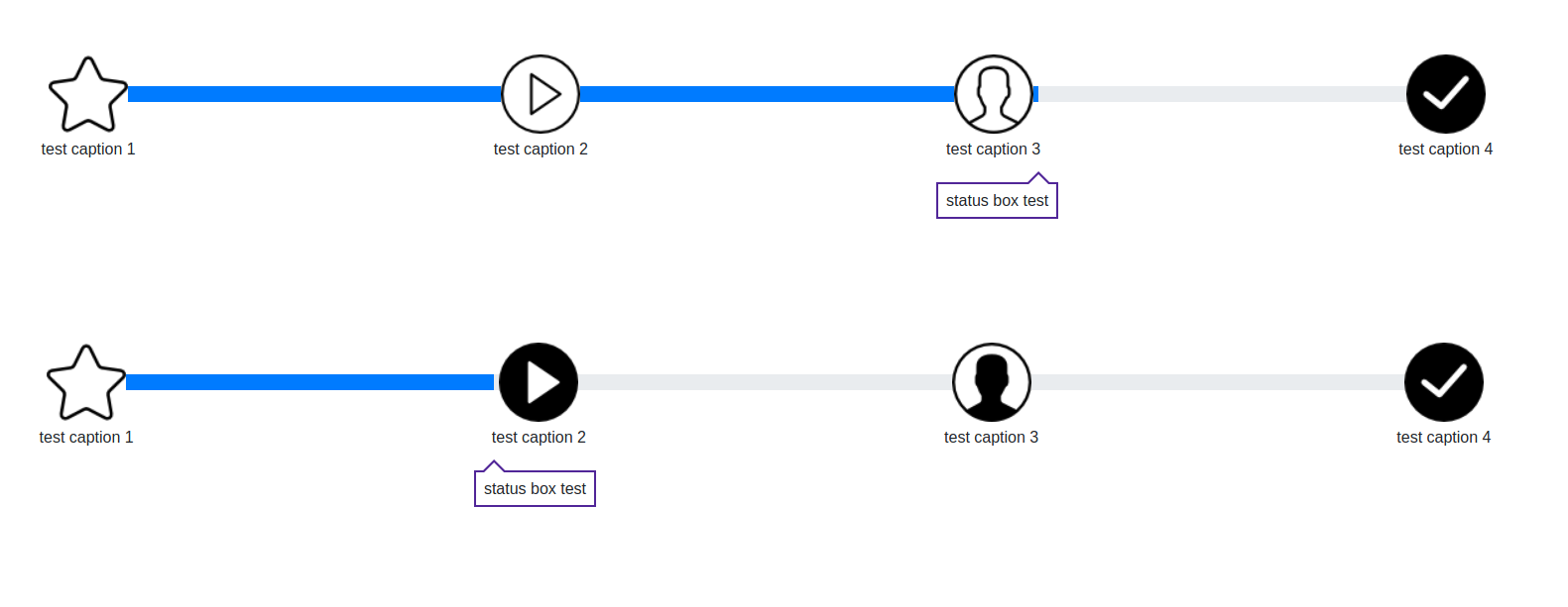
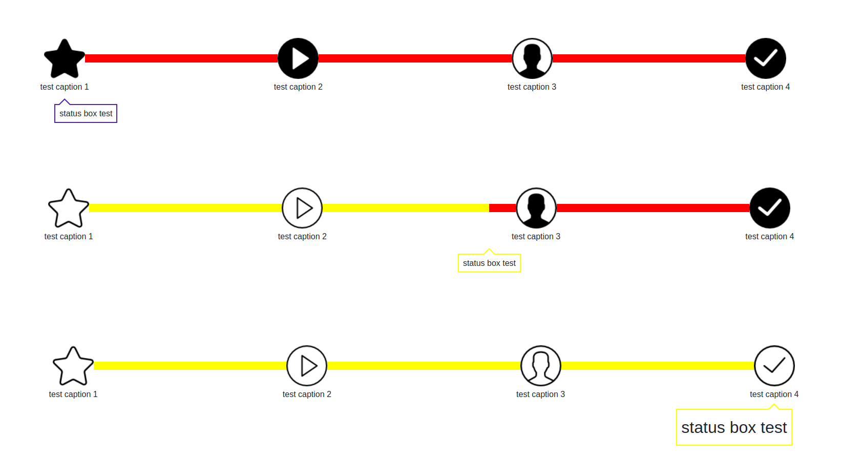
This angular component is a graphical view of a progress bar which include images as intermediate steps.
This library use bootstrap framework to generate the progress bars.
Get the Changelog.
Special features
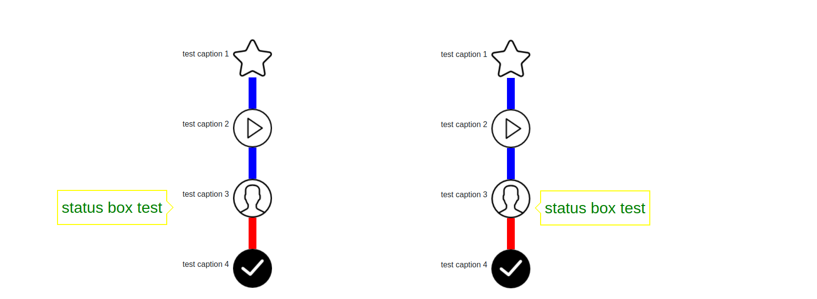
- Use the graphical view in horizontal or vertical position
- Use a status box to inform about the progress status
- Use caption for the images
- The images could be changed when the progress is over the image
ScreenShots
Horinzontal mode:


Vertical mode:

Demo
On going ...
Requirements
- Angular 5 or superior and ng-bootstrap 1 or superior plus its dependencies
Installation
- NPM:
npm install ngx-graphical-view - Bower:
bower install ngx-graphial-view
The library use bootstrap, so you need to add the bootstrap css file to the application:
- In the index.html file, add the bootstrap css file.
<link rel="stylesheet" href="https://maxcdn.bootstrapcdn.com/bootstrap/4.0.0/css/bootstrap.min.css" integrity="sha384-Gn5384xqQ1aoWXA+058RXPxPg6fy4IWvTNh0E263XmFcJlSAwiGgFAW/dAiS6JXm" crossorigin="anonymous">- Or copy the file "bootstrap.min.css" in the src folder of your application then add it in the styles variable of the file ".angular-cli.json"
"styles":[
   "bootstrap.min.css"
   ]
Usage
Import the module in your appplication module
import { GraphicalViewModule } from 'ngx-graphical-view';then declare it in your app imports:
import { BrowserModule } from '@angular/platform-browser';
import { NgModule } from '@angular/core';
import { AppComponent } from './app.component';
import { GraphicalViewModule } from 'ngx-graphical-view';

@NgModule({
  imports: [
    BrowserModule,
    GraphicalViewModule
  ],
  declarations: [ AppComponent ],
  bootstrap: [ AppComponent ]
})
export class AppModule {}
You can now use the component, add the element to your HTML:
<graphical-view [steps]="'X'">
  ...
</graphical-view>
Model of the object steps:
export interface Step {
    image: string;
    imageComplete?: string;
    caption?: string;
}
Usage Example 1 - horizontal mode with caption and status box
<graphical-view
            [steps]="steps"
            [progress-value]="40"
            [status-caption]="'status box test'"
            [direction]="'HORIZONTAL'">
</graphical-view>
where steps is
 let steps: Step[] = [];
    steps.push({ 'image': 'step1_w.png', "imageComplete": 'step1_y.png', "caption": "test caption" });
    steps.push({ 'image': 'step2_w.png', "imageComplete": 'step2_y.png', "caption": "test caption" });
Usage Example 2 - horizontal mode without caption and without status box
<graphical-view
            [steps]="steps"
            [progress-value]="40"
            [direction]="'HORIZONTAL'">
</graphical-view>
were steps is
 let steps: Step[] = [];
    steps.push({ 'image': 'step1_w.png', "imageComplete": 'step1_y.png'});
    steps.push({ 'image': 'step2_w.png', "imageComplete": 'step2_y.png'});
Usage Example 3 - vertical mode with caption and status box on 50% of the width
<graphical-view
            [steps]="steps"
            [progress-value]="40"
            [status-caption]="'status box test'"
            [direction]="'VERTICAL'" style="width:50%;display:block">
</graphical-view>
were steps is
 let steps: Step[] = [];
    steps.push({ 'image': 'step1_w.png', "imageComplete": 'step1_y.png', "caption": "test caption" });
    steps.push({ 'image': 'step2_w.png', "imageComplete": 'step2_y.png', "caption": "test caption" });
Component Attributes
Inputs:
steps(mandatory) - Table of Step object (see bellow) Model of the object steps:
Step {
    image: string;
    imageComplete?: string;
    caption?: string;
}
were - image: is the image to display - imageComplete: is the image to display when the progress is over the image - caption: is the caption of the image
progress-value(optional) - Overall value of the progress bar (must be between 0 and 100). Default value is 0.steps-height(optional) - Height of the image in rem.caption-size(optional) - Size of the caption.caption-position(optional) - Position of the caption compare to the image. Either "TOP", "BOTTOM", "LEFT", "RIGHT". Note that top and bottom are for horizontal direction only when left and roght are for vertical direction.caption-color(optional) - Caption color.progress-bar-height(optional) - Height of the progress bar in rem.status-caption(optional) - This is the text that will be displayed in the status box (if none are given no status box will be displayed).4status-position(optional) - Position of the status box compare to the progress bar. Either "TOP", "BOTTOM", "LEFT", "RIGHT". Note that top and bottom are for horizontal direction only when left and roght are for vertical direction.status-color(optional) - Status text color.status-size(optional) - Size of the text displaye din the status box.status-border-color(optional) - Color of the status border.progress-background-color(optional) - Color of the progress bar background (part not filled).progress-color(optional) - Color of the progress bar (part filled).direction(optional) - Direction of the graphical view,either "HORIZONTAL" or "VERTICAL". Default value is HORIZONTAL.
Testing
Tested on chrome and firefox for angular 5.
License
As Angular itself, this module is released under the permissive MIT license. Your contributions are always welcome.