0.0.2 • Published 4 years ago
ngx-mat-smart-daterange-picker v0.0.2
NgxMatSmartDateTimePicker
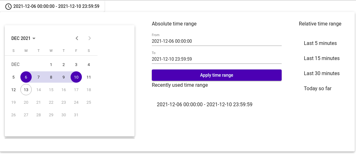
This library add a component to select a date range à la Grafana. You can pick date with the picker, use pre-defined periods or select date manualy.

Get started
Install the lib
npm install ngx-smart-daterange-pickerThen import the module somewhere in your application :
app.module.ts
NgxSmartDateRangePickerModule.forRoot({
  lang: 'en-US' // available locales are en-GB, en-US, fr-BE, fr-CA, fr-FR
});
And use it in your component :
app.component.ts
start = new Date(2020, 0, 1);
today = new Date();

maxRange = 10; // limit selection range to 10 days (0 for unlimited)
app.component.html
<ngx-mat-smart-daterange-picker [min]="start" [max]="today" [maxRange]="maxRange"> </ngx-mat-smart-daterange-picker>Options
You can define relative time range periods globally when importing module
app.module.ts
const relativeTimeRanges: RelativeTimeRange[] = [
  { label: 'last5Minutes', from: 'now-5m', to: 'now' },
  { label: 'last15Minutes', from: 'now-15m', to: 'now' },
  { label: 'last30Minutes', from: 'now-30m', to: 'now' },
  { label: 'todaySoFar', from: 'now/d', to: 'now' }
];

NgxSmartDateRangePickerModule.forRoot({
  relativeTimeRanges,
  lang: 'en-US'
});
Or you can define it when using the component :
app.component.ts
// Overload default configuration
readonly relativeTimeRanges: RelativeTimeRange[] = [
  { label: 'last5Minutes', from: 'now-5m', to: 'now' },
  { label: 'last15Minutes', from: 'now-15m', to: 'now' },
  { label: 'last30Minutes', from: 'now-30m', to: 'now' },
  { label: 'todaySoFar', from: 'now/d', to: 'now' }
];
app.component.html
<ngx-mat-smart-daterange-picker
  [min]="start"
  [max]="today"
  [maxRange]="maxRange"
  [relativeTimeRanges]="relativeTimeRanges"
>
</ngx-mat-smart-daterange-picker>
API
NgxMatSmartDateRangePickerComponent
| Name | Description |
|---|---|
| @Input() min: Date | Minimum date that can be selected in picker (default: undefined) |
| @Input() max: Date | Maximum date that can be selected in picker (default: undefined) |
| @Input() maxRange: number | Number of day that user can select in picker (default: 0) |
| @Input() recentlyUsedTimeRangeCount: number | Number of date the component keep in the recently used section (default: 4) |
| @Input() relativeTimeRanges: RelativeTimeRange[] | Dates that can be shown in the relative time range section (default: lot's of dates |