ngx-sheet-modal v1.0.2
ngx-sheet-modal
Demo

Demo and Full documentation
DEMO AND DOCUMENTATION OFFICIAL WEBSITE
Description
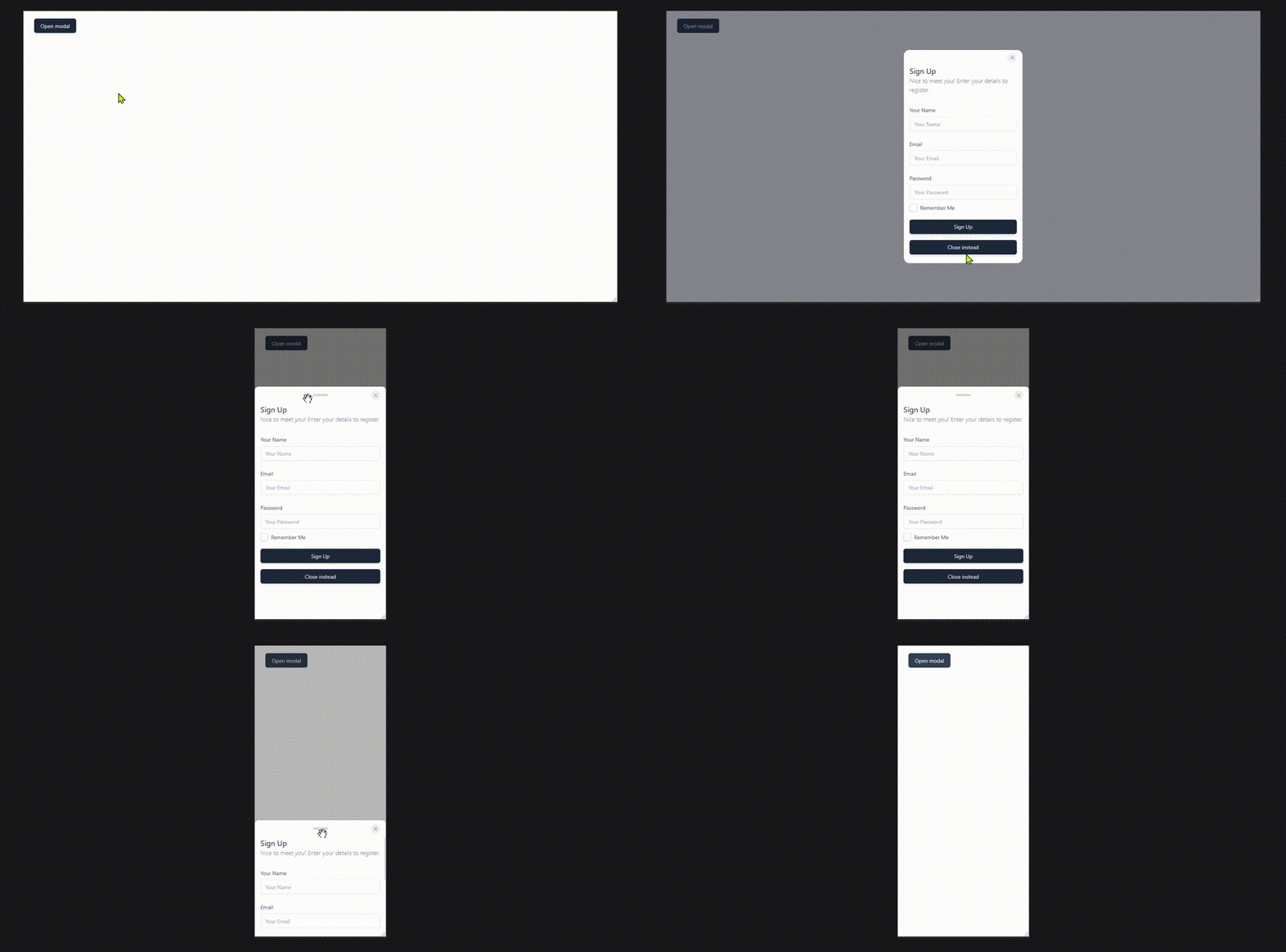
ngx-sheet-modal is an Angular component designed to provide a sheet-style modal, which can be triggered from any part of the UI. The modal supports drag-and-drop functionality, smooth transitions, and flexible configuration to allow users to close the modal through various triggers like a flick gesture or a manual close button. It integrates seamlessly with Angular's reactive forms and is ideal for managing product, order, or customer data in a sleek and interactive way.
Key Features
- Drag-and-Drop Support: Move the sheet modal smoothly with a touch of a finger or mouse drag.
- Flick-to-Close: Close the modal via a flick-down gesture when enabled.
- Highly Configurable: Configure the sheet modal's behavior, such as close actions, threshold for flick gestures, and more.
- Seamless Integration: Easily integrates with your Angular project, supporting both form-based and interactive UIs.
Technologies Used
- Angular 18: Frontend framework for building dynamic, component-based applications.
NgRx: State management library for handling the application state (optional based on project needs).
Installation
npm i ngx-sheet-modalBasic usage
async openSheet() {
    const sheetRef = this.sheetService.openSheet(MyComponentComponent, {
      size: 'xs',
      sheetSize: 'md',
      maxSheetHeight: 'lg',
      placement: 'center',
      closeButton: true
    });
    // Accesing MyComponentComponent instance
    const componentInstance = await firstValueFrom(sheetRef.childInstanceReady);
    componentInstance.title = "This is my new title"
    // Passing the modal Ref to the child component to give it the power of close the modal
    componentInstance.modalRef = sheetRef;
  }
Sheet API
The SheetConfig interface is used to configure the behavior and appearance of the sheet modal. Below is a table summarizing the available options and their descriptions:
| Property | Type | Description | Default | Possible Values |
|---|---|---|---|---|
size | 'xs', 'sm', 'md', 'lg', 'xl' | Defines the size of the modal for desktop devices. | 'md' | 'xs', 'sm', 'md', 'lg', 'xl' |
sheetSize | 'xs', 'sm', 'md', 'lg', 'xl' | Defines the size of the sheet for mobile devices. | 'md' | 'xs', 'sm', 'md', 'lg', 'xl' |
placement | 'bottom', 'top', 'center' | Specifies where the sheet modal should appear on the screen (e.g., top, bottom, or center). | 'bottom' | 'bottom', 'top', 'center' |
maxSheetHeight | 'xs', 'sm', 'md', 'lg', 'xl' | Defines the maximum height of the sheet for mobile devices modal. | 'lg' | 'xs', 'sm', 'md', 'lg', 'xl' |
backdropClose | boolean | If true, the modal can be closed by clicking on the backdrop. | false | true, false |
lockBodyScroll | boolean | If true, body scroll is locked when the modal is open. | true | true, false |
closeButtonIcon | string | The icon to be used for the close button. | SVG close icon | String (e.g., <i class="ri-close-large-line"></i>, 'x') |
backdropIntensity | number | Defines the intensity of the backdrop. Higher values make the backdrop darker. | 0.7 | 0 to 1 |
resizable | boolean | Whether the sheet modal is resizable (Only for mobile devices). | true | true, false |
dragIndicator | boolean | If true, a draggable indicator will be shown to indicate the sheet can be moved. | true | true, false |
closeButton | boolean | If true, a close button will be displayed in the sheet modal. | true | true, false |
backgroundScale | { enabled: boolean, rootBackgroundColor: string, bodyBackgroundColor: string } | EXPERIMENTAL NOT RECOMMEND TO USE IT - Configures background scaling when the modal is open, including background color properties. | { enabled: true, rootBackgroundColor: 'white', bodyBackgroundColor: 'black' } | { enabled: boolean, rootBackgroundColor: string, bodyBackgroundColor: string } |
styles | { backdropClasses?: string, sheetClasses?: string, closeButtonClasses?: string, allowAnimations?: boolean } | Customizes styles for the backdrop and sheet, including optional animations. | undefined | Object with optional properties for classes and animations |
closeOnflickDown | { enabled?: boolean, flickThreshold: number } | Configures the flick-to-close feature. If enabled, the modal will close when a flick-down gesture exceeds the threshold. | { enabled: true, flickThreshold: 0.5 } | { enabled: boolean, flickThreshold: number } |
Notes:
sizeandsheetSizecan be independently configured, meaning the modal and the mobile sheet can have different sizes.maxSheetHeightensures that the mobile sheet does not extend beyond the specified height.backgroundScaleapplies a scaling effect to the background with color options when the modal is visible.closeOnflickDownprovides a unique feature for closing the modal based on swipe gestures, ideal for mobile users.
Prerequisites
Before starting, ensure you have the following installed:
- Node.js (version 16 or higher)
- Angular CLI (to run the Angular project)
Clone the Repository
git clone https://github.com/yourusername/ngx-sheet-modal.git
cd ngx-sheet-modal
Contributing
Contributions are always welcome!
PRs should be well tested and contains all the integration tests. Coverage should be always 100%.
See contributing.md for ways to get started.
Please be kind and respectful.