ngx-simple-date-picker v1.0.6
NGX Date Picker
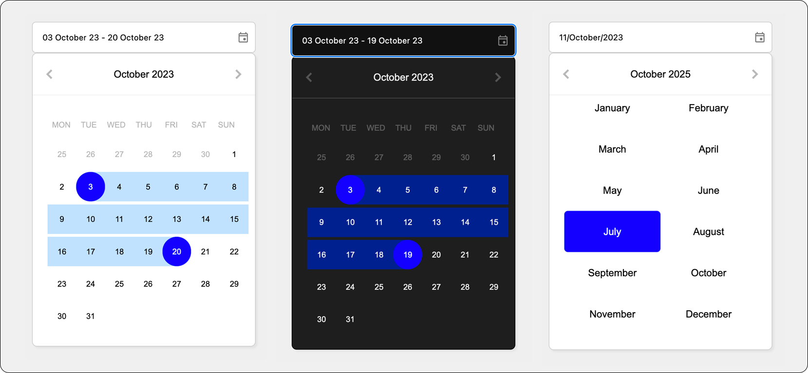
A simple-to-use date picker component for use in Angular (ngx) projects. This component provides your users the ability to select a date or a date range using a clean, sharp looking popup user interface.

Features
- No external dependencies
- Provides either the ability to use the picker UI directly or via a date picker input field
- Built in light/dark mode
- Easy to override configuration
- Easy to override styling
Demo
Click here to view available demos
Using the Input Component (easiest)
How To Use
If you wish to show an input component that will allow your uses to select a date or date range, use the following code:
In your template:
<ngx-date-picker-input [(date)]="dateSelection" (dateChange)="onDateChanges()"></ngx-date-picker-input>
<div>{{dateSelection | json}}</div>
In your component:
@Component({
  templateUrl: './example.component.html',
  styleUrls: ['./example.component.scss']
})
export class ExampleComponent {
    dateSelection: DateSelection | undefined

  onDateChanges() {
    console.log(this.dateSelection);
  }
}
The dateSelection property uses a two-way binding, so you can either bind it directly to your template
or perform an action within the onDateChanges() method above.
Configuration
You can configure both the date input and also the date picker using the NgxDatePickerInputConfig interface. For example,
you can use the following code to enable dark-mode:
datePickerConfig: NgxDatePickerInputConfig = Object.assign(getInputConfigDefaults(), {
  darkMode: false
});
You then just need to pass that config to the ngx-date-picker-input using the [config]="datePickerConfig" attribute.
Full options are listed below:
{
  minDate: Date;
  maxDate: Date;
  initialView: ViewMode;
  rangeMode: boolean;
  darkMode: boolean;
  datePresentationFormat: string;
  datePresentationLocale: string;
  datePresentationValue: any;
}
Using the Picker Directory
If you do not wish to use the input component, you can instead use the picker directly.
How To Use
<ngx-date-picker [(date)]="dateSelection" (dateChange)="onDateChanges()"></ngx-date-picker>
<div>{{dateSelection | json}}</div>
In your component:
@Component({
  templateUrl: './example.component.html',
  styleUrls: ['./example.component.scss']
})
export class ExampleComponent {
    dateSelection: DateSelection | undefined

  onDateChanges() {
    console.log(this.dateSelection);
  }
}
Styling
If you would like to override styling, you can use the following (as an example):
Change the date selector day color:
::ng-deep ngx-date-picker {
  --ngx-date-picker-highlight-background-color: red !important;
}
Change the date picker input width and background color:
::ng-deep ngx-date-picker-input {
  width: 450px;
}

::ng-deep ngx-date-picker-input input {
  background-color: #efefef;
}
Contributing
Feel free to fire off a PR if you have any improvements.
Support
Please contact me if you need any help.